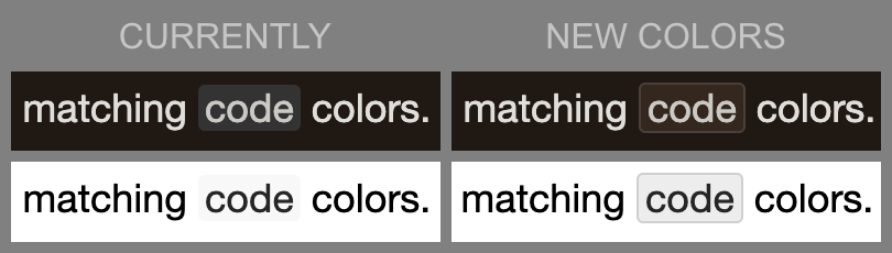
Thanks! I’ll give this a go for now. It definitely looks better than the grey. I’ve also added the code block section to the @media conditional, since that seems to work fine in both states, and I think what I have looks nicer than the default big grey box.
I don’t know why there was anything overriding the footer bar link colour to begin with. It uses the normal link colour in dark mode, so I just removed it from light mode.
When something like that comes back to haunt me, it’s often “inexplicable” in the sense of “just tryin’ something real quick here, no need to comment, going to delete it anyways” and then the phone rings…
Slightly off-topic, but I often use inline code for keyboard shortcuts, e.g. ⌥⌘Ü. Turns out <kbd>…</kbd> actually looks pretty nice here: ⌥⌘Ü. Those things you discover on a dull Saturday.
Yeah, I noticed that a while back as well. I’d use it more often but I think I’d want to automate the typing a bit with a text expansion tool or something, because that’s a lot of typing over what I currently do! Just haven’t gotten around to it yet.
That’s interesting. It must be my PC. I have 4 browsers and I don’t mess with the text settings. My ad blocker is Malwarebytes and that shouldn’t interfere with text colours. I need to look into this further.
Thanks for your help.
I’ve merged this with the main discussion on fixes to the automatic dark mode feature that was recently added. I have added an alternative “card” look to the theme when viewing it in dark mode, which should address what you were describing. Let me know if you spot anything else that this fix might have missed, and I can add some more scope to it.