It would be great if the index cards could be spaced closer together. I’ve chosen the lowest spacing, but there is still a good bit of wasted space here:
You’re looking at the amount of space that is required to display a regular width index card. Without any of them in the mix, it looks like there is unnecessary horizontal spacing, but this look is necessary to keep rows from staggering in an unsightly fashion when regular cards are mixed in with photo cards.
The actual horizontal minimum is as small as the vertical minimum that you can see here.
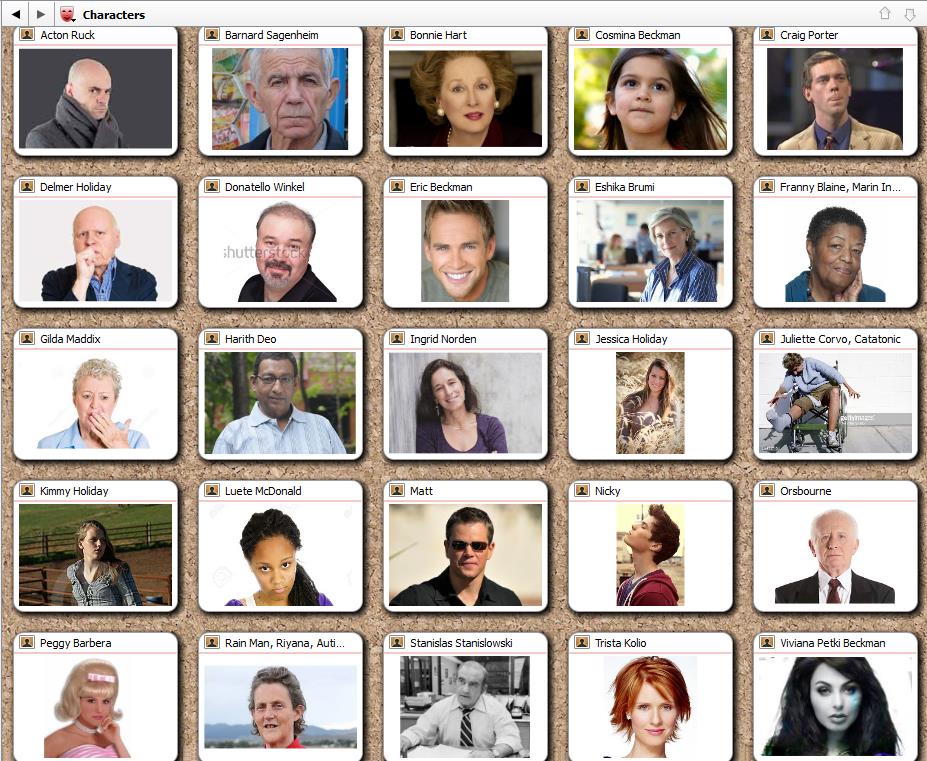
The [Aspect] Ratio of the cards is ignored for cards that do have images. For example, I had selected 5 x 2, but the cards with images are shown at 5 x 5.
Photo cards use 1:1, the idea being that there are “index cards” and “Polaroids”. A bit of an affectation perhaps, maybe a more modern example would be “Smart Phone” shaped images.
But to speak more practically on the matter, using a 1:1 ratio means the shape works equally well (or bad, depending on whether you’re glass is half empty or not) no matter the physical shape of the image. If we made image cards the same shape as index cards, then they would really only work well with landscape images—and if they responded to the aspect ratio slider in order to retain the same shape as “index cards”, then it would impossible to optimise your image cropping. With them being a predictable 1:1 no matter what, you can crop accordingly and be certain that they will look good for years to come and in any Scrivener project.
So that’s the balance in the equation. If we optimise to the corkboard looking like a perfect grid no matter what, then we compromise on the display of the actual thumbnails themselves. If we optimise to the thumbnail quality, then the perfect grid suffers. I do think most appreciate that thumbnail quality is prioritised.
As for myself, I tend to use Freeform on image boards, but I do understand that’s a matter of taste. To me I just like having a “lightboard” feel to those kinds of folders, and it does make throwing in the occasional annotation as an index card look nicer.
I understand your points, but would still like to have the choice. Also, won’t people be frustrated when they try to change the aspect ratio and it doesn’t work (when displaying image cards).
As it stands I’ll have to adjust the ratio whenever I look at text vs. image cards (unless I want to waste a lot of space).
No biggie.
With them being a predictable 1:1 no matter what, you can crop accordingly and be certain that they will look good for years to come and in any Scrivener project.
That’s ironic because for years I’ve cropped my images to a landscape format, and now all of those images are no longer optimal.
I find I agree with Trombone Al on this one. I’ve long found the aspect ratio for images on the corkboard frustrating, particularly given the ability to adjust how the image is cropped.
From the Scrivener Mac Manual, section 13.3.1:
In general, Scrivener design has been moving away from skeuomorphism (over many objections, including mine ) It seems to me that insisting on a Polaroid aspect ratio for corkboard images is at least as ananchronistic as a cork texture background. I’d much prefer to have all my corkboard cards matched in shape, please.
Re: Anachronistic: I don’t think my statement is OTT when Ioa describes them as “Polaroids.” Outside of specialised situations, I don’t think I’ve seen a Polaroid instant photo for more than twenty years. Even before smartphones, digital cameras were replacing them.
As to the aspect ratio, I still stand by my opinion that the ability to customise Scrivener synopsis image cropping means that enforcing 1:1 is unnecessary. The current Windows version of Scrivener doesn’t seem to bother. I happen to like my corkboards dense. But your opinion is the one that counts.
It shouldn’t be difficult to add, although I’m swamped right now with dark mode - I just get grumpy about being called anachronistic, probably because I’m starting to feel I am.
And my apologies for not stating this above, but THANKS! for putting this on your infinite to-do list! I totally understand about the Mojave dark mode having priority—dark mode has to be one of the most requested features on this board, and even with OS-level support implementation can’t be trivial.
Yeah, it’s huge. Scrivener contains around 500 icon image files, over 100 custom UI classes and dozens and dozens of controller classes that control those views. Every icon has needed a dark mode variant, almost every view class has needed rewriting to support dark mode, and every controller class that glues the UI classes to the model classes has needed code adding to handle dark mode too. That, and working around about a 100 new Apple bugs - so my nerves may be a little frayed right now.
Anyway, I apologise for grumpiness above - especially when you’re a valued and helpful member of the forum.
That’s one of those things that causes hair pulling (“Aargh! I set the ratio to 5 x 2, why isn’t it WORKING?”). It also results in tech support questions such as mine.
So, you might either change the text on that dialog to “Ratio (text cards)” or just make it apply to all cards. Otherwise the option is misleading.
You could also have two controls: “Ratio (text)” and “Ratio (images),” but that would involve more programming.
And, I would stay away from “Polaroid.” And I’m someone who used this camera in photo club: