If you don’t already, you can also colour the icons per label, so you can bookend the title in colour. I find this to be effective where the old system was quite overpowering (and the new fullwidth system even more so).
If you don’t already, you can also colour the icons per label, so you can bookend the title in colour. I find this to be effective where the old system was quite overpowering (and the new fullwidth system even more so).
It isn’t necessarily a case of “haters gonna hate” – that’s dismissive of what could be a genuinely serious irritation. Subtle differences in UI can cause a major change in eye and cognitive strain for people.
I can live with the new style and adapt to it, but I really did find the rounded corners and more subtle color gradient to be more soothing on my eyes, especially on one of the frequent days I have a migraine. If we at least had the option to reduce the saturation of the color for the labels, maybe that would help?
I’ll admit I’m not a fan of this flat look, but I’m looking clclampbell’s screenshot and can’t see how anyone can’t see the older look is so much more clear and readable than this new psychedelic look. Either you have a big slab of, say yellow, with no separation, or a rainbow of colors overwhelming you.
There was no confusion in the old version. And I agree with the “currently open” highlight bar being almost impossible to find amongst the crammed candy-crush colors.
It’s a real form over content thing really gets in the way of the writing process. Please at least allow options.
(But I dig the icon emojis.)
As I’ve said before I’m not a big fan of the flat look but following a recalibration of my display and a little tweaking via the Accessibility prefs, I find I can quite happily live with it.
However, despite all the tweaking, folder labels appear so washed out as to be pointless. I don’t use them a lot as I tend to sort stuff with fancy icons, but on occasion they can be useful. They really do need to have greater saturation and/or revert to the Scriv 2 format. TBH I’d prefer both.
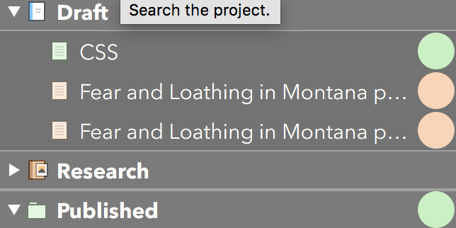
You still have full control over the label colours, you don’t have to stick with the defaults. I prefer a little more saturation as well; the approach I take in my default starter project is to have a bunch favourites already listed with generic filler names, ready to be pressed into use:

AND:
Thanks a lot for those two very helpful posts which I missed earlier. I’ve now sorted out the labels and using full width I can probably live with the lower saturation. Great to have this forum.
I am surprised that this slider does not effect also the opacity of label colors used as background in Binder rows:
Scriv Prefs > Appearance > Opacity of label colors when used in backgrounds.
Perhaps it should?
-gr
P.s. I don’t myself use row-coloring, but prefer to just tint binder icons with label color – and that already works perfectly, imho.
I use row-colouring but would be interested to learn how to tint just the binder icons if that’s possible.
Hi Tacitus,
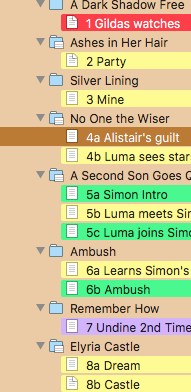
View > Use Label Colour in > Icons colours the icon in the cork board, outliner and binder. (It gets swamped if you have the Full Width Binder option set so that has to be turned off to see it — my screenshot further up the page has both the Binder and Icons set, but Full Width unset.)
HTH
Hi brookter:
Thanks for this. See what you mean about them being swamped if you have full width set. With only the icons coloured it’s not that easy to see, which does suggest a little more saturation would be a good idea. Still it works sufficiently well for what I need as I’ve generally used the old style full-width label.
Thanks again.
Just because some preferred the aesthetics and usability of the previous setup does not make us “haters.” I don’t “hate” anything about v 3 – I’m grateful for the constant improvements and that the fine folks behind Scrivener work hard to appease such a wide spectrum of users. I just personally found it hard on my eyes to see the difference between current file and all the rest, per the way I like to use the Binder (color-coded according to character POV).
And – Merry Christmas!! – I’m so thankful for the new update with the adjustment to the label colour! THANK YOU!! ![]()
Also, thanks to the folks on this thread who made me aware of changing the colour of the icon… at first I dismissed this idea but now I’m going to mess with it a bit, along with the label colour. Thanks so much for hearing us on this. I know everyone has their preferences and it’s impossible to make everyone happy. But I don’t think anyone posting on here is a “hater,” so please don’t take comments like that to describe all the rest of us.
I had decided not to upgrade to 3.0.1 since 3 is working fine on my MacBook Pro, but does this mean the upgrade changed the full width label color in the Binder to the old way?
[attachment=0]
It’s very close! Here’s a sample screenshot:
Thank you, thank you. I’m so glad I read your post. Shall update forthwith.
I’m sure it’s something I’ve done, but in my main current Scrivener project (3.0.1), I’m not seeing an option for “Use Label Color in” but “Use part Color in” – please see attachment. I do, in fact, have labels assigned to various docs within the project. In other projects, the “Labels” option does appear. What, pray, have I done?

The word “label” can be changed when editing labels. It looks like you renamed it to ‘part’, so Scrivener is adapting to the name you gave to what was once called “Labels”.
I think this setting is now available in the project settings (under the Project) menu, or maybe via the inspector where you add/change/or delete labels.
Well, you hit that nail squarely on the head, rdale. Thanks very much for your help. At this moment, I can’t really see the utility of being able to rename the label tool itself, but there is much that is beyond my understanding. 
thanks again
I’ve used it a few times to track PoV, and prefer to have it named specifically for point of view, rather than it being a generic “Label”. I think of it similarly to Custom Metadata (in that I use specific names for each CM column), except that a renamed Label has greater visibility throughout the Scrivener interface (icons, index card, binder rows, outline rows, etc…).
That makes sense, rdale. Thanks.
Sometimes I use the Label for “status” where that is the most important thing to track in the project, and then I use the Status for something else. It can be quite a bit less confusing if the label field is marked “Status” in the outliner instead of something else.