I’ve switched back to Scrivener from Ulysses. I appreciate that Scrivener is highly customizable. I was curious whether anyone has some tips for modifying Scrivener so that its a bit less overwhelming and more easy on the eye. (I don’t mean this as a criticism). I’ve hide the menu, ruler, and just have the binder and editor open (two panes). I’ve switched to a black background and green text in the Compose mode.
Does anyone have any former Ulysses-lovers have tips to make Scrivener a bit more like Ulysses’s interface?
Can’t think of anything. Scrivener doesn’t have an option to Hide Tab View, nor does it have a Sheets View. So you’re not comparing like things. If you were, you would have the Library open in Ulysses instead of the Sheets, which is not possible. And, of course, basic UI elements are different visually in each program, e.g. the appearance of Scrivener’s Inspector vs Ulysses’ Attachment panes. Wish I could be of more help.
Have a look at the Window > Layouts > Manage Layouts dialogue. This allows you to set up your screen to a particular layout, then save and name it to get back to it quickly (you can also add a shortcut in System Preferences to make this quicker still).
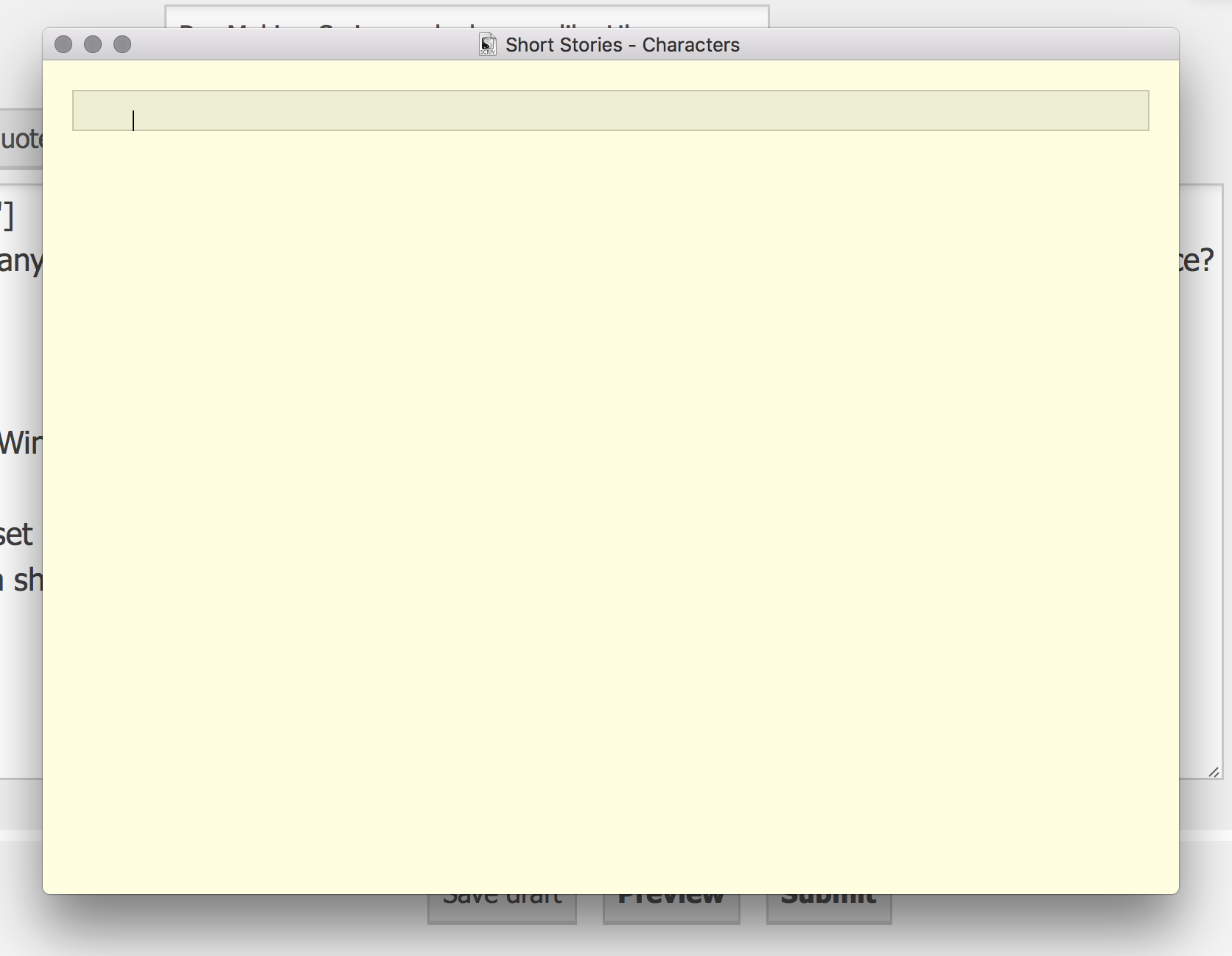
So firstly set about going through the menus to get rid of everything that’s non-essential: on the view menu you can hide Toolbar, Tab Bar, Binder, Inspector, and on the sub-menu Editor Layout you can hide the Header View and Footer View. Toggle the formatting bar with cmd-shift-R and the ruler with cmd-R. You’re left with something like this…
Once you’ve reached this state of nothingness, save it in Manage Layouts, give it a shortcut and it’s available whenever you want it.
In effect, you’re recreated composition mode, with a couple of exceptions: you can use it in a window, and you can slide the binder and inspector in temporarily with cmd-opt-B/cmd-opt-I. Of course the other window shortcuts (e.g. for Keyword HUD cmd-shift-K etc still work as well).
Thanks for the suggestions! (If there are others interested in making Scrivener more like Ulysses, you can also set the Binder background color under Preferences.)
Also, you can use Better Touch Tool to set up swiping to hide and show UI elements. I think that’s one of the best (albeit non-visual) elements of Ulysses.
Yeah? Different strokes! That’s actually one of the few things that drives me nuts about their window—that and how elements vanish if you resize it past a certain point. I’d rather manage what stuff is visible and don’t really see why the software should be making that choice based on something as arbitrary as window width.
I do like the idea of a gesture to hide and show extra UI elements in Scrivener though. Hmm. Maybe pinch and zoom.
Very helpful; thank you! I found this for the first time this week, after switching back to Scrivener following a brief dalliance with Ulysses, and was delighted to see how easy is to do this.