You’re welcome!
Other fonts that conform to the Screenwriting requirement of 12-point 10-pitch mono are:
Courier Final Draft (from Final Draft)
Courier MM Screenwriter (from Movie Magic Screenwriter)
Courier Screenplay (from FadeIn)
VTScreenplay fonts - Remington, Oliver, Smith & Underwood (From Vintage Type Foundry)
You can use any of these fonts at 12-point, and your pagination will stay exactly the same.
You know, I recently went hunting for the source of this term. I first heard it as “vacuuming the cat”, but that search only netted me YT videos of people… vacuuming their cat. ![]()
I love the oddness of the phrase “moogie-hoovering”. A personal Hooah! for me was that I recognized both terms enough to recognize the saying! ![]()
Thanks for the colloquialism from the eastern side of The Pond.
Anne.
Does anyone know how to obtain the VTScreenplay fonts? From my cat moogling–I mean web googling–it seems that Vintage Type Foundry is no longer in business?
Thanks!
Jim
Remington B is available as a free download on many font sites.
The Vintage Type Foundry was a one man shop run by Mark Alan Thomas. His web site is here: markalanthomas.com/
You can send him a message via the page, and ask him if he still sells the fonts.
While I don’t use a monospace font for writing, thank you so much for this post! I am a software guy by day and I’m very excited about giving this a try. It looks great!
Thank you for that! I’ll follow-up with him.
I did see Remington B floating around, but it doesn’t support italics. Do you know if the other VTScreenplay fonts do?
Thanks,
Jim
I don’t think they have a separate italics font.
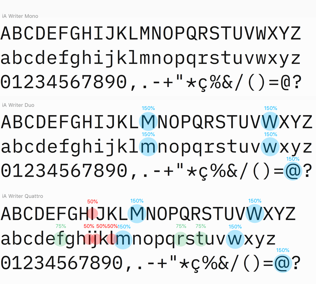
I’m sure Silverdragon’s monospace purism will not be satiated, but iaWriter have released a new font which takes the Duospace concept even further into the proportional font space. They still keep the wider overall spaces typical of a monospace font, but more characters get proportional width adjustments.
Anyway, for font nerds the details of the design are interesting nevertheless, and the fonts are all free to use! They are using new OTF technology called variable fonts (infinite number of weights rather than fixed) and they’ve also added lots of tweaks for CJK users and even some ancient greek!
ia.net/writer/blog/a-typographic-christmas
Adding to the growing list of variable fonts with monospace sensibilities, Recursive by arrow type varies across 3+2 axes, including sans-monospace and strict-causal.
recursive.design/ — github repo
There are still some platform issues for handling variable fonts, so they make static versions available, which works wonderfully in code editors. I haven’t yet tried to see how Scrivener handles the variable font, but there are some outstanding bugs in macOS handling of slant IINM…
Another free and high quality monospace was also recently released by coding IDE company Jetbrains:
jetbrains.com/lp/mono/ — github repo
High legibility but not much “character” so not my cup of tea personally, but well crafted nevertheless…
Both fonts have beautifully designed webpages too 8)
I just found a new free monospaced crush:
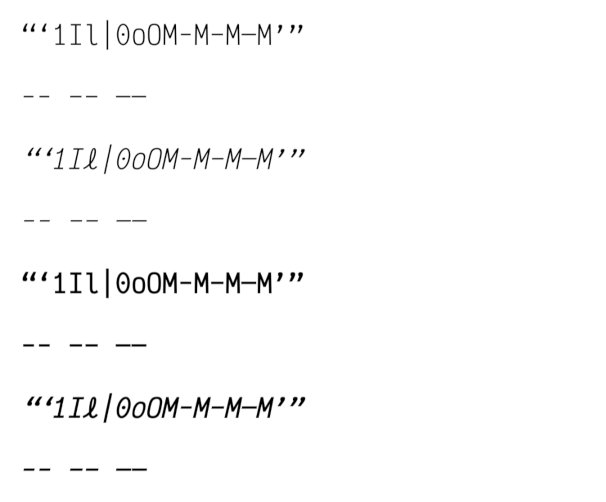
Victor Mono, available from FontSquirrel.com, and doubtless many other free font sources. It has the distinct glyphs that I insist on: legible typographic (English) quotes, distinct hyphens/dashes, distinct uprights (one, ell, capital eye), and distinct zeros and capital "o"s. Its italics are quirky, half-cursive and fun. It’s a little narrower than Courier Prime, and has wider line spacing—not a substitute for scriptwriting purposes.
Here’s a sample from FontSquirrel:

And my own test of my pet font peeves (capital I, lowercase l, numeral one, English typographic quotes and the various flavours of dashes:
@SilverDragon I downloaded and fooled around with Victor Mono but I am still married to Source Code Pro!

Alas, I’m not married to any font. I just play the field… 
Courier Prime and I are still going steady at the moment.
But there’s a lot of fonts in the sea, so I just don’t think I’m ready for a deeper commitment.
So many fonts. So little time.
You’re not the marrying type?

Finally was able to find both JetBrains Mono and the static mono versions of Recursive. Thanks for mentioning them, Nontroppo!
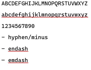
If I were still programming I would definitely give JetBrains a whirl! Those operator ligatures are cool! Other than that, it’s a nice crisp coding font with good dashes but those English typographical quotes are the type that are hard for me to read.
As for Recursive Mono, I like the Casual family best, and it’s going into the rotation of fonts I switch in occasionally. Nice dashes, readable quotes.
And yet I find myself sort of going steady with good ol’ Anonymous Pro. I like the squat, Courier-style semi-serif letter forms. Nice quotes, too. Dashes—well, I use 3 hyphens for em-dash and two for n-dash now, so they’re less critical.
I recently got introduced to Microsoft’s Cascada Code font (included in their new Windows Terminal package) and am slowly learning to love it.
github.com/microsoft/cascadia-code/releases
By the way, for anyone that uses homebrew, their cask system has a bunch of fonts that are simple to install, so if you want e.g. fantasque, victor, jetbrains and cascadia, type this into terminal:
brew cask install font-fantasque-sans-mono font-victor-mono font-jetbrains-mono font-cascadiaI use this to install a bunch of fonts (and most of my apps) automagically on fresh installs of the OS, easy to work into a script that sets up a machine. Homebrew will also update these for you when there are new versions available, without any fussing! 8)