Great work! I used the scrivener gold for my nanowrimo project last year and I plan to use this for this year too!
I was looking forward to the tutorial but for some reason when I try to open it, it says that it needs to update the project (tutorial file) so it can run on the new Scrivener beta. The file right now has the symbol for the Scrivener Gold and the beta has expired. However, when I try to update the file, the Scrivener automatically quits and I can’t open the tutorial. What’s the problem? Please help. Thanks
A bit slow to download the beta what with other stuff going on, but this is a glorious program.
Keith - you’ve done an excellent job of remixing the good bits of SG while keeping the look clean. I’m particularly impressed at the way you’ve combined the different views into one - that view switch was always a bit sticky, and I was used to the idea from the dev tools I use every day (the Eclipse IDE has perspectives which have a similar role).
Dunx - glad to see you are still around and using Scrivener!
bluloo - yep, that is true. The “Add” and “Edit Scrivenings” buttons (which have menus attached" aren’t proper toolbar items. They are really views placed inside the toolbar, like the search field, so they don’t shrink. I’ll see if I can do anything about it.
justinlau_15 - sounds like you haven’t got rid of your old copies of Scrivener Gold. Delete all copies of Scrivener Gold from disk (you can reinstall it afterwards in another folder if you want to keep it around), delete the tutorial and start again. To be extra sure, you can also delete the preferences file (search for com.literatureandlatte.scrivener). Don’t just dump it in the trash - make sure you empty the trash, too, so that SG is completely wiped. Now install Scrivener again - making sure it is to the Applications folder - and copy the tutorial from the DMG to another folder again. Then reboot, to force the new icons, services and Spotlight support to get registered. Everything should work fine, then. It sounds like the tutorial somehow got opened by SG and converted back to the old format. Hope that helps - let me know if not.
Very much so - SG is my primary writing app for large creative projects. I wrote NaNo 2005 in it in the first place of course, and have imported NaNo 2004 in as well. I also write roleplaying scenarios in it.
Browsing through a few of the other threads here I am glad to see that you are implementing more keyboard shortcuts. I type a lot faster than I mouse, so always happy to see more options for not moving my hands over to tickle the rodent.
Just discovered Scrivener last night and am blown away by it. Have been looking for something like this for years - but never thought it could be this good…
Small thing: I liked the way in ScrivenerG that the information panel elements were visually indented - this seemed to me to give them a little conceptual space from the main work/writing panels. Cf the way it’s done in Aperture - and Scrivener seems to have all the potential for an Aperture For Words, or even an Aperture for Thought. is there any way of having an option for this - either a harder line around that panel, or indentation - or is that a code nightmare?
Anyway, thanks for a stunning piece of software that I’m already using more than things I’ve owned for years…
I looked at Aperture quite a lot when redesigning the interface, actually - hence the new Keywords HUD, which is a complete rip-off of the one in Aperture. The reasoning behind the lack-of-indentation in S1 is that I wanted to make sure that as much screen real-estate was used as possible, so that those using Scrivener on a small laptop screen could would still have a lot of room to move. There was also a bug in SG which would lead to the shadow around the index card in the info panel to get drawn forever, so the current solution killed two birds with one stone. An intermediate beta of Scrivener which I never released actually had even less of a divide - just a Mail-style one-pixel line between the text and the info panel. That definitely made things seem too crowded, which is why I eventually went for the normal splitter bar as being somewhere between the two extremes. At one point I was going to make the inspector look and act just like the one in Aperture, with collapsible views, but so many of the views in the Scrivener inspector need to be resizable (notes, keywords, references), it’s something of a different situation.
That was a bit of a long-winded way of saying, yes, it would be a bit of a coding nightmare. However, I am open to suggestions to possible solutions. It certainly seems that the current info panel isn’t exactly pleasing everybody, as some other users have said that they find the whole spit between meta-data and supporting materials a little awkward. I don’t know if there is a way to please everybody, but I’ll certainly have a think about it.
Thanks Keith - I’ll look forward to following progress. You’re right, don’t think collapsibles would work - just be nice to have some kind of subtle demarkation between the text and its accompanying information.
But if you stopped work on this now I’d still be registering…
I am not a fan of collapsible sections, it is a UI nightmare. Click-points drifting up and down in a complete lack of consistency, wasted space on individual section overhead, coding nightmare, et cetera.
An alternative: Path Finder’s modular sidebars. Each sidebar has a pre-designated number of sections from 2-3. The header for each section is a drop-down so you can select which content you prefer where. So you could keep the two pane concept, and then let the users swap out whatever views they want in those panes. Have a two-section and a three-section set.
Visual distinction: Really only notes has this problem, so why not go back to defaulting the notes field to a subtle grey tint? I think that, more than any visual elements set between the two text fields, will make it clear where one starts and the other begins. Take a look at Ulysses. I’ve never felt the fields were cluttered. If you look at the pixel distance and UI elements separating notes from the editor, it is nearly the same (they are still using the pre-Tiger stripes look). Everything is in the notes tint.
I like the tint idea - that would help. I guess I also liked the way the index card hovered, suggesting an independence from the rest of the interface/text - which in some subtle way also made the corkboard module feel usefully ‘other’ than the pure writing experience.
That is so subtle I can’t actually tell the difference. Is it just the black triangle in the corner? What is the point of that?
As for the tinted notes, I’ll add it to the list. But of course, then I will have to make the notes background user-definable via Preferences. And if I do that, someone is bound to pipe up with, “Hey, if I can change the background colour to the notes, why not to the main text, too?” At which point I will shoot myself as the list of things to do - and the size of the Preferences panes - gets out of hand.
The trouble is that it really has to be a grey, because anything else will jar with the new interface, but at the same time there are several different shades of grey already used, and you don’t want to use too many greys and at the same time don’t want the notes to be completely indistinct. At the moment I have set it to a very subtle grey for beta 2 - so subtle it may not even show on most screens (0.99 white).
If anyone wants to try out different colours in Photoshop and finds one that really fits, let me know.
Yes, please keep it subtle, especially if there won’t be a preference for it (and I understand the reasoning there). I will be using the notes pane pretty extensively and I would rather it have not a different background color. I like it as is. (you definitely can’t please everyone! ) A subtle color would be a good compromise for those that don’t want it and those that do.
Note noticing it is actually a good thing, in this case. The idea is to add some minor screen element that most people never notice, but creates a “feel” that sets apart the interface elements. Like the 98-99% grey background colour. Most people will never notice such a mild tint, but if it reduces eye strain and creates a “feel” of differentiation between two components, then it is has served its purpose.
I tried it on several corners and combinations of corners. The only other alternative that I thought looked okay was having the left top and left bottom rounded. It looked kind of dorky on all four, primarily because there is not a good visual element on the right for it to merge in to.
I doubt I will go for the corner thing. For a start, there is already a meaning to this sort of visual element: if you have a colour picker and choose a non-system-defined colour, the colour square will have a little triangle in the corner to indicate that it is a custom colour. As soon as I see that triangle, I think there must be something changed about that particular index card. That is my aesthetic reason; my technical reason is that I don’t really want to subclass your everyday run-of-the-mill text field just to pop a little triangle in the corner, about which most users will no doubt ask, “What’s that, then?” I prefer the clean look as it stands now.
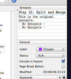
As for the grey notes view… I’m not even sure about that. I think I quite like the clean white look. Anyway, here’s a shot of the 99% white:
The trouble I have with it is that it actually draws the eye to it, which is exactly what it’s not supposed to do. In a set up where the binder is white and the main document view is white, if the notes are a light grey, you suddenly have an area that is obviously different… Hmm. Maybe I should make it a Preference after all…

 The reasoning behind the lack-of-indentation in S1 is that I wanted to make sure that as much screen real-estate was used as possible, so that those using Scrivener on a small laptop screen could would still have a lot of room to move. There was also a bug in SG which would lead to the shadow around the index card in the info panel to get drawn forever, so the current solution killed two birds with one stone. An intermediate beta of Scrivener which I never released actually had even less of a divide - just a Mail-style one-pixel line between the text and the info panel. That definitely made things seem too crowded, which is why I eventually went for the normal splitter bar as being somewhere between the two extremes. At one point I was going to make the inspector look and act just like the one in Aperture, with collapsible views, but so many of the views in the Scrivener inspector need to be resizable (notes, keywords, references), it’s something of a different situation.
 Is it just the black triangle in the corner? What is the point of that?