Ulysses III

Yeah, I don’t know what the hell I was thinking. In fact, back in the day, I think I was one of the people requesting that feature, and before Fountain I used it every day.

It seems to me one way to “hide” the Scriptwriting element is to actually elevate it to its own menu. You’re not limited to 9 menu items, right? Apple’s own Pages has 10. I feel like doing that might put Scriptwriting in its proper place — if you want to do it, there it is, but regular users won’t have to deal with it. I mean, obviously it already is its own menu item… I don’t know, something about putting it as a main menu seems to both elevate it and tuck it away.

Two quick thoughts about the preferences issue. I keep thinking about my wife’s suggestion when I’m overwhelmed by any organizational task: Make like-piles. And I think that begins with a standalone Fonts pref pane. Creating a Fonts preference pane — just that alone — will simplify, by my count, 4 different preference panes. That’s my radically simple solution.

Here’s my radically unsimple (read: undoable) solution, which will cost millions of dollars and thousands of lives. It’s not a request, just a possible note to add to a Scapple project sometime.

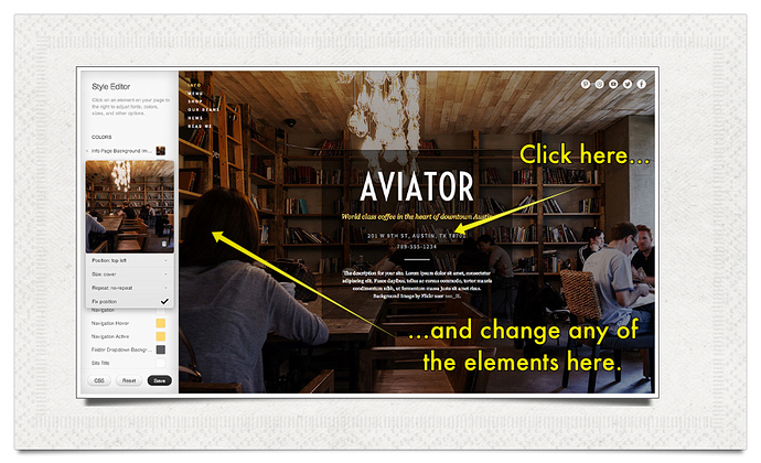
Squarespace (which, I know, is HTML and totally different) has a mode that allows you to click on elements of your Squarespace 6 website in a main window, and in a sidebar it brings up the stuff you can change about that element (color, font, whatever). Change those elements (they all have pop up menus), click save and you’re done. Here’s an example:

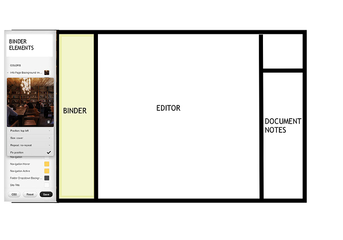
I keep wondering if that visual approach works for apps. In fact, Scrivener already does this in a way with the Main Text Style preference. That thing is genius, as is the Use Formatting In Current Editor box. I wonder if there were more interface elements that could be changed in the same way. Short of being able to snap into a “Customize” mode as with Squarespace, is there a way to apply the visual “make it so” functionality of the Main Text Style Box to other elements? Like, what if you made a bare-bones Scriv mock up in the preferences, and… I can’t explain it. Here’s a 5 min mock up:

I’m saying that the above is an actual preference pane. Is that insane? It seems insane. I should get out more. I’m going to go work now.

Best,

SC

I received a courteous reply from SoulMen support to my questions about U-III’s refusal to edit text already marked-up using (Multi)Markdown. They confirm that it won’t and it appears that they are sticking with that choice. They say they can’t accommodate markup created outside their App because they want to “free the user from all the complicated details of Markdown and other markups” by using their own interface widgets (e.g. for foonotes, links, images etc).

To me, this is bizarre. “Freeing the user from complexity” is what lightweight text markup schemes such as Markdown and Textile are FOR, already. They eliminate the overhead and complexities of HTML, LaTeX and resT, not to mention RTF and XML. They do this well and there’s no need to break with that essential function — except for marketing reasons.

Lightweight markup is intended, I believe, to GUARANTEE compatibility between marked-up texts or at worst to offer transparent and non-fatal fall-backs when markup varies e.g. between versions of Markdown. U-III breaks this model. Thus Fletcher Penney has been careful to ensure that Multi-Markdown is a super-set of Markdown. John MacFarlane’s wonderful Pandoc, too, provides extensions of Markdown that accommodate both Markdown and MultiMarkdown (not to mention resT, Textile etc).

Users benefit from this guarantee in many ways, not least of which is that our data is our own. We can be sure that whatever environment we choose to work in, in the future, our marked-up texts will be accessible and (more or less) identically represented by viewers/browsers.

But U-III is apparently designed (like many programs on the App Store, alas) not to respect my ownership of my own data (text). It wants to own the data for itself, by using a proprietary approach to creating markup that renders it incompatible with other markdown editors.

Sad and stultifying.

Peter

I wholeheartedly agree with everything your saying here. The beauty of Markdown is it’s simplicity and it’s faultless roundtrip editing behaviour. I hate to say it but it’s increasingly looking to me like SoulMen are riding the coat-tails of the current buzz around all things Markdown without being true to the things that make Markdown such a great technology.

Peter, could you give an example of this limitation you are describing? I just tried doing what you said, creating a document using MD in iA Writer, then importing in to Ulysses III, and it opened fine, using all the correct styling and their widgets in place of my manual footnotes. I added some text, then exported it out to iA Writer, and everything was fine. I must be missing something. Many thanks.


Update: Perhaps I do see it. I just noticed that it changed the custom name of one of my footnotes to a serial number instead. Perhaps there is more like this?

Apologies for butting in here.

Ulysses recognises three types of file - plain text (.txt files), Markdown XL (a bespoke version of Markdown that is like a hybrid of Textile & Markdown with some unique syntax that is only recognised by Ulysses) and Markdown itself (a slightly watered down version of John Grubers original syntax). It doesn’t at this stage recognise Multi-Markdown and I believe this is what Peter was making reference too.

Coming from a completely different perspective, as someone who doesn’t use markup but who generally uses barely any formatting at all (a sort of puritanical strain of rich-text writer), I think that the combination of Ulysses III and Daedalus Touch has just solved the problem I have had with finding a note-taking application that I am comfortable with on my iPhone but which is easy to integrate with the rest of my life on my Mac. I don’t have any real desire to write stuff on such a tiny screen, but I do sometimes need to jot things down if they occur to me when I am out of the house – all sorts of material, from work-related notes to shopping lists to actual writing for a number of purposes. And I don’t want to faff about with getting it into an appropriate application on my Mac according to the type of material it is; I want flexibility without having to do endless import/export or cut/paste or moving files around on my hard disk.

While the main “keyboard” of Daedalus Touch is no easier to type on than any other iPhone app I have used, the keyboard extension row is great for things like quotation marks and brackets, which are ususally a real pain in the neck. (I don’t use much formatting, but I am fond of punctuation!) So that’s handy, for a start. And a simple, easy form of markup is very handy when writing on a device with limited text functionality. I know, I know – that’s Daedalus, not Ulysses, but I’m sort of reviewing them as a double-act. And I’m coming to the Ulysses bit now.

Other apps I have tried have felt clunky in terms of getting the information out of the iPhone and into something more sensible on my Mac, but viewing the material in Ulysses III is effortless. The Ulysses application is just sitting there, waiting to update itself with the latest notes from Daedalus, made large enough so that I can read them, and maintaining the stacks-and-sheets structure so that notes on disparate subjects aren’t all jumbled up together. Couldn’t be easier. At least, it couldn’t be easier after I realised that there was a hidden “Show” button in Ulysses III which would actually display my Daedalus notes; up until that point, I was getting rather frustrated with my apparent inability to get iCloud to work.

Putting material from Ulysses onto the iPhone (in Daedalus) works equally well, too, making it easy to take notes out with you. Creating groups in the “Daedalus” section of the Ulysses sidebar, and adding sheets to them, updates the contents of Daedalus in a matter of seconds, with no further action needed beyond the creation of the stacks and sheets. Quick and simple.

When I have processed the text, copying it from the “Daedalus” section to the “On my Mac” section, or exporting it elsewhere, I can just delete it from Daedalus, and that’s it gone from the cloud. At least, I hope it is. Looking at the “Documents & data” contents via “Manage Storage” on the iPhone, it’s a bit hard to tell from the obscure filenames, but files certainly do seem to be removed when sheets and groups are moved to the Trash.

The export options from Ulysses III are quite handy. There aren’t any options for directly exporting to Scrivener, but Ulysses does offer a range of relevant applications suitable for opening various flavours of TXT, RTF and PDF file, without having to save to disk first (although you can do that, too), and the most recent selection for each is conveniently saved on a button to speed up the process next time. A couple of them are a bit odd. In all my years of working with text, I have never felt the urge to open an RTF document in System Information, but perhaps I am just blinkered by convention.

What is working really well for me is the “Copy to clipboard” option, which means I can very quickly paste the text into Scrivener’s scratchpad, and from there despatch it to its final destination in the appropriate Scrivener project. With a note consisting of a name and address, I even output the text straight to FormalAddress for parsing into my Contacts application. The process for both workflows feels smooth and speedy.

What don’t I like about Ulysses III? The lack of customisation of the colour scheme. Normally I couldn’t care less about customising interface colours, but I’m getting old and my eyes ain’t what they used to be, so I simply can’t see grey-on-charcoal text, and the “pure” and “dark” modes just aggravate the problem. As far as I can tell, I can customise the markup colours but there isn’t a lot of control over the interface itself. The Soulmen’s website has leanings in the same grey-on-black direction, so I guess it’s a style thing.

All in all, I’m very glad I bought Ulysses III today, and its little iPhone friend, Daedalus. The combination has already proved to be genuinely useful, fitting easily into a number of information-transfer processes, and even making them smoother than my usual methods. I don’t need another long-form writing application, and I don’t currently intend using Ulysses in that way (although you will notice that I couldn’t resist buying yet another word processor, junkie that I am), but I really do believe that Ulysses III and Daedalus together are brilliant for other shorter writing tasks that I need to perform every day. Ulysses has won a place in my dock.
I feel pretty much the same way, and I really like the Daedalus connection too, but I also agree with Peter that these (now confirmed) restrictions don’t seem to be in the original spirit of MMD.

The sticking point is that if U-III is being marketed as a new text editor, competing with Sublime or MMDC2, then it’s not going to work as such just because of those restrictions; but their new marketing tag is actually `All your texts. In one place. Always’ which indicates that round-trips are not expected (or encouraged) and so that this is not really intended as a general text editor in a larger work-flow at all.

It seems to be working nicely for me as a place to write relatively self-contained, relatively short (2-3,000) review-type articles. I write one a month and they (quite literally) pay my rent, so anything that helps here, helps a lot. Yesterday I included my nvAlt notes Folder (a mixture of .txt and .md files) on DropBox as an `external source’ in U-III, filtered it to get the relevant notes, and with its quite lovely working area it turned out to be a very good environment in which to write these articles. It’s not going to work so well, for me, for bigger projects, or those that require better access to and integration of research material, or those that require MMD round trips - but then that’s what I have Scrivener and MMDC for.

Horses for courses, as always; the only problem, I suppose, is if any misleading marketing implies otherwise.

Cheers,

Eric

I haven’t tried Ulysses III yet – I don’t know if I should be spending money on yet another piece of software when I haven’t got any money. But I note that Brett Terpstra has indicated that he will be doing something with Marked that may help export: he says of Ulysses, “You can export your documents to RTF, PDF, TXT or HTML. In the near future — when the next version of Marked is officially released — integration with Marked will be tight.” See his blog post:

brettterpstra.com/2013/04/03/mac … ysses-iii/

Martin.

I feel this actually promotes it too much rather than tucks it away. Any user trying out Scrivener for anything other than scriptwriting will suddenly have that menu in their face, and it might feel that Scrivener is too geared towards scriptwriting for such users; it might also encourage our vocal screenwriting contingent to demand that, seeing as Scrivener boasts about “Scriptwriting” in its menus, it now at last implement MORE and CONTINUED etc. :slight_smile:

Now, if it were promoted but could be hidden, that might work, but I’m not sure that the HIG allow main menu items to be hidden like that, as the idea is that the menus act as a way of discovering features.

I’ve been doing that today! I’ve been going through every preference and assigning it a category in OmniOutliner, trying to work out a better system of organisation. It’s hell, though, because as soon as you start putting things together, you realise there are other things that sort of belong with them. (E.g. “Media background colour” and “Use smooth line art in PDF files” - both media-related, great! Until you realise that the media background colour can be set differently for QuickReference panels and full screen mode, too…)

The trouble with this is that you would also need a separate Colors pane. But that’s fine. My current thinking - and I’m still experimenting - is to have the “Appearance” pane have sub-tabs, like OmniFocus’s Sync Preferences pane:

There would be three tabs: “Options”, “Fonts” and “Colors”. Each tab would have a sidebar listing interface elements.

That, at least, is the best I’ve come up with so far - and it should reduce the proliferation of panes and sections quite significantly if I get it right.

Yep, that’s pretty insane! There’s just no way of doing that in an OS X app. Well, you could, but I’d essentially have to rebuild the entire interface out of custom views which take font and colour instructions and various other options, and then swap out the real interface for that interface and… Argh, I’m getting scared just thinking about it.

All the best,
Keith

On another simplification topic, I’d be grateful to anyone who could help with these questions about project structures in Scrivener:

https://forum.literatureandlatte.com/t/feedback-wanted-how-do-you-structure-your-scriv-projects/21951/1

Thanks!

More and Continued are not for spec scripts. That’s a request you should continue to ignore. :slight_smile: Also, I disagree with you about a dedicated menu making Scrivener look too geared toward scriptwriting—to me, it just says “here’s another thing you can do, but it’s over here. It’s a different mode, and you need to use this menu.” I get what you’re saying, though.

I thought about hiding it too, but then how would someone know how to do a script? I mean, there’s RTFM, but that’s just begging for an extra hour a week of customer support for you.

It’s a complex thing, I know! I started to make a little list when I was posting above, and it quickly gave me anxiety.

I had a thought about putting certain preferences in multiple panes — giving people two ways to do some things, with clicking the SAVE CHANGES button making the change The Truth in all preference panes. But that’s just asking for trouble, right?

I love that idea!

I didn’t mean to scare you. Wait, yes I did. :smiley:

On the general note of simplification (and not wishing to sound contentious) I think that Scrivener only appears to be complex because of the myriad of customisation options. The 500 odd page manual doesn’t help with that false impression of complexity either (the Take Control ebook on Scrivener does a fabulous job of parring down the essence of Scrivener in an intelligible and approchable manner in only 100 or so pages).

My suggestion would be to offer two types of customisation. One would be simple and template driven (five or six flavours), the second would be an enhances version of the existing preferences dialog for advanced users. I personally now find the multitude of options available to me through the preferences dialog extremely helpful. But when I first returned to using Scrivener V2 having not used it since the very early days of V1 I was completely lost.

My bible when it comes to simplification is John Maeda’s wonderful little book, The Laws Of Simplicity - d.pr/deV - An whilst some of his laws sound a little ‘no shit Sherlock’ in isolation; taken as a whole they add up to a powerful way of thinking about any simplification project. In a nutshell they go as follows:

  1. Reduce - The simplest way to achieve simplicity is through thoughtful reduction
  2. Organise - Organisation makes a system of many appear fewer
  3. Time - Savings in time feel like reduced complexity
  4. Learn - Revealing knowledge over time makes everything simpler
  5. Differences - Simplicity & complexity need each other
  6. Context - What lies on the periphery of simplicity is definitely not peripheral
  7. Emotion - Emotional involvement can ease complexity
  8. Trust - Trust leads to simplicity
  9. Failure - Some things can never be made simple

In summary - simplicity is about subtracting the superfluous, and adding the meaningful.

I’d still grab the book if you haven’t read it before - as useful as my Guardian like book in 30 seconds summary is :slight_smile: - as you’ll read it cover to cover in an hour or so. It really does focus the mind for any type of simplification project.

V1 apps like the new Ulysses remind us of how powerful parred down options can be but deep customisation has it’s uses too!

I think that Ulysses III and Dedalus Touch make a great match. I already had DT but it was a little a lone piece of work, but now I find it very useful with U3 (that seems something like an ongoing work with great potential).
While waiting for a perfect version of Scrivener for iPad, there is a lot of movement out there in the AppStore. I think that a work-in-progress version of Scrivener for iPad would be well accepted by us users. Perfection is a very good thing, but… (OK, I know your position about this!) :laughing:

couldn’t agree more. i find scrivener very simple. it’s very possible it’s just because my own personal needs match very well the most salient features of scrivener. i never even bothered to read the manual. i just used it and find myself using it more and more for rather unorthodox projects, scrivener-wise. very short projects that still benefit from parsing, chunking, re-organizing the flow of the argument. great tools tend to work well in the most unexpected ways.

Keith, you are on to something there… on the right way. More, more—continue, continue…!

I’ve played with it and I really like it :smiley:

Ulysses III looks stunning. I love the rounded page edges and the whole markup thing works well. I’'d probably use it for short works, but for novel length pieces I think it has quite some way to go.

Part of the reason that Scrivener’s setup can be complicated is because it offers so many options for editing and export. It’s possible to go straight from Scrivener to RTF/epub/mobi without having to do any final polishing in another word processor (though it would be great if I could strip superfluous blank lines from the end of each document during export). Which works for me because I hate round-tripping. Ulysses III is hasn’t reached that level (in fact, it’s still some way off from Ulysses II).

Then I played around with Scrivener’s settings for a few minutes and managed to achieve a similar onscreen layout with the exception of rounded corners on the pages. The SoulMen’s choice of the Menlo font was inspired.

Ulysses stores everything in one place. There’s no notion of separate projects, which I imagine makes syncing across the Mac platforms a lot easier. Whether we like it or not, I think this is Apple’s ultimate plan for file storage and syncing across their desktop and mobile platforms, so we’ll have to get used to it.

Ulysses III shows a lot of potential, but I don’t think it’s a Scrivener competitor (I can’t really see myself writing a book with it), and doesn’t need to be.

Interesting thread, lots of thoughtful comments and themes. I didn’t download U III and most likely I won’t. I am tempted because the Soulmen make very pretty apps. DT looks very pretty on my iOS devices, and yet, I rarely use it. I got U II on a $1.99 offer (I believe Ulysses original price was over $100, that’s quite a drop), and tried to play with it and use it, but it just doesn’t do it for me. I guess Keith is right, the philosophies are so different that I don’t see U and Scriv to really compete. For me, U looks like more a note-taking tool. But for note-taking, Notebooks works much better for my needs (folder structure, can read all sorts of files, etc.) Indeed, NB is much more than that (I used it also as my to do list). And now there is also a Mac beta version. I guess I find the Soulmen philosophy a little too rigid and their choices not exactly the choices I would have made. I am afraid I won’t be the only one. U III may not have the impact the Soulmen were hoping for. And that’s a little sad because they are clearly passionate about their choices and they work hard to deliver. But as someone already remarked in this thread, they are making choices that confine the users to their own apps, rather than allowing their apps to interact flexibly with other apps.
Not sure why Keith wants to rethink some aspects of Scriv. There is complexity in Scriv, but you don’t have to use it, if you don’t want to. (I definitely don’t) But I bet there are users out there that like and use almost daily the many complex things that Scriv allows.

I love Daedalus Touch, and I think I will love Ulysses III. But I don’t use DT, and I don’t see myself using U-III for other than some short stories.

Why? I don’t know. The look and general concept of both apps is terrific, but there is something that doesn’t make me feel at home.

Paolo

This was in fact one thing I had been considering. The main reason I am wary of doing something like this is that it reminds me of educational word processors that have different “levels” for different ages which turn on or turn off certain features, and I also think that as soon as you put in buttons that open “Advanced” options, it’s like a red flag to some users telling them to stay away. So my first approach will be to try to simplify access to existing options, I think, but I certainly don’t rule this approach out if it could be done right (another problem is deciding exactly which options would be “advanced”, of course…).

I’ve just ordered it from Amazon. I like how it’s less than 200 pages, which is apt - too many authors take 500 pages to lecture on simplicity of design. It’s also nice to receive a recommendation for a book on design from someone who appreciates Scrivener as-is - I have been know to run swiftly in the opposite direction from UI book recommendations made by users writing to us to tell us how Scrivener is just too complex, they’re not going to use it, we should totally redesign it etc (fortunately we get very few such emails; they just tend to stick in the mind more than the nice ones). I also appreciate these points:

Because some things make life simpler only because you first went through a learning curve (I always compare it to driving, and have an image of some of the more vocal “everything-should-be-as-simple-as-Notes-on-iPhone” crowd refusing to use a car because it has too many pedals and mirrors, which could surely be simplified). It’s always good to step back and take a fresh look at your work, though, because as a program evolves, it’s easy to miss where new features could have better been combined with old features.

Thanks!

All the best,
Keith

I very much doubt they’d accept not being able to read any text documents, sync with the desktop version, add new documents, or have the inspector work consistently - there’s a big difference between an early version of software and software that’s not finished. :slight_smile: