When you choose a comment in the Inspector there is a faint outline to select the chosen comment but the box is a subtle color. I use colors to highlight topics, in current book green is for telepathy and several comments of a similar color may be visible at any time. A more definitive marking of the currently selected comment like a black outline or red or an outline which changes based on strength of color would be helpful. See how the current comment highlight is hard to see on a full screen.
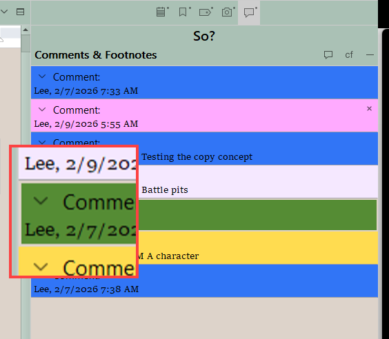
Yes, this is a filed problem that has been around since the very beginning. The main technical limitation is this is just how the framework indicates selection, so changing it would require overriding how selected “buttons” look at a fairly deep level—and in a way that wouldn’t impact everything. It does this because inactive selections are supposed to be very subtle, so as to not create a lot of visual overload on the screen, and to better indicate where the keyboard focus currently is.
Given that the core behaviour is based on when the view is active, it does use a much more visible selection if you move the focus over there. The keyboard shortcut to Navigate ▸ Inspect ▸ Comments and Footnotes will do that for you in a passive way (use it a second time, if the first use is needed to open the tab).
1 Like
I do see that better using the menu command. even if you could make the box several pixels thicker that would help to make the selection clearer. I do not know if that would require less manipulation.