Advice on how to setup format & compile for [markers in right margin for ePub]

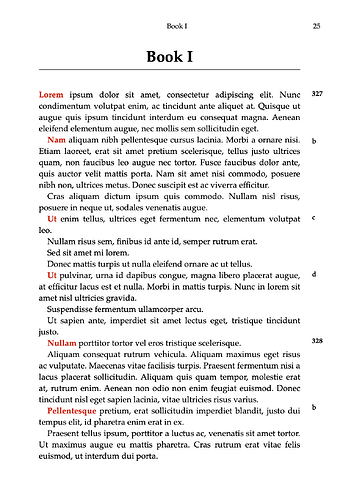
Hi - I am looking to achieve a very specific formatted output (to ePub/printed book etc.) The output format needs to have a layout which has text printed (output) in the outer margin, please see attached image for visual representation.

What this is is line numbers to the text — typically used in translations of Ancient Greek texts by Plato, Aristotle etc. — called (in the case of Plato/Aristotle) ‘Stephanus numbers’. The (Stephanus) numbers refer to a specific line in the text and thus must always appear with that line — for example the first word of the line (coloured red to show the relevant line for example here, it will not be printed red in the final output). So depending on the format of the output (printed book, ePub etc.) the number must ‘stay’ with the line.

To achieve this (I gather) two things have to be done:

  1. The text (number) ‘inserted’ somehow into the text, I am not sure what tool to use to do that — Inline Annotation?
  2. The text then needs to be printed (in a column??) in the outer margin space.

Also, separately, I want to have the usual format found in a printed book with paragraphs (other than the first paragraph of a section/chapter) indented.

There are, as we know, many options in Scrivener so I am not really sure how to achieve this — of course I am also hoping that it is possible.

Thanks in advance for any guidance/tips on how to do this.

In the precise form you are imagining, this is much harder to achieve than you imagine – in any software. I don’t use epub, but is it even possible to achieve in epub? – there you have no control over where the line wraps.

Is it essential that the numbers appear on the right? That’s a world of typographer’s pain right there.

If the numbers can be placed in the left margin, your task may be much simpler, because now you can get what you want with a simple hanging paragraph!

-gr

(I have conned marginalia – taking some marked-off inline text and throwing it to the margin – for web pages and in LaTeX, but neither of these quite help you. The need to make it work for epub seems like a real challenge.)

Digital books that require fixed formatting are published in the PDF format.
Ereaders can display them.

It seems what I suspected/feared. I have seen — for example with a well known version of the Republic — the standard ebook formats (Kindle) have Stephanus numbers ‘inline’ in the text while PDF formatted versions of the book have a layout which, essentially, matches the printed book. Having precise (i.e. looking like the printed page) layout is a nice-to-have but I would really like to have it in an ebook format with the benefits of that.

So I guess it’s a hill too hard to climb — that is if I am wanting to create an ePub version. It seems it might simply be the best to ‘embed’ the numbers inline in the text.

If I was to go down that path what element would you recommend? Straight text, an Inline Annotation or something else? I would sort of think of using something like an Inline Annotation to keep the numbers ‘special’. It would then be possible to apply special formatting to the text? For example include curly braces around the text, make the text bold etc.

The main issue you will probably run into is compatiblity. Considering that ePub files are basically self-contained websites, and we know what websites can do (look around this thread, at how elements are in the margins, aligned to the right of each comment, etc.), it might seem like the sky is the limit—but everything a website can do isn’t supported by all of the mainstream ebook readers.

Putting a note in the margin is trivial with HTML+CSS, you just need a span around some marker text at the front of the paragraph (which Scrivener can do for you with styles), and then some CSS to position the span ‘absolute’ and pinned to the right of the display. Then you would offset the right margin of everything else, giving space for this area, and the rest would be finesse—padding and alignment tweaks to make it look nice.

But Kindle doesn’t like absolute positioning, which gives you the ability to say this thing here should be 237px down from the top and 18px from the left, no matter what, even if it is on top of other things. So while that approach would work fine for Kobo, Sony and other Adobe Digital Editions-based ebook readers, it wouldn’t work for a big chunk of readers.

The second-best method is to use a float, which is in principle the same tool we would use to make a drop cap, on the left side of the paragraph. Floats become objects that pushing other objects around, make space for them and wrap around them. So, if we make a margin on the right, then that effect of being inside the paragraph and having the text wrap around it does not happen, and the right-float marker sits aligned to the paragraph’s top, on its right.

If I was to go down that path what element would you recommend? Straight text, an Inline Annotation or something else?

So for this part, as I mentioned briefly above, styles are what you want to use, 100%. They give you this flexibility:

  • Nuke the marked text (for formats where this isn’t wanted or cannot be conveyed properly).
  • Put custom syntax around it, like the HTML we would need to do something special with it in CSS: <span class="refmark">378</span>. You type in “378”, mark it with the style, and then set up your compiler Format setting to insert the static raw syntax around it—making sure to tick the checkbox to treat this as raw markup, in the Styles pane.
  • Handle it correctly in post, with proper desktop publishing software. While you might not get it to look right in Scrivener’s PDF, styles make it so templates you prepare can format things correctly once the compiled output is imported into them.

There is more that styles can do, but those are probably the key points for what you’re looking to do.

If you need some primers on how to do this in Scrivener, here are some threads on how to go beyond what the checkboxes and switches in the compiler GUI can do—some of these topics are in fact very close to what you want:

If you are still learning CSS and aren’t sure how to pull off the float:right look, I can help you work something up, but you might be able to cobble something together from the examples already given in those threads. The first link, by the way, goes to a primer on how and where to paste CSS you find on the web into your book’s compile settings.
2 Likes

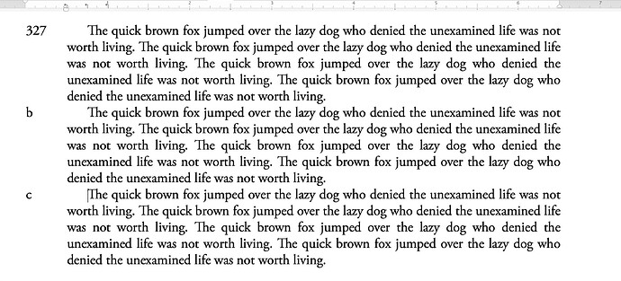
FWIW, example of numbers on the left. Simple hanging paragraph and a couple of tab stops.

2 Likes

If you do decide to go with the left side hanging indent approach, here is a guide for doing that.

1 Like

This is going up on my refrigerator asap.

6 Likes

Hi, update. Been looking through this, firstly though a big thank you to everyone who responded with tips :waving_hand:

I — ideally — wanted to have the numbers in the outer margins of the Verso/Recto pages, so not in the gutter. So having the numbers in the left margin would not be the optimum for Recto pages.

As I am aiming for an eBook format (specifically a Kindle book) where page size can be, and usually is, a premium I opted for inline text. I’m using Inline Annotations and have added a space to the right-hand “]” marker to separate it from the text rather than put the space in the text as, obviously, that can cause issues with text flow. Having the Stephanus numbers inline is not that obtrusive.

I did a test compile to an .epub and then send to Kindle, it looks fine!