I see the fonts mentioned in the article in my Office Apps, but not in Scrivener.
Do they need to be manually added?
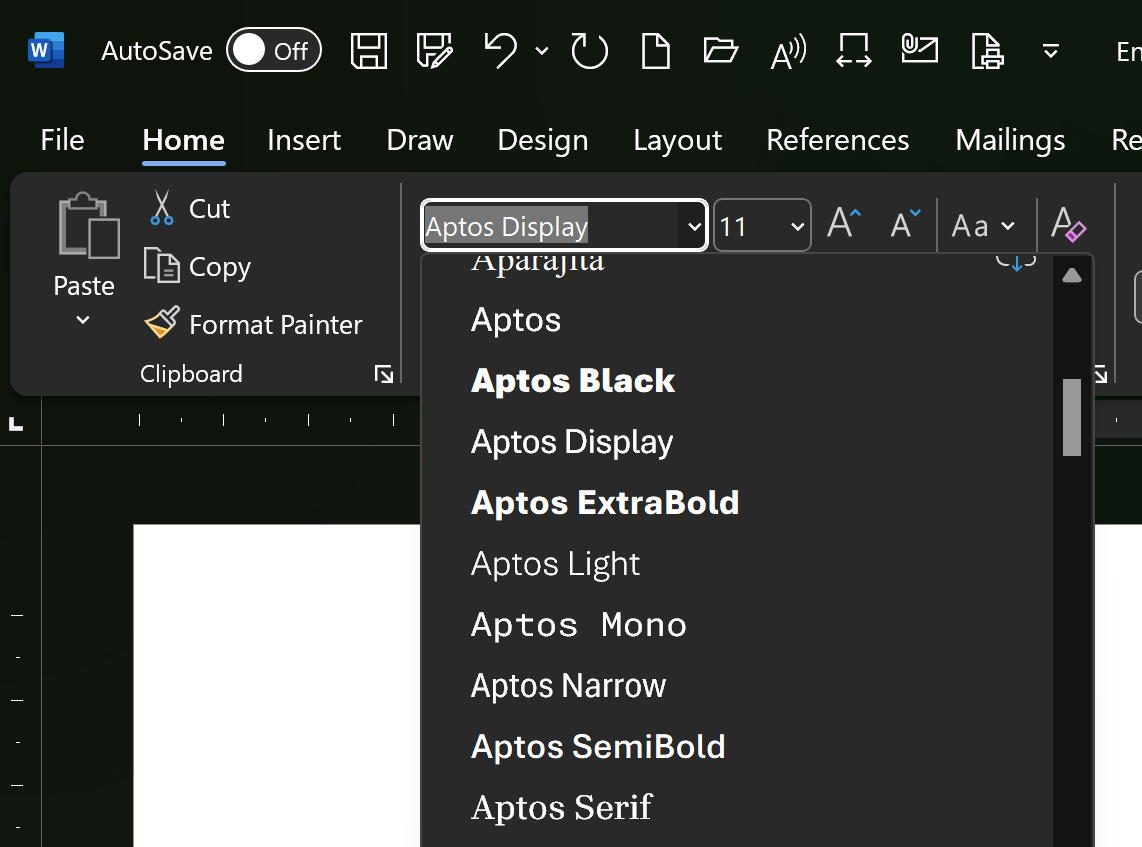
Personally, I dislike the winner, Aptos. An h looks too close to an n and the spacing is wider than with the Calibri font, for the runners-up too.
Are you actually seeing this font in Windows Font Settings?
On my PC it was showing with its old name (Bierstadt) as a cloud font in Word. I was able to download it locally–the cloud symbol is now gone in Word–but still the font does not show up in Windows Font Settings. If it’s not in Font Settings, then Scrivener can’t use it.
I suspect that this font is only for use by Office apps. Hopefully someone who actually knows will clarify.
Best,
Jim
Good question.
I’ll check tomorrow.
I do have it under various Aptos names and the old Bierstadt name in Word.
I may have it because I’m on the Office beta channel.
i also have the competing finalist fonts.
And Calibri is still around too.
1 Like
This reminds me of some time after MS released Calibri. The BBC once more set out to teach people to use computers. So there was an episode on writing your documents in Word, in which the presenter knowledgeably said, “I like to make my documents individual, so I choose the font ‘Calibri’!!!” Actually, I think the BBC binned the programme soon after that.
![]()
![]()
Mark
3 Likes