I’m not sure if it’s my imagination but font rendering seem to have improved with Beta 20. Previous, I noticed that proportional fonts - regardless of which is selected - were somewhat messy in the spacing with letters being too close at times. With Beta 20, the rendering is now comparable with the rest of Windows 10.
PLEASE STAND BY AS I AM GOING CHECK THIS (because big if true)
EDIT: I cannot tell a difference lol. I use Calibri for composition and I switch to Garamond for review/editing, so not sure if either of those would be rendered differently if something were improved.
P.S. - It’s a pretty cool trick if you didn’t already know… changing the font from what you’re used to forces your brain to slow down and read the words instead of just looking over them. I have caught the most incredible mistakes this way. At one point I was like, no way, changing the font must be changing some of my words and punctuation! Okay, I’m done ranting, where’s the coffee?
Upon examination, it doesn’t appear that the improvement is there. Below is a sample of 11pt text from Scrivener
And below is the same text rendered in Microsoft Word:-
You can see how the letters are more compacted in Scrivener which is not as pleasing as the rendering in Word. This is most evident in the word “textile”.
How very peculiar. I don’t use MS Word much so I never noticed the difference before. I’ve just gone through and tested it myself to see that Calibri does indeed appear like you’ve shown - the ti touch in Scrivener, while they’re separated in MS Word. I normally use Candara and don’t notice much of a difference between them.
There’s something else though - it seems that generally MS Word adds more sub-font rendering (if that’s the right term) to their letters, leaving them thicker but also blurrier around the edges. This could be because of my choices of background vs font colors being different per program, though, which could also explain why I far prefer the way Scrivener does it (for Candara, I mean - I can see why it’s not quite right for Calibri).
Hmm. I don’t seem to be seeing what you are.
Although what is seen depends a lot on what font size and also screen magnification are set to, as both of these fiddle with pixel alignment. You said 11 pt, but your text is much bigger than that. I used 13pt with 125% magnification, which gets a laptop screen near to paper size fonts, and pretty much matches your size.
What I do see is that Scrivener 20 appears not to be engaging Cleartype - this is an issue we’ve been through before. It has to do with how Qt, the underlying text editor framework, is set up or compiled, and this doesn’t look right on Beta 20.
Here’s Scrivener 20, substituting a font I didn’t have and adding two more common serifs:

Then here’s Word, with Cleartype on the laptop turned off:

And finally, Word with Cleartype of the laptop turned on:

What can we see?
- Scrivener 20 and Word without ClearType look pretty similar
- Turning on ClearType gets Word to look a lot better
- Scrivener isn’t affected by ClearType, and that’s its evident problem
ClearType is the ‘sub-font rendering’ Scribblette is talking about, as their post came while I was preparing this. It will especially help with a higher-resolution screen than I’m clipping from here, and maybe that’s something to do with why Scribblette may feel some fonts don’t work with it. Higher res means your screen will act more like an inkjet, so that the ‘blurs’ then make the font look relaxed and real.
ClearType tends to fix spacing (pixel alignment) problems also, but yours are notably more severe. The laptop here is very up-to-date on Win10, and I wonder what you may be running?
Here’s a reference for when this was a problem earlier in Scrivener: [url]https://forum.literatureandlatte.com/t/have-we-been-here-before-font-rendering-on-screen/33893/1]
I imagine Tiho can get this fixed in a next release, without too much effort, but let’s hear from him if it’s so :smiling-cat: (no emojis apparently on the forum)
A p.s. – none of these renderings look too nice; again it’s problem with less than high-end Mac screen resolution. If I’d upped the font size further and kept the screen magnification down, hinting would have made things look better, on Word, and on Scrivener once the ClearType engagement is fixed.
But again, I feel your examples show some other problem going on, perhaps on your pc?
I’m using the very latest update of Windows 10. The font looks bigger because I have a 150% magnification on my high-DPI monitor.
Even in your examples - look at the word “textile” and see how the “t” and “i” actually touches each other in Scrivener. It does not do this anywhere else. Likewise the spacing between the “x” and the “t”. It is entirely possible that this is a bug in the Qt rendering engine.

I’m seeing this problem in the samples narrsd posted above. See how the “t” is touching the “i” in the word “textile”. This only occurs in Scrivener and not Word. If it is indeed a problem in my PC, it’s also happening in his PC.
Well, again, this is a complicated area, and it’s affected very greatly by the combination of font size and screen magnification effects – and presence, or not in this case, of ClearType.
So I’m not surprised we see different things, given your settings.
The key is trying to map very fine details to much larger pixels – or indeed, shaded, tinted pixels, actually, which is how it can optically work. ClearType is what does this, so it’s critical that it be employed.
Notice how much much your spacing issues are present and then clean up, between the non-ClearType and ClearType examples just in Word.
In Scrivener, try simply raising the font size significantly. Then you’ll see Qt/Scrivener is rendering font hinting well, as the letter shapes and spacings quite clear up. 36 points is good.
No ClearType to make the interpolations is the reason for the spindly look of fonts at normal sizes in Scrivener 20, for same reasons --no mapping of shades to eye-render ‘half’ or less pixel positions or widths…
Just to be clear - the above example was from your own post. I simply highlighted the area of the problem. As you can see - ClearType makes no difference here. Look at your own example for Calibri in Scrivener and Word (with or without ClearType). [Once again, in reference to the examples you posted, not mine. To be absolutely clear - your examples exhibit the same problem.]
You mentioned that the problem should be less pronounced at 36pt but I see no difference. Below I post the example from Scrivener at 11, 36 and 64pt. See how the “ti” sticks together:-
In MS Word, the same text, same font, same size, exhibits no such sticking together regardless of ClearType being turned on or off:-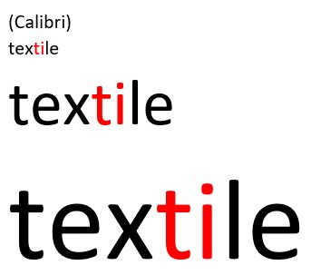
Daniel, it’s late here, so this will be my last.
- yes, there’s a touching on Scrivener 20, as you point out, between the t and i in textile (Calibri). I missed that
- if you look at Arial however, same spot and on Word, you’ll see considerable difference in the spacing between the same t and i, without and with ClearText. Considerable, on the scale of the letters. Not touching.
- overall evenness, spacing much better on Word, with ClearText functioning than when not.
- I was going to point out it’s all far from perfect, never has been right in all cases for Word – width of vertical strokes, l, t, etc… Ancient Microsoft half-heartedness.
Further than this, I don’t think it’s at all helpful to have some kind of further discussion with you about details.
it’s wrong, needs to get fixed.
ClearText working again will assuredly re-improve Scrivener. You can then see if it all meets your stringent standards.
I can assure you it will never look like an InDesign printed page…
These are called ligatures, and are a typographic feature considered desirable in printing (and probably worthwhile on high-resolution displays in most cases).
 [size=80]Some common ligatures, one of the user manual fonts and Calibri, set with the LaTeX engine[/size]
I can see how it might be a matter of preference, as to my eye the example produced from Word looks subpar; certainly nothing to strive for. :mrgreen: That’s not to say Scrivener’s engine doesn’t have room for improvement (though I don’t know how much of that is something we have control over, one typically doesn’t meddle in font layout unless you are making a word processor or design package).
Thanks for giving a word for the issue - “ligature”. It would be nice if this could be made an option. Not urgent - it was just something bugging me. The issue that got me down this rabbit hole was the perceived irregular spacing between letters in a word. The ligatures contribute to the impression of some letters sticking to one another (eg. “tio”) while others seem to have slightly larger spacing (eg. “na” in Arial 11pt) This is hopefully solved with ClearType. The magnification used also seems to have some impact on the severity of this problem.
Note how close “tio” appears compared to “na” at the end. ![]()
In any case, thanks for the attention to this issue. It’s a very useful program even in this unfinished form. Can’t wait to purchase the 3.0 version.
Very good, Ioa!
Late, I forgot that aspect, but of course you’re spot on. And as surely, Scrivener will look best to have them, once ClearType is back to take care of the optical spacing.
I logged back in also to remark that Calibri is a Microsoft font, so may well not play right by standard hinting rules either.
And then there’s brilliant Donald Knuth, who wrote the book on all this, thinking it would take him six months, which turned into ten years actually.
Not simple, not suited to any naïve exactness.
Scrivener’s need is just to get things adequately smooth to look at while writing, and that’s what ClearType has long been for.
Cheers - fixed I hope from phone…
Now where ligatures drive me nuts is with fixed width fonts. For some reason, some do have ligature glyphs, and if the engine has them turned on by default and no way to turn them off—argh! Fingernails on a chalkboard. I don’t mind ligatures at all with serif fonts, and I’m ambivalent with sans (not a big fan of the genre).
I’m completely with you on the kerning issues in the engine—though for some reason your screenshots of what Scrivener looks like are considerably worse than what I see. I’m not sure what the deal is there, maybe Windows versions? I’m on the latest 10. Maybe it is magnification—I use 90% normally on Windows, but I don’t really see any difference between magnification levels, myself (other than hinting adjustments, naturally, but hinting has to do with the shape of the glyph within its box, not the optimisation of a sequence of shapes in separate boxes).
But like I say, these are not easy problems to solve if you’re making a writing program on top of a text engine, instead of making a text engine (i.e. you spend your time on features like corkboards and outliners, instead of spending a year on x-height optimisation). Stuff like high-quality (or even mid-quality) font rendering and the overall typography of aesthetically pleasing sequences of glyphs is a pretty deep topic…
Exactly. ![]() And the type of quality you see in my screenshot above comes at the cost of rendering. All real-time text engines will suffer a drop in quality so that when you type in letters they appear as you type, rather than seconds later.
And the type of quality you see in my screenshot above comes at the cost of rendering. All real-time text engines will suffer a drop in quality so that when you type in letters they appear as you type, rather than seconds later.
So yes, it is all about compromises in text editors, and hopefully we can at least find the right settings (which is probably a bit of a metaphor) in Qt to get it on par with what folks consider baseline font handling.
Meanwhile, maybe acquire an affinity for monospaced fonts in writing contexts. ![]() Most of the problems are in the complexities of proportional font spacing. A solid monospace font that you like can look good with far less complexity in the layout code (and yes, I’m aware, some would say it all looks “as good” because all monospace looks like trash
Most of the problems are in the complexities of proportional font spacing. A solid monospace font that you like can look good with far less complexity in the layout code (and yes, I’m aware, some would say it all looks “as good” because all monospace looks like trash ![]() ).
).
The original example in post 3 by Daniel shows other problems, which are potentially better explained by another typographical term: kerning — where the relative space between individual letter pairs are optimised for legibility. This normally depends on Opentype kern tables embedded in the fonts themselves (many old TTF fonts don’t contain kerning tables), but also require software support. The classic test is to look at this character pair: VA — if kerning is disabled then there is no overlap in the head of the V and foot of the A. On macOS at least kerning is on by default everywhere (certainly works fine in Scrivener), but I don’t know how kerning is handled or how it interacts with font smoothing in Windows?
I also use 90% magnification - seems more natural on my high-DPI screen. I noticed that the issue is more pronounced with certain fonts. In the case of the example above, I was using Arial which is fairly common (which also replaces Helvetica when using documents created on a Mac).
Ioa, a couple of things here. Yes, magnification I believe can get into this, depending on how it’s implemented, as it can alter the fineness of the pixel block each character will try to map to.
But also, I found a gem, out of half-memory about MS Word font issues: Word 2013 doesn’t use ClearType, rather its own (which does not have good appearance). This is the version on my machine, thus in the pictures, as not worth upgrading for the few times I open it.
So there’s a reason for worse or just other font appearance in my examples.
And then,
Yes, kerning is the main issue being discussed here, other than Calibri perhaps being over-supplied with ligatures, as Microsoft was trying to create a solid, thus ‘clear’ screen appearance with it. It’s not unheard of for them to get a little ham-handed, and maybe for this reason as well as the monospaced types, Scrivener could provide a ligatures/no-ligatures setting.
But ‘kerning’ on Windows isn’t simple, is highly affected by ClearType – because ClearType makes your eyes think there is sub-pixel rendering so that the characters visually have more resolution.
If you think about it, this visually more accurate rendering alters the appearance not only of character stroke widths, but of the apparent spacing between characters. Which is kerning.
Thus when ClearType is turned off, the pixels you get aren’t in the right optical place to give intended spacing.
The drawing is too crude, and becomes uneven, because it’s not following the original font kerning instructions, as the pseudo-pixels of ClearType would. Thus complaint.
You can read about this, and look at a good enough visual to see the effect as you view from various distances, here: https://en.wikipedia.org/wiki/ClearType
Action items, then:
- For sure, get ClearType back in action inside Qt for Scrivener editors, so that we get the visual benefits, nice clear appearance that doesn’t disturb writing
- Lower priority but seems easy if a general setting, provide a checkbox to use or not use the font feature of ligatures
Ioa, I’m confident you guys will indeed come up with the good ‘adjustments’, and much appreciation as you do.
Clive