Hi all,
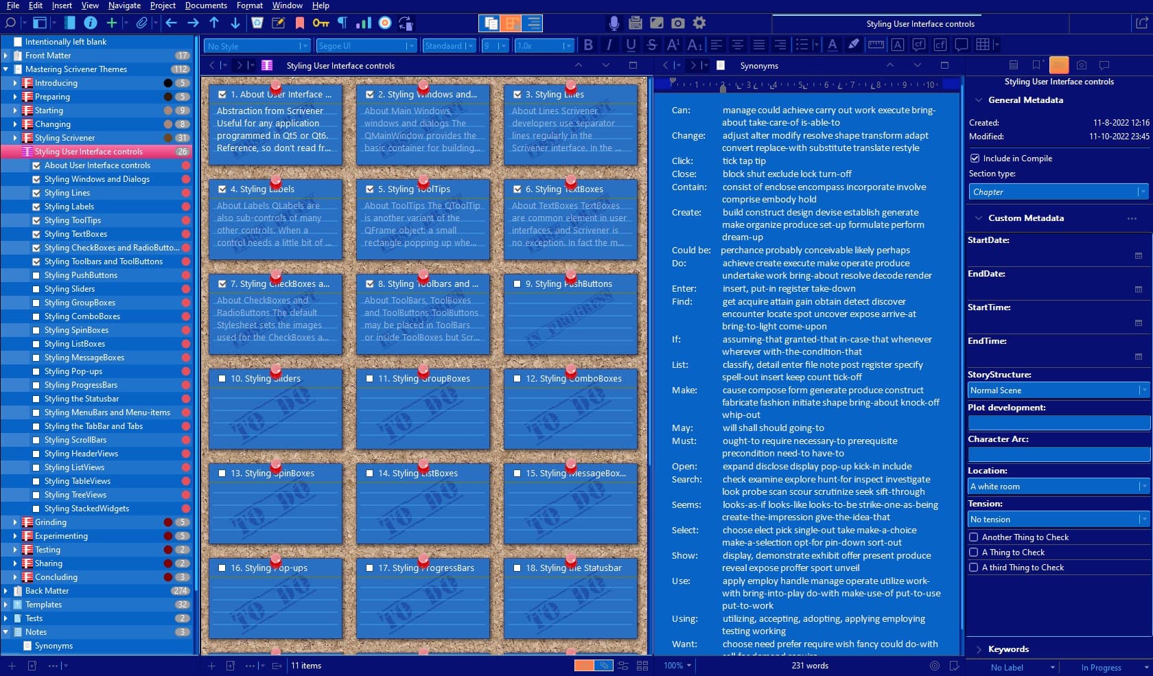
I see this issue has been addressed before, some time ago, so perhaps someone can help. In the binder section, for each primary item there is a tiny (molecular in size) triangle dropdown icon and I can barely see it. The triangle seems ridiculously small and with my dark theme, practically zero contrast. In fact I didn’t even realize the triangles were there, until one day my eyeball fell onto the screen and accidently spotted it.
Is there a way to increase the triangle size or increase the binder contrast and if you know, please if you can, explain to me as if i were 2 years old with no fingers. I have tried correcting with Bard and ChatGPT, but the solution has stumped even them.
Thank you in advance!
DD
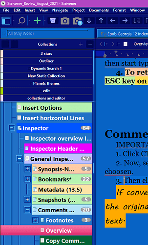
Antoni Dol who is often on this site has a theme tropical night where replaces triangle with big + or - in a box.
You do have to buy but fantastic gorgeous theme. (I have no association with him
here is a pic
1 Like
- Increase the size of Binder triangles
File > Options > Appearance > Binder > options > Binder items spacing.
- Increase the contrast of Binder triangles
Replace the triangle icons with custom icons. See the topic Increase contrast of Binder arrows for details.
Hope this Helps

Better without Collections and Binder item background Label colors. 
Just too cool Antoni! Amazing you have set up a whole theme thread, I’m reading it. Thanks so much.
This is a fantastic lead and I appreciate the quick response. Indeed Antoni goes into great detail on solving this.
I understand the adapted Theme is not the same as you use. With the custom icons supplied with the Theme and the information in the Readme.txt, you might get a long way. But there are also changes in the Theme Stylesheet to make. If you’re not familiar with creating or adapting Themes, let me know. I will do the adaptions for the Dark Theme…

