[size=200]W[/size]ell, if dropcaps in ePub files are the goal, you can in fact get Scrivener to produce the necessary code for this, since ePub is just based on the same technology used to style web pages, and we’ve provided all of the necessary hooks you would need to do advanced styling from the project side of things. Before digging into that though, it is important to know that not every e-book reader is capable of formatting text around floating boxes. You will, at a worst case scenario, get a result similar to the second screenshot you displayed, where you have one very tall character at the front of the line. It is not uncommon to see a result like that on the Kindle and in other contexts[size=80][1][/size]. Another problem you are going to run into is that e-book publishing is the very antithesis of a stable output! For dropcaps to be successfully implemented, we need absolute control over the font face, leading, and other such trivia—such as we have in print. With electronic publishing, every single device is going to use a different font, different line-heights, text rendering engines and so on. What this ultimately means in practical terms is that there will be some devices that show too much whitespace below the dropcap, because a line has been wrapped that is right on the edge of the dropcap floating box. So if these are acceptable fallbacks and pitfalls for you, then you might be interested in this technique.
There are five separate ingredients that we will need to tap into here, one of which will require the 2.5 version of Scrivener, which has the ability to inject raw HTML code into an e-book:
-
[b]Format/Formatting/Preserve Formatting[/b]: this menu command draws a blue box around whatever you have selected in the text editor. It is a special range that ordinarily tells the compiler to leave the text alone instead of overriding its formatting. However with some of the other compile formats, it has slightly different usages. One of these is with the HTML based outputs, like ePub.
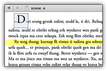
Here we have a possible look for dropcaps in the editor. Note that the formatting here is arbitrary and has no bearing on the output itself (though it could be used in conjunction with a RTF file to at least give you the start for a dropcap in a layout program). What looks a bit like an underline here are actually two hyphens on each side. I chose that as my “code” for dropcaps as it is relatively unobtrusive and unique enough to not be accidentally triggered by hyphen usage elsewhere.
-
Now open up Compile, and enable the option, Treat “Preserve Formatting” block as raw HTML in the HTML Options compile pane. This is the one you will need the beta for!
-
Replacements compile pane: while we could type in the raw HTML code for every dropcap in the book, it will be easier on the eyes (not to mention more flexible, as you could compile to another format other than ePub and have the “dropcap” removed entirely). Replacements let us look for simple things like “–D–” and turn them into more complex things like [b]<span class="dropcap">D</span>[/b], while compiling. That way the editor stays clean, and we get the technical output we need to style the first letter a bit differently from everything else.
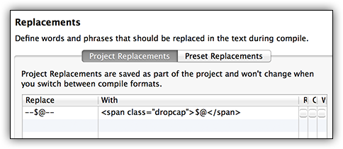
So you will want to Replace[b]--$@--[/b]With[b]<span class="dropcap">$@</span>[/b], if you go with the double-hyphen method[size=80][2][/size]. When you compile, Scrivener will insert the HTML code needed to treat this initial letter as special, in our stylesheet. We could use a less bulky way of doing this, but support for CSS3 is even less abundant than floating box support is, among e-readers, so we’ll stick with the messier but more compatible method of putting a ‘span’ around the letter.
- Finally, visit the Layout compile pane, enable “E-book contains script formatting” (ignoring the fact that it does not) and click the
[b]Customize CSS...[/b] button. The first thing you will want to do is delete what is already there. As mentioned, this is generally for publishing screenplays via e-books, so there will be things like scene settings, action, etc. Just delete that and replace it with the following example CSS code:
[b]span.dropcap { font-size: 300%; float: left; line-height: 1em; padding-right: 0.15em; }[/b]
Click the OK button, compile, and test the output in something like Adobe Digital Editions, Sigil, or Calibre. Using this code, I got reasonably nice results in Apple iBooks as well, but there was an excess of whitespace beneath the dropcap in ADE (which might impact the NOOK). If the ePub is opened in Kindle Previewer, it will be converted to a hybrid Mobi/KF8 e-book. If the e-reader (currently Paperwhite & Fire) supports the latter format, the dropcap will be displayed somehwat properly (the Paperwhite ignores the line-height setting, causing an amount of padding along the top). On older Kindles and iOS devices, which use the Mobi format still, you’ll get the tall-character rendering.
Of course, you may want to play with the look a bit as I just chose something that looks nice to me without spending too much time on it. The font-size value is a percentage multiplier off of “normal”. So 200% would be twice as big as body text. The line-height command keeps the top of the dropcap flush with the top of the paragraph, rather than having a little space above it—not every e-book reader will respect that. The 0.15em is a unit of measurement based on the font size that adds a little space to the right of the dropcap, between it and the next letter of the word. Adjust that to increase or decrease the spacing.
So what about compiling to other formats? Basically you’ll just want to change your Replacement so that [b]--$@--[/b] is replaced with [b]$@[/b], in effect deleting the hyphens (or whatever). If you style the capital as in the screenshot above, you might even have an acceptably good output for some contexts, even if you use the compiler to reformat the look of the body text, thanks to that Preserve Formatting field.
Footnotes:[size=80]
-
Amusingly, Amazon even touts this “style” on their Kindle product page, as though it were desirable, so perhaps their being neglectful of the rendering problems will result in people becoming accustomed to this look instead of a dropcap that falls into the text.
-
I realised after writing this and making all of the screenshots that most people use double-hyphens as a shortcut for inputting an em-dash. So you might need to use another symbol here. The important thing is that the stuff around the dropcap letter is around the [b]$@[/b] in the Replacements panel.
[/size]