I’m using Scrivener 2.2 (15858) on Mac OS X Lion 10.7.3 (11D50).
Compile/Formatting/Override text formatting/ does not work properly if the font is from an Open Type Font Family. For example, I use Adobe Frutiger Std (9 fonts) and Adobe Myriad Pro (10 fonts). They both have fonts such as ‘Regular’, ‘Light’, ‘Semibold’, ‘Condensed’ etc. Scrivener ‘Compile’ respects the selected font family (e.g. Myriad Pro’), the font type (e.g. italic, bold), and the font size, but not the font itself (e.g. light, condensed).
For example, I position the cursor within the body text on the ‘compile/formatting’ pane, then click the ‘A’ button, which brings up the Mac OS font selector (as with cmd-T), then select ‘Myriad Pro / Light / 12’. The preview pane shows the text using the correct font setting. However, after compiling for PDF or RTF, the font does not make it into the PDF/RTF. Instead, the PDF/RTF shows ‘Myriad Pro Regular 12’ (which is also the font that is embedded into the PDF). Same behavior for all other OT font families I tried. In addition, same behavior when I print to the native Adobe Distiller rather than using Mac preview.
The problem does not occur for single fonts, such as Optima, for example.
The only way I can use font families is to set them as the editor font (using cmd-T), and then compile ‘as-is’ or use ‘preserve formatting’. Doing so, the correct font goes into the PDF/RTF, e.g. ‘Myriad Pro Light 12’.
This isn’t really a bug, but expected - and intentionally-coded - behaviour, I’m afraid. When converting the font, Scrivener deliberately maintains the face of the original font. This is necessary, otherwise Compiling would wipe out all your italics and bold, or any other typeface formatting that has been added to the text. So it is only the font family that gets overridden.
Thanks for the reply. Even though it is not a bug, it considerably reduces the benefit of Scrivener’s key feature: having a clear separation between editor and output settings. It means that I can not use professional commercial Open Type fonts, which are always delivered as font family packages with one unique font family name, and multiple fonts having different font names and style names. In my case, for example, it is Adobe Myriad Pro with 10 fonts (regular, light condensed …) and 20 styles (bold, italic, …). Each font can be purchased separately, too.
The only way to use fonts from font families with the current Scrivener release is to set the specific font in the ‘compile/formatting’ setting and in the editor at the same time, or else use ‘compile as-is’. In that case, however, any WYSIWIG editor would do better.
I don’t think that this is a problem. The point is that Scrivener mixes font names and font style names in an unpredictable way. There is an unnecessary dependency between the style names in the editor, and style names of the replacement font in the ‘compile/formatting’ settings.
I select some font in the editor to be my ‘plain’ style, that is the font and style shown without any editor styles applied via the ‘B’ and ‘I’ buttons (italic, bold, bold-italic). In my case it is ‘Menlo’. The name of the plain style of Menlo happens to be ‘regular’. (In another font it may be called ‘normal’ or some other style name, such as ‘semi-condensed’.) I want this plain editor style to be replaced by ‘Myriad Pro Light’ in the output. This is the font I select in the ‘compile/formatting’ settings. In the Mac font dictionary, this font has font family name ‘Myriad Pro’, full font name ‘Myriad Pro Light’, and font style name ‘light’.
But by coincidence, the Myriad Pro family also has a font named ‘Myriad Pro Regular’ (with style name ‘Regular’). Scrivener ignores my font selection (Myriad Pro Light) and uses ‘Myriad Pro Regular’ instead, due to the style name ‘regular’ of the Menlo font used in the editor. But that’s a pure coincidence, many fonts don’t even provide a style named ‘regular’. Now, if I choose another editor font that, by coincidence, provides a style named ‘light’, then Scrivener actually uses the Myriad Pro Light font as desired. In particular, this happens when I use the Myriad Pro Light font itself as the plain font in the editor.
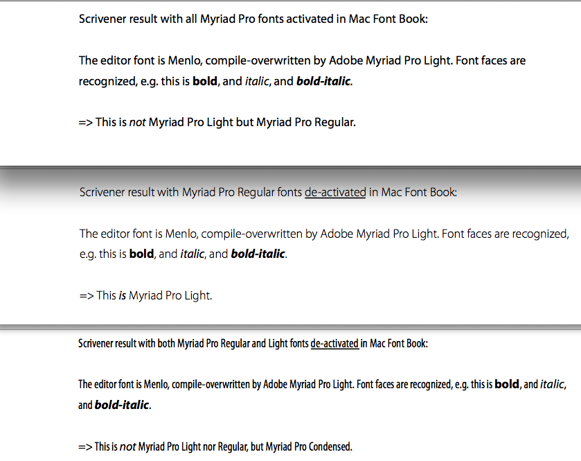
I have uploaded a screenshot to demonstrate what happens: The upper part of the screenshot shows the result when all fonts from the Myriad Pro font family are activated in Mac OS X Font Book. The font in the output is Myriad Pro Regular instead of Myriad Pro Light (which I have selected in the compile/formatting settings).
The middle part shows what happens if I de-activate the ‘Myriad Pro Regular’ font in the Mac Font Book. Here, Scrivener actually uses Myriad Pro Light as the replacement font.
The bottom part shows the result with both ‘Regular’ and ‘Light’ fonts de-activated in Font Book: Scrivener uses Myriad Pro Condensed as the replacement font.
In conclusion, Scrivener uses a manually selected replacement font from a font family only if, by coincidence, the style name of the editor font and the style name of the replacement font are the same. Otherwise, it uses some other font from this font family, chosen in a unpredictable way (probably based on some ordering in the font dictionary for this font family).
Note that in all three cases the other editor styles (italic, bold, bold-italic) are recognized, based on the font family. That is, all there cases show Myriad Pro Italic/Bold/Bold-Italic fonts.
I suggest you to re-consider this implementation because it turns output font selection with font families into a random game. Font style names in the editor should not be automatically matched with style names in the compile output font. At least not for the ‘plain’ style.
The solution would be to respect the exact font name that the user selects in the compile/formatting settings. This is the replacement font for the ‘plain’ style used in the editor, i.e. without any editor style buttons (‘B’, ‘I’) applied.
For the other styles (bold, italic, bold-italic) it will be acceptable to let Scrivener select the replacement font based only on the font family name and the editor font style name. (Note, however, that there exist fonts which do not provide any ‘bold’ style, but something different like ‘semi-bold’.) This would be the poor man’s solution.
The luxury solution would be if you let the user select the font replacement for each style (plain, italic, bold, bold-italic) separately in the ‘compile/formatting’ dialog. Using font families, it is very likely that the appropriate styles will not be named ‘italic’ and ‘bold’. For example, this would allow me to select ‘Myriad Pro Light Italic’ as the replacement font for the ‘italic’ style in the editor, ‘Myriad Pro Semibold’ for ‘bold’, and ‘Myriad Pro Semibold Italic’ for ‘bold-italic’ – rather than having to accept the automatic selection of ‘Myriad Pro Italic’, ‘Myriad Pro Bold’, and ‘Myriad Pro Bold Italic’ (as it happens now).
Making output font selection more predictable would greatly enhance Scrivener’s capability to produce high quality outputs.
By the way: I think that Scrivener for Windows does not suffer from this problem. I tried it once, using the same fonts and setup, and it actually produced Myriad Pro Light in the output.
Aside of the output font issue, Scrivener is a great application!
In this build, the entire new font is used, typeface included, but the bold or italic setting of the original will still be respected. What is possible is all down to Cocoa’s NSFont. In previous builds, the code used went something like this:
i.e. Only the family name was used (not the typeface, which is your problem).
In this new build, the code goes something like this:
fontToUse = newFont;
if ([originalFont hasItalicTrait]) [fontToUse setHasItalicTrait:YES];
if ([originalFont hasBoldTrait]) [fontToUse setHasBoldTrait:YES];
By using bold and italic “traits” rather than a specific typeface, NSFont will apply these traits to the current typeface, so where the current typeface is “Condensed” and a bold trait is applied, if there is a “Condensed Bold” or “Condensed Strong” or whatever, that a will be used.
This should do as you hope, but let me know if you run into any problems in this build.
That’s cool! Now it does exactly what I was looking for. This was the fastest feature response I’ve ever seen. Thanks a lot!
I tried it with Adobe Myriad Pro family and Linotype Frutiger LT Std family. Both have ‘light’ fonts with their own ‘light-italic’ styles, while the ‘bold’ and ‘bold-italic’ styles are separate fonts. The Frutiger family is special because it has a ‘roman’ font without an italic style (only the light-italic). In contrast, the Myriad Pro has both a ‘light-italic’ style and a separate ‘italic’ font (which looks fine when used with the Myriad Pro Regular font, but not with the Myriad Pro Light font).
The result is that it works exactly as you say: The plain editor style now uses the ‘light’ font selected in the compile settings, while the editor ‘italic’ is automatically replaced by the corresponding ‘light italic’ (rather than the ‘italic’ as before), and the ‘bold’ and ‘bold-italic’ are replaced with the corresponding separate fonts (because there are no bold and bold-italic styles for the light fonts). When using Frutiger ‘roman’ as the plain editor style, then the editor ‘italic’ style is replaced by Frutiger Light Italic because this is the only italic style in the font family. Perfect!
In addition, when clicking the ‘B’ and ‘I’ style buttons in the compile/formatting preview (not the editor) after selection of the plain font, the font selection in the cmd-T dialog automatically switches to the correct font based on the base font. For example, it switches to ‘Myriad Pro Light Italic’ when clicking ‘I’ after ‘Myriad Pro Light’ was selected (whereas it had switched to Myriad Pro Italic before).
Even better: Choosing an italic, bold, or bold-italic font as the plain font, the corresponding styles in the editor are replaced by the reverse styles in the output font. That is, when ‘light-italic’ is selected as the plain font, then an ‘italic’ (‘bold-italic’) style in the editor appears as as ‘light’ (‘bold’) font style in the output. That makes sense.
The automatic style selection now works as expected. A ‘nice-to-have’ add-on would be an ‘expert’ setting in the compile/formatting dialog to manually set a replacement font for ‘bold’ and ‘italic’ editor styles separately. In my example with Myriad Pro Light as the replacement font for the plain editor style, it would be desirable to use Myriad Pro Semibold and Semibold-Italic rather than Bold and Bold-Italic (which look much to heavy in a light font).
However, this is really only a ‘nice-to-have’. I’m completely satisfied with the current enhancement.
I’m glad it’s working a lot better now, thanks for your feedback. I think the “expert” setting is a bit out of scope for now (we already get criticised for too many Compile options!), but I certainly don’t rule it out for the future.