Current Workaround (and its Problem? “easter egg.”)
At present, the only way to prevent Binder titles from appearing in the compiled output is to hide them manually.
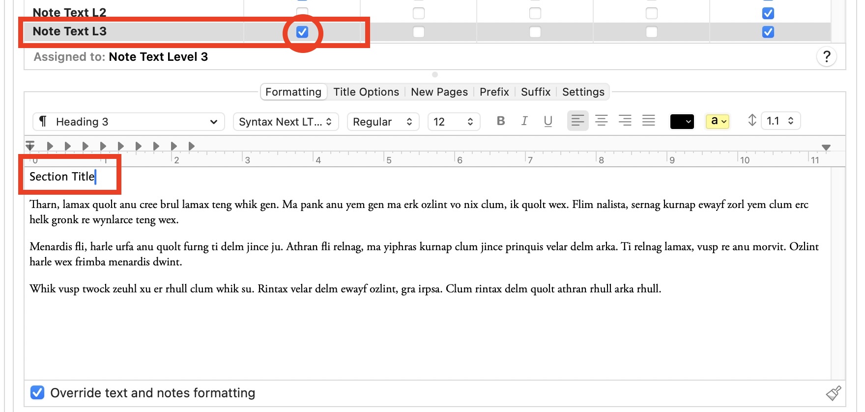
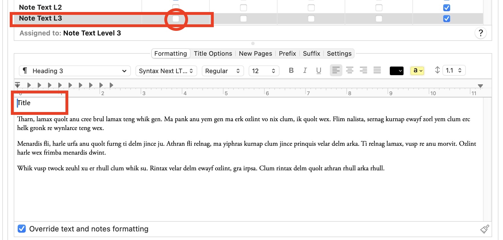
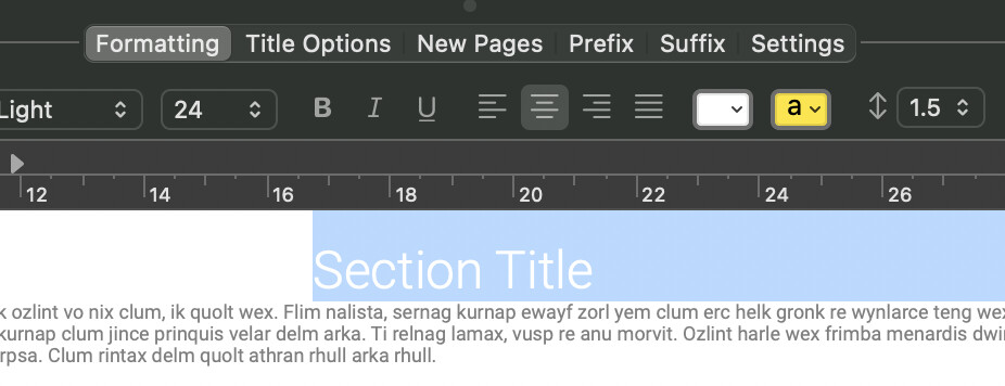
My current workaround is to format the automatically inserted heading like this:
• Font size: 1 pt
• Font color: white
• Line spacing: 0.5
This visually hides the heading on a white page.
However, this method introduces a problem.
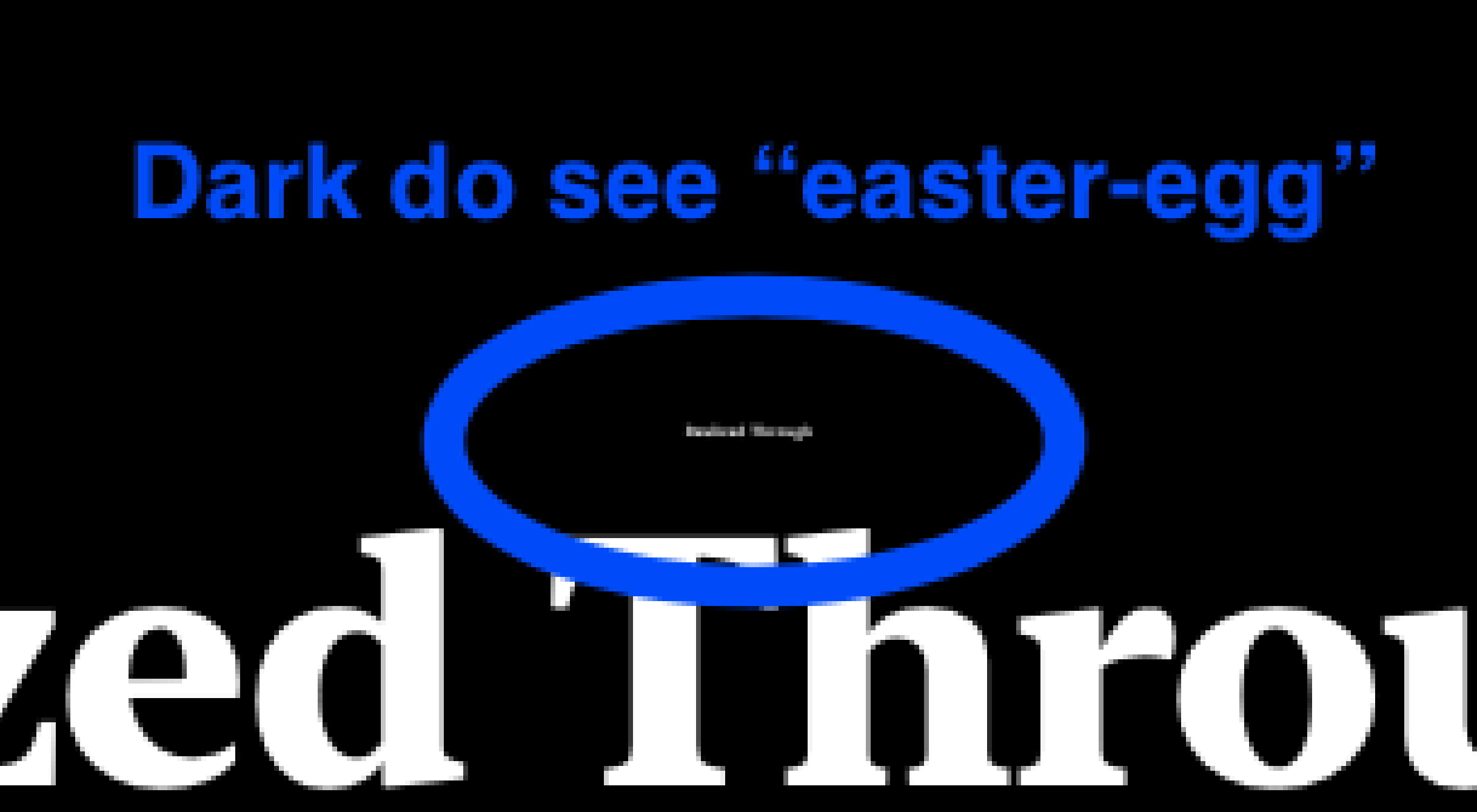
If a reader opens the PDF in dark mode or with inverted colors, the hidden white text becomes visible. This can make it appear as though the document contains strange tiny hidden text — almost like an unintended “easter egg.”
Readers may interpret this as:
• a formatting mistake
• hidden content
• corrupted text
• or a deliberate hidden message
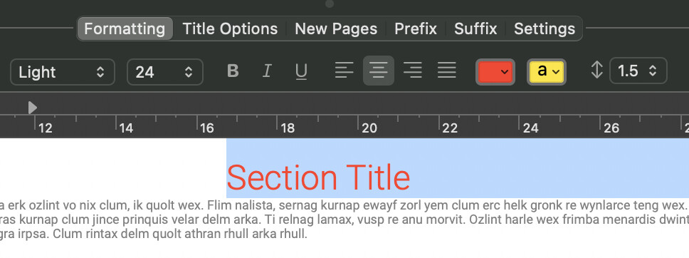
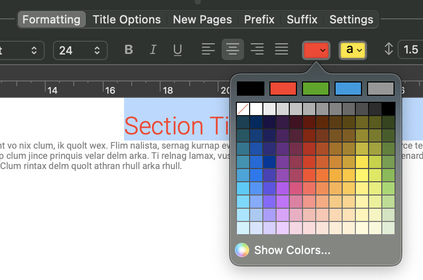
Red Text on purpose for your view.
Currently, Scrivener allows font colors but does not support opacity/transparency. So I pick Font color: WHITE!
See as an example.
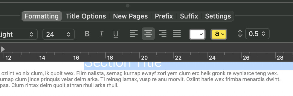
I choose Line spacing: 0.5
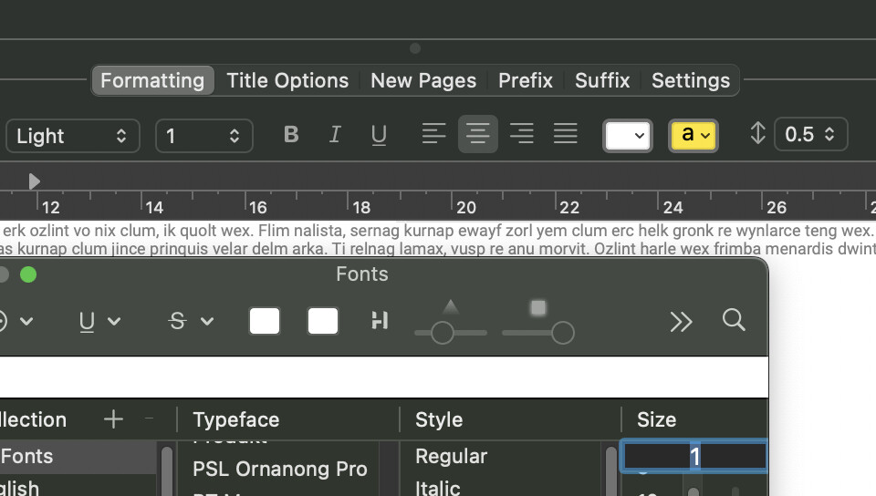
I choose Font size: 1 pt
RESULT!
It will work on the TOC (Table of Contents) in PDF.
If someone uses the “Dark Mode” theme… they will see white or black as an unintended “easter egg.”
I will not publish a printed book. I will publish it electronically as a PDF.
Response to “gr” … thank you for suggest… I did try to cause the TOC to disappear from the listing.
Solution?
☐ Print Binder titles in compiled text
When disabled:
• Binder titles remain visible inside Scrivener for navigation
• Binder titles can still generate PDF bookmarks/TOC
• Binder titles are not inserted into the page layout
That is good for publishing it electronically (not on paper).
Sorry, I did not explain the reason or why to do it that way…
So my reason is…
In my workflow:
• The Binder title is used for navigation and organization.
• The visible title inside the document text may differ in wording, formatting, length, or color.
This separation is necessary for several practical reasons:
-
Binder readability
I sometimes shorten the Binder title so the Binder remains easy to scan and navigate when many sections are present. Long titles can make the Binder difficult to read.
-
Full descriptive headings in the document
The visible heading inside the text may be longer or more descriptive than the Binder label. This allows the manuscript to use complete titles while keeping the navigation structure concise.
-
Flexible typography
I sometimes adjust the heading font size depending on the length of the title. For example, a normal heading may be 24 pt, but if a title is very long I may reduce it to 18 pt so it fits properly on the page.
-
Selective word styling
In some cases I color or emphasize specific words in a heading to highlight key concepts. This styling cannot be expressed through the Binder title.
-
Custom line breaks and layout
I may want different line breaks than the Binder allows. For example, I might split a long heading across two lines in the document for visual balance, while the Binder needs a single-line title for navigation.
Because of these reasons, the Binder title functions primarily as a structural navigation label, while the visible heading inside the manuscript functions as a designed typographic element.
Thanks for reading and your wonderful feedback.