Not sure what I am doing wrong, but I see a lot of images online of the background looking like an actual cork board and the cards looking like real index cards. It’d like to enjoy that aesthetic for when I am working in the cork board.
I am using the dark skin. When I go to appearance and tell the cork board to use the cork board background, nothing changes, it is still dark grey.
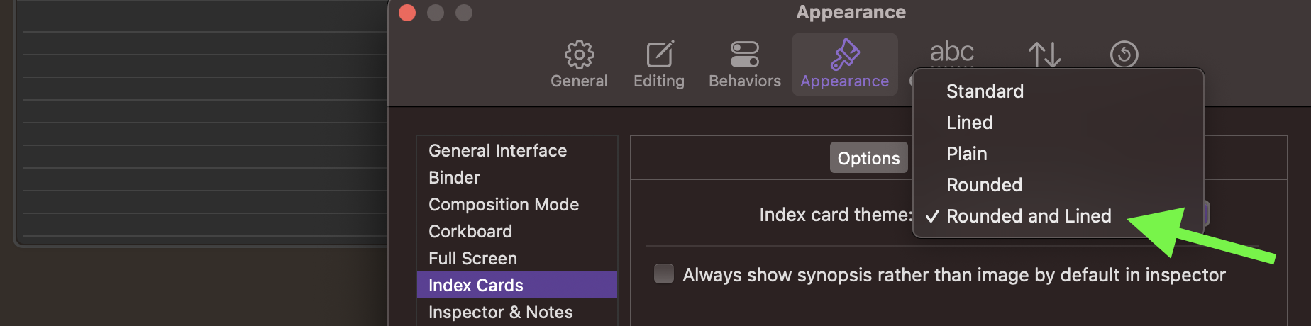
If I go to the index cards, I can change the color of the cards and the font, however, the lines do not invert when I go to a lighter colored card so they just disappear.
I love using dark mode while I am writing in all all contexts. Anyone know how I can get the cork board to look more like a coorkboard?
I did select both line selections, unfortunately it seems when I do that and make the index card color white, the lines are not shown. My guess is a different set of colors are being used for both light and dark modes. Ideally I’d like to select the color for the “red” line and the “blue” lines as part of the color selection (like I can currently select the background color)
Is Scrivener in “light mode” when you change the index card (background) color to white? I think the line color is computed based on the reasonable assumption that an index card in a (supposedly) dark theme isn’t very bright.
Add: Just tried that. Dark theme. I change the index card (background) color to white. The lines disappear (Scrivener tries to make them a little brighter). Now a light theme. I change the index card color to black. The lines disappear for the same reason.
Add2: The text color seems switch in a useful way, based on how dark or light the background is. The lines don’t.
That is good we are getting consistent behavior. Do the developers read these posts? It would be nice to be a feature request to set those colors on the card.
No need to add clutter, this thread adequately describes the problem and I’ve added a note to see if that something that can be improved. In general if a question turns into a feature request we prefer moving the thread or tagging it one way or another as that leads to fewer useful search results for future browsers.
In my opinion, if someone wants dark cards in light mode or vice versa, they shouldn’t be stuck with hard-coded assumptions in the drawing model that presumes nobody would ever want to do that. I would not expect there to be a whole raft of settings for line colours and everything, but a simple dark/light foreground swap that follows with the text colour swap would be good.
That said, I did once have a paper journal that used light grey paper and white lines. It was quirky.