Hi guys, so I’ve been trying to compile in E-book format..and it works fine, it’s just that the separators wont show up. I have this seperator: ـــــــــــــــــﮩ٨ـ and I’m using Noto-Sans Arabic to use it. It works perfectly fine in the PDF-Paperback format.. but not epub 3. Can someone help please? I tried to put it in Text Section as a custom inbetween section text seperator..but it won’t show up no matter what I do.
Hi.
Do you get one or more tofus, or nothing at all ?
[tofu: □ � ⍰ ▯▢⬚ ]
]
An ereader (Kindle, Kobo, etc ; non-android, the dedicated ones) doesn’t have all the characters, btw.
I don’t get any at all, it’s just a blank line. And I’m on IOS “Books” app…That’s where I open the Epub.
A good troubleshooting technique is to change what you are using to look at something, before spending a lot of time trying to figure out whether or not the thing you’ve made is good or not. There are thousands of ePub readers out there, and hardly any of them work exactly alike.
For example, if I copy and paste your separator into the “Ebook” settings, for the “Text Section” layout, and make no other changes about it, I get expected output of that separator in the ePub file. I use a tool called Sigil to avoid the problems of rendering engines being different, so I can look at the actual ePub markup itself:
<p dir='rtl' class="separator">ـــــــــــــــــﮩ٨ـ</p>
It even detects that some of the characters being used are from an RTL language (not that it matters in this case as the .separator class is set to be centred in the book CSS. Granted not every ebook reader might display them all (even in Scrivener’s separator text field, I do not see them all), which is why I would generally try to stay away from unusual characters, or characters that might require extended language support fonts.
For example… I would not be surprised if your your ebook reader does not have that font available, and you should expect that most of your readers won’t have it either, but even if that was a common font, it’s all academic as no ebook should be stipulating fonts as part of its formatting (unless they are being embedded). In fact Scrivener deliberately strips out font family declarations from the CSS because it is considered bad practice.
So embedding is an option, and will work in most readers. You are in luck with this particular font, as it is provided under the SIL Open Font Licence, which allows for distribution and embedding.[1] The only downside is that it will add a step post-compile to actually get the font into the ebook. You can prep the compile settings to be ready for that though, so that dragging the font into the .epub is all you need to do.
Take note of clause 2, under Permissions. You will need to credit the use of the font somewhere in the book; the copyright page is typical. ↩︎
1 Like
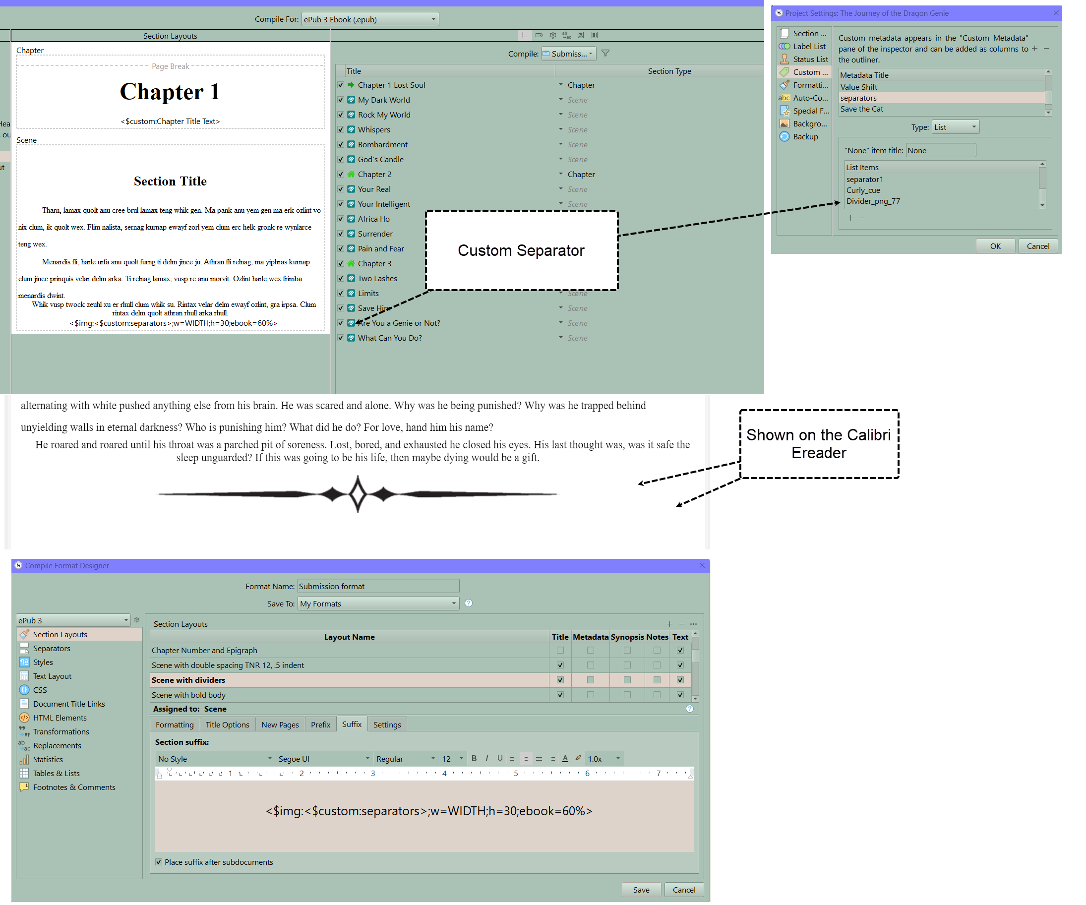
The advantage of an image is you can scale it for the epub reader and the font doesn’t matter. You could make a transparent png file of the text divider and use the image to avoid the issues Amber mentioned and have the image automatically size to the ereader screen.
I wish SVG support, and foreground colour mapping to solids, were better supported. While images get around some issues with using character-based separators, they also introduce their own issues. Your example, while it is correctly alpha masked so that the reader’s background colour setting is shown around the shape instead of a white rectangle, still suffers when the background colour itself is black or dark grey.
I think ultimately you would need a more complex CSS-based solution that uses the dark/light mode detection, and calls different images based upon that—but then you are needing support for these more advanced directives, and ebook readers that correctly identify their themes by mode rather than just changing colours in a freeform manner.
Another solution is to take a cue from what your mouse pointer looks like. If you put a white border around a black object (or vice versa), than it will be visible across all backgrounds.
And then you have accessibility concerns, such as Scrivener not having a natural place to put alt text for separator images, causing screen readers to roll right over them without pause. There are ways to fix that, but all involve more advanced techniques.
Speaking of accessibility though, it might be good to have a screen reader go over “ـــــــــــــــــﮩ٨ـ” aloud. The result I get is… well, not what I’d associate with “scene break”! 
3 Likes

Good advice
. . . . . . . .