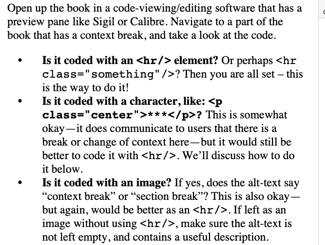
The default Ebook format itself uses the least accessible method, an empty space. I would never use this default myself (for other preferential reasons too—I think ebooks are better designed with visible scene breaks because we can’t predict when they will fall between screen flips).
Stock settings
So this is what a scene break looks like with stock settings:
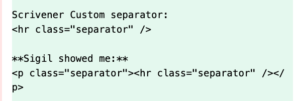
<p class="separator"><br /></p>
As noted in the guide, not the best result, a screen reader will read right over that without pause and create an ambiguous transition.
Asterisks
You can easily make your ebooks a bit better though. If you go into the Separators compile format tab, selecting “Text Section”, you can set the Between separator to “Custom”, and type in some asterisks. (You may need to edit a few different Layouts’ separator settings, it depends on how you structure things, but “Text Section” is the typical vanilla bulk content layout.)
Now you should get:
<p class="separator">* * *</p>
Still maybe not the best, but at least a screen reader will say something that would be commonly spoken aloud when the context shifts. That’s probably the easiest way all around, and is the second method on their list.
Images
For both this and the next approach, at the moment, these only work on the Mac.
The “Custom” separator field is granted a special exclusion that allows you to put raw HTML into it, without it being escaped and turned into visible text. So you can type out the full, recommended image reference:
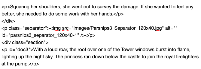
<img src="images/separator.png" alt="scene break" />
Of course what goes into ‘src’ depends on your image name, but do make sure you follow capitalisation precisely. What you don’t want to do is use Scrivener’s image placeholder, which it looks like you might be doing, as it has no way of specifying the ‘alt’ field, and without that you might as well be using an empty line, as far as accessibility goes.
As with the methods we might use to add ‘alt’ text to figures in the editor, you need to include the separator graphic in the draft somewhere. Scrivener won’t export it into the ePub’s images folder just because you type in its name somewhere.
Note that one does not actually need to use an image for the visual scene break. We could use an invisible 1x1 pixel transparent image, and then use CSS to insert text around the image, instead. In some ways this may in fact be the best way to insert text breaks, because screen readers will only read the crafted alt text, while those reading the book visually will see a theme-appropriate text sequence, which can potentially use a custom font for special glyphs, that look equally good in light and dark mode ebook readers.
Horizontal rules
Note: in my testing the page you linked to overstates the quality of this result. Not every screen reader will announce a horizontal rule verbally, and in my testing multiple ebook readers do not allow them to be styled in a completely different fashion (such as replacing them with images or text).
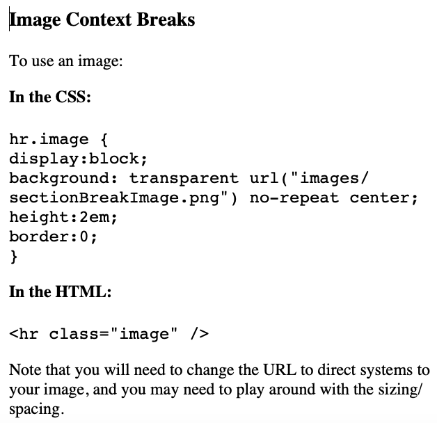
As Images
As with the image method above, we can type in the HTML directly:
<hr />
As this will be placed within a classed paragraph, we do not need anything special for it, as we can address it specifically with the following CSS selector:
p.separator hr {
    ...
}
As Asterisks
The separator field would be the same exact thing, the only difference with this method is using their example CSS for printing asterisks instead of a full horizontal rule.
For Windows
As noted, you can’t really do anything other the first two methods on Windows, becaeuse it doesn’t handle HTML in the separators field correctly. One approach is to use some text in the custom field, and then open the compiled .epub in Sigil and bulk replace all instances of that text to the proper HTML. If the ePub already has the right CSS in place, it should immediately look correct.
The alternative is using Pandoc’s ePub conversion, which Scrivener does integrate with, but that is a whole separate conversation. If anyone on Windows reads this and is curious, I can provide some links to threads on that. With Pandoc you can do all of the above easily.