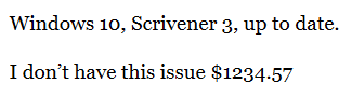
Problem - Until now, Scrivener has been faithful to my use of a dollar sign followed by an amount; it produced it all in the same size (which is what I want). But lately, it’s been misbehaving. The dollar sign becomes small, as do the numbers until the decimal sign, before resuming the normal size. It’s frustrating. Nothing in the manual, tutorial, or the forums seems to help.
Hi.
Have you tried in other apps?
I searched a little (very little and quick) and I found that sometimes it can be Windows doing that. Something about a fallback font triggered by $.
If it does the same in other apps, then you’ll know it is a Windows issue.
. . . . . .
Hmm… Perhaps I do, now that I look a bit more closely.
. . . . . . .
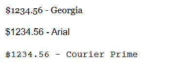
Nope. Just the font itself - Georgia
══════════════════════════════════════════
??

1 Like
Georgia for you is using ‘old-style’ numbers.
![]()
Mark
Thanks for the speedy reply. Yes, I have tried in other apps. They are fine, like $.9.85, just like here.
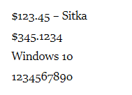
Now, in Scrivener I have always used Sitka and Times New Roman pretty exclusively. The superscripting of the dollar symbol + the first digit happens with Sitka only. I don’t understand it. When printed it looks weird, let alone while I am typing it.
The Windows settings (thanks for the sketch, btw) are fine as per.
Also, I have examples of earlier writing when this “superscrpting $ in Sitka” did not happen. This started happening only about a month ago.
Thanks.
If it is only one font doing that, then it is not the system nor Scrivener.
I would start by reinstalling the font.
If that still fails, try a look-alike alternative.
Numbers are ugly as hell, but they are not doing what you’ve described.
2 Likes
Yeah, because you’re using them wrong! ![]()
Ah, I see.
There must be some kind of grammar rule stating that 1 or 2 shouldn’t be written before 3, 4 or 5, and that 6 shouldn’t come between 5 and 7, I didn’t know about.
![]()
(I keep typing my 8’s backwards. My bad.)
1 Like
The numbers (or order of numbers) are not the problem. It’s the context. Like… wearing woodland camo in a fancy restaurant or white tie in the jungle.
2 Likes
Are you high?
![]()
. . . . . .
Seriously. Text figures (“old style” numerals) are meant to blend in with text body. By mimicking the look of letters; ascenders, descenders and that stuff. Lining figures (“modern”) in that context draw too much attention for the wrong reasons. Kind of like all capitals look like shouting and you avoid that by using small caps.
If you take the “wobbly numbers” out of the context they’re meant to be in (body text) – in isolation they look like shit.
1 Like
Well, taking into account that writing “He shot 6 of them.” in a narrative text is wrong (should be “He shot six of them.”) and that one can’t write $567.14 without raising doubts about a severe brain malfunction, I don’t get your point at all.
![]()
Your picture shows it perfectly. The numbers in this isolated example are supposed to “line up”, otherwise they do look just weird.
However. Embedded in a larger text, lining up makes them stick out (in the same way “$BGF.IA” would). Depends on the font, it’s not always completely horrible.
ADDED LATER:
Excerpt from this Wikipedia article (with some added fluff for demonstration purposes), set in EB Garamond:
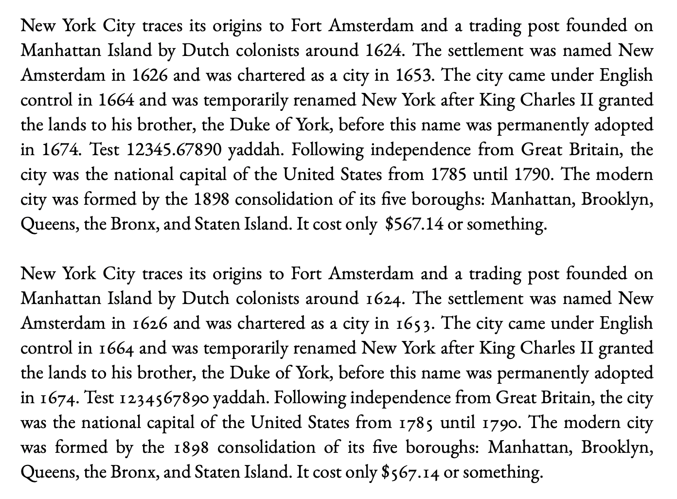
The lining numbers stick out in the first paragraph, the longer the number the worse it gets. Maybe that’s the intended effect for whatever reason[1], and that’s okay. But it looks like bad taste in prose (IMHO).
such as short, number-heavy paragraphs in an encyclopedia ↩︎