Hi there everyone.
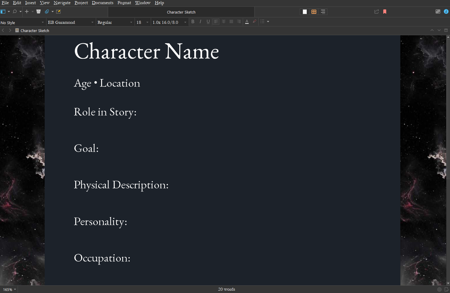
So far I’ve been thankfully enjoying my Scrivener experience. However, there’s a small thing that’s been bothering me. It’s that I have uploaded the font “EB Garamond” into my Scrivener, but it doesn’t display the font correctly (as you can see in the pictures below). For the most part, I don’t mind that, but when I try to make the text italic, it just sways in a strange way. I’ve tried un-installing and re-installing the font once again, but to no avail.
If anyone has any tips, I’d be forever grateful.
Thanks in advance
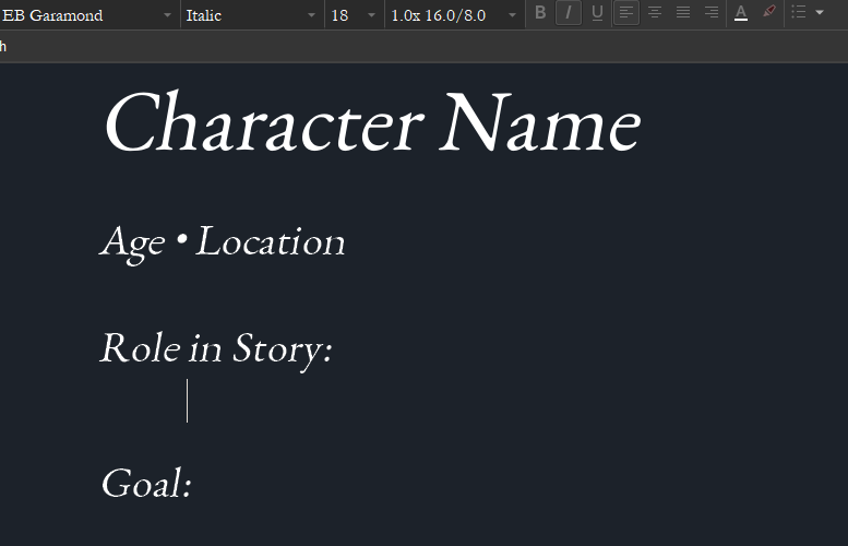
Looks like faux italics, meaning you don’t actually have the italic version installed, and software is faking it by slanting the text by 15 degrees.
So, find the EB Garamond italic font and install that to see it as it was designed.
3 Likes
Thank you for your suggestion. I installed Aptos, which is the recent Windows default font in place of Calibri, and also noted the awful italic slant.
Does this mean one needs to select the italic version of the font or would italics formatting now be ‘fixed’?
Usually a family of four files need to be installed to see the letters as designed. Do you istall the entire family or just the Regular font file?
If I click on the dropdown next to font on the format bar only Regular shows up, so I guess, not the entire family.
Font Squirrel has EB Garamond with true italics.
Download & install both the Regular and Italic files for EB Garamond 12, then close & launch Scrivener.
Best,
Jim
2 Likes
No, actually, I do have the whole EB Garamond family installed (including italics). This’s why I don’t know why it’s acting this way in my main editor.
Note EB Garamond ~ 0.014 had separate italics, and later versions the italics are united:
http://www.georgduffner.at/ebgaramond/italic.html
The latest OTF version is 0.016 and the Github repo where the font was developed:
points to bitbucket for downloads:
https://bitbucket.org/georgd/eb-garamond/downloads/
Then Google hired a new designer to take the 12 point version and make a web version:
GitHub - octaviopardo/EBGaramond12 and EB Garamond - Google Fonts
This is at V1.001 and a different set of TTF files.
At least on macOS, Scrivener handles the V0.016 OTF from the original designer fine, italics are geniune though because there is an 8pt and 12pt and a default version, it is possible Windows chokes when trying to select which italic to use. Perhaps the Google version will work better on Windows, though I prefer to use the original…
1 Like
Here are some problems with Scrivener using inline italics:
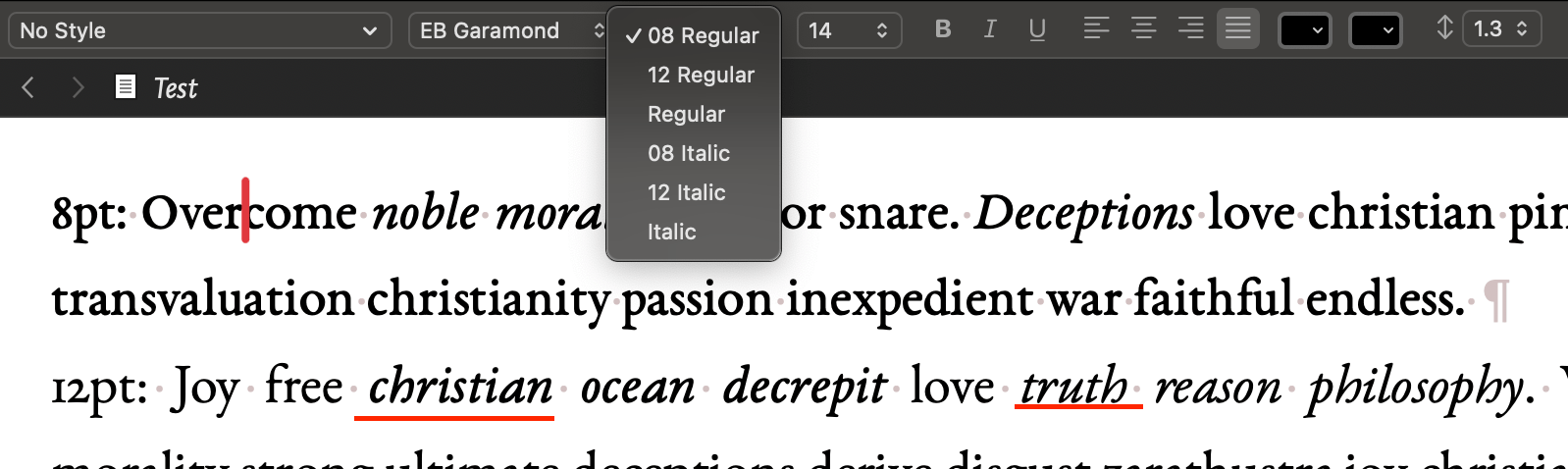
For 8pt variant the 8pt italic is correctly selected. But for the 12pt variant, toggling italic give the 8pt version (first underline, note the weight is subtly different). The second italic underlined was specifically selected to be 12pt italic and works fine. I suspect the Google version being 12pt only should not have this issue.
1 Like
I tried downloading EB Garamond italic both 8 and 12. I must admit, the 12 does look the most natural, as the image below illustrates:
Note: Yellow highlight is italic 12, and the blue one indicates italic 08. (of course, both italics are EB Garamond)
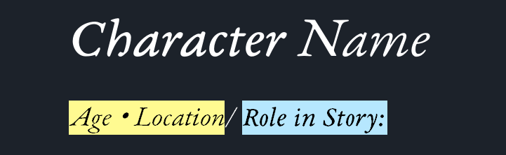
Also note how thw text highlighted in blue has more weight than the yellow one