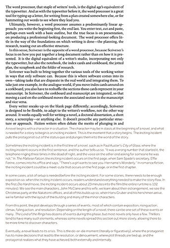
It’s not just the font (although that contributes to the problem), it’s the overall impression that someone put in some extra effort to make sure the text is harder to read.
This combination of low contrast (due to font thinness) and super long lines effortlessly catapults the reading experience from “interesting choice” but still almost solid ground far into “mocking typography” territory.
And yes, I know how to repair it with Stylus.
ADD: To illustrate this, compare the Scrivener manual (top) with the L&L blog (bottom) at a similar font size.
