Sorry to bring this up and possibly it is posted in the wrong section but I have been unable to locate a contact link for the web administrator.
Sadly the forum seems to be following the general “We’d rather use a soft trendy grey font than really care about those with less than 100% eyesight” website trend.
The problem is however hard I try, because of the strain on the eyes I just cannot be bothered to struggle to read the expansive warnings, guidance and notes.
Now the whole purpose of writing is to communicate and that includes a careful selection of the style, size and quality of font used. Whilst Effra-Light is quite delightful in short clips, such as an advertising brochure, it really is a serious no-no for me when struggling to absorb the information the Writer is attempting to get across.
What can be done to select a decent font that looks black and does the job of communication ?
Something I wish mainstream browser developers would greater emphasise is that how the Web is viewed can be modified at will. I suppose a common but inflexible take on that capability can be argued for “reader” modes—you can control everything about a page, the reader mode just uses that ability to do one very specific thing as a feature. Vivaldi goes a bit further with a bunch of accessibility options that can override the page view in real time.
Thankfully there are plug-ins that can help. While Stylus can get a bit technical if you poke under the hood, its easy mode is pretty simple. For example you click on the toolbar icon while viewing this forum, let it search for themes, and you’ll find a Bolder Sans theme I created. Install that, and now you won’t have to worry about the font choice.
It is indeed a strange irony that the forum supporting the use of a software package devoted to promote clear and concise communication through the written word fails to share the same ethos!
I hope the persons who are in a position to reconsider the choice of font, agree to make the change in the forum’s CSS file, which should take less than one minute.
If this was an easy problem to solve – e.g. everyone agreed what settings of font, color, and size constituted “readable” and “clear” – L&L would have already done it.
As our experience as users of Scrivener teaches us, we have no such consensus. People set the most amazing combinations as their editor defaults and in fact get upset when they can’t set every inch of the UI the way they want.
But for web sites?
Please be consistent. Ioa already told you how to fix the problem.
I am sorry but that is a nonsense. This is nothing to do with tuning one’s browser. Why should the User make special arrangements because a single website cannot comply with normality and insists on presenting its information in a precious manner?
I am also a web developer and very cognisant that pages must be easy to read quickly otherwise the Visitor will just leap off elsewhere. Those fortunately diminishing oh-so-clever Websites using pale grey fonts with hard-to-read pages barely get read. For that reason standard fonts are always “accepted and expected” - Arial, Times Roman, etc
If anyone wants a plug-in to use a non-standard font of their choice, that is fine but one doesn’t legislate for the minority and force the majority to make change.
Furthermore, why should I introduce a plug-in which will skew all displayed fonts on every visited website to a single style, when most variations are perfectly fine to view?
As I said before, this font is absolutely fine in small doses on some materials, but it certainly wouldn’t work for most publishing applications. In fact it is recommended for Headlines major and minor and I quote “It is not strictly a font intended for setting body copy” .
I think my point has been missed - writing is about communicating and the method of delivery is a vital component , be it printed on paper or displayed on a screen.
Hopefully a staff member down in Cornwall will pick up on this or perhaps I will contact them directly.
The plug-in I referred to does nothing except what you tell it to. If you visit a site you can click on the icon and install themes that others have created for it and registered on the site (or create your own), but if you do not install any themes for the site then it will be untouched. It’s not a simple font adjustment tool either, all it really does is apply a custom stylesheet to the page after it has loaded—with that the font could be changed, but so also can the colours, and even the entire design to some degree. As a web developer you should feel right at home with it. With my humble CSS skills I can usually fix up any site I come across that has elements of design I don’t care for.
Your point hasn’t been missed, and it’s not the first time it has been made either. We had a long thread about it back when the site update was rolled out, and it was mentioned that we would take a look at alternatives the next time we had the web developers work on it. That isn’t a promise that anything will change, but that’s the last I heard about it.
I was reading your blog on a Mac and my eyes were getting tired. I continued a short while later on a Windows laptop and my eyes started getting tired again. This rarely happens on other sites, and is clearly not machine- or screen-specific, so I took a few moments to figure out why.
Your blog’s main body text (eg the Plotting a Novel with Scrivener post) uses the Effra Light font which, as the name implies, is light. So light in fact that as writers you should probably be aware that your blog has largely lost this reader with such an unhelpful choice. The letters are light and thin with minimal contrast, making longer reading times a strain.
It may well be that your own UX research disagrees with me on this point. Your site, your choice! However I’d suggest you reconsider using such a light font for long-form content. As it stands the only way for my tired overworked eyes to be comfortable when reading your blog posts is to use the browser inspector to replace the font entirely - even boring old fallback sans-serif provides a blessed relief.
In the meantime, I don’t know what browser you are using, but if Safari have you tried “Reader” view? Menu: View → Show Reader. More readable, probably.
I haven’t surveyed other browsers to check how Reader View done there.
When in Reader view (or even regular view) you can zoom in and out to make the fonts as large or small as you want. Colors pretty much disappear with characters in black.
Refer to my post above, where I share a theme I made for Stylus that gets rid of this font everywhere it can.
I don’t myself actually use it much anymore, as I use uBlock Origin instead, which I’ve set to block cosmetic font usage across the entire Web. Not only can these be a privacy concern, I don’t generally care to see some “fancy” font when a typical one will do just fine, anyway.
Thanks for merging my post into this thread; apologies as I only did a quick check for an existing one and missed it.
I appreciate the suggestions (and will probably use reader mode).
In response to the comment about this not being an easy problem to solve, as a web and software developer myself I feel I ought to point out that it can be one of the simplest dev tasks possible - just don’t specify a font, and the platform/browser will apply its own tried and tested defaults.
That said, if you need separate web developers to work on it then I appreciate the logistics may make it trickier than the technical aspects would imply, and in which case thank you for taking the font into consideration on your next web development iteration.
I can’t speak for the person that made the comment, but I think they were referring more to the subjectivity of font selections being difficult in a “you can’t please everyone” fashion, rather than any technical aspect of doing so (because yes, the easiest way to make a site is to just let the browser pick the font from the core user-agent stylesheet).
It’s not just the font (although that contributes to the problem), it’s the overall impression that someone put in some extra effort to make sure the text is harder to read.
This combination of low contrast (due to font thinness) and super long lines effortlessly catapults the reading experience from “interesting choice” but still almost solid ground far into “mocking typography” territory.
And yes, I know how to repair it with Stylus.
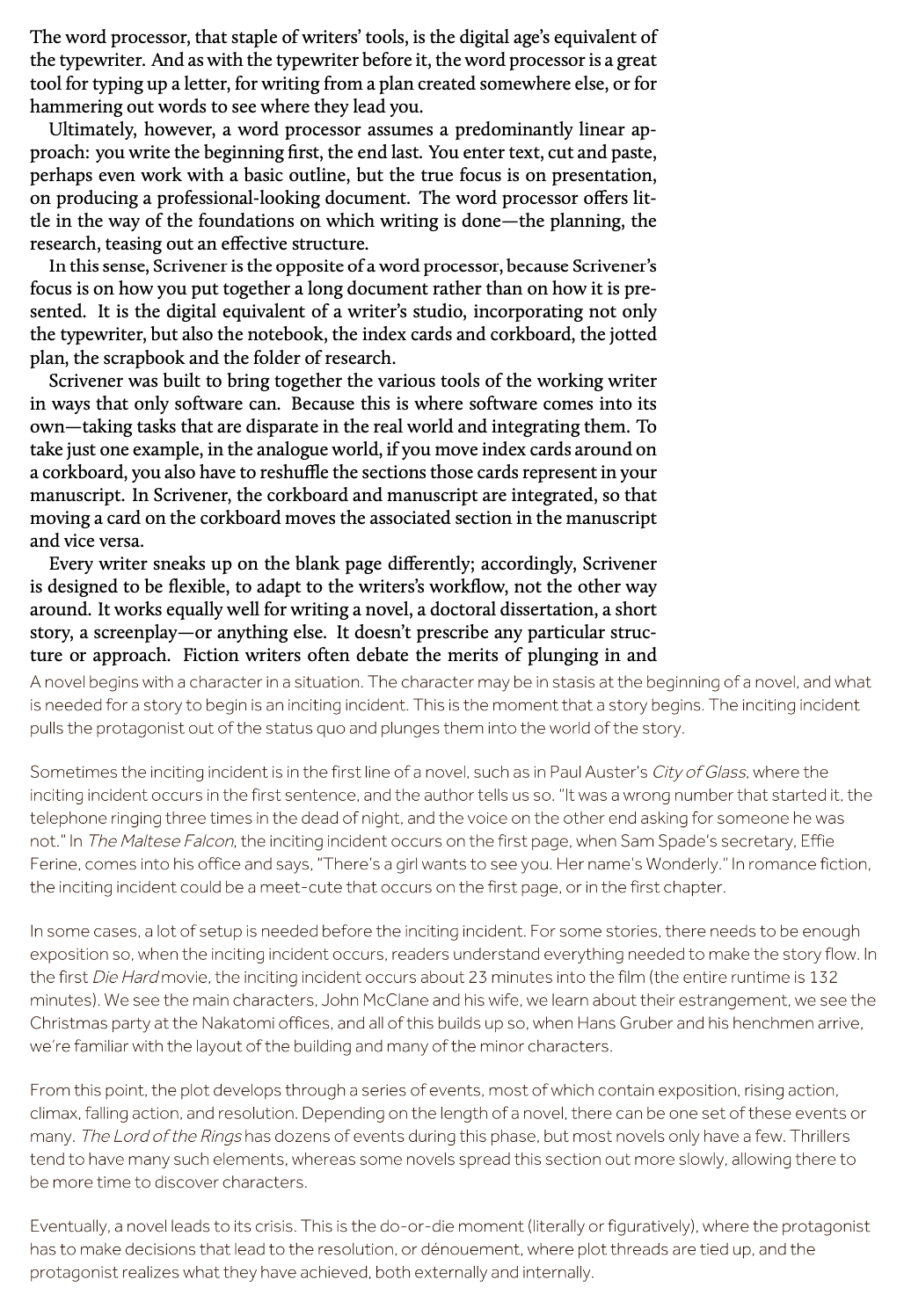
ADD: To illustrate this, compare the Scrivener manual (top) with the L&L blog (bottom) at a similar font size.
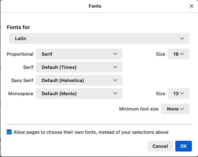
Depending on the browser in use change the default font choice to whatever you want and then turn off the option for web sites to override that. For example in Firefox Preferences > General then the Font section > Advanced and tweak this
to select your prefered fonts and making sure to turn OFF that last option. It should then give you the presentation that you want on every web site you visit not only L&L’s forums and marketing main site.
Yes, there’s workarounds. Yes, I use one. But with all respect, the very fact that there’s a thread like this – still active! – makes the point that Effra Light is a poor choice of web font. Please, L&L folks, consider changing it.
Yeah, but this thread is only 17 posts long (until this post) and had only 11 posters (until now), not all of whom were arguing in favour of change. That’s not a lot of disgruntled people to amass over a 5 year period, and likely a percentage of users that wouldn’t even register as a rounding error.
That is even worse! At best it is a childish font as it was specifically designed for applications geared to young children.
But I make the point again if anyone does not like a font used on this or every other web site then change the defaults in the browser and force the prefered font. I force fonts to be Gill Sans which, unlike Helvetica, was designed to be used in both heads and body text, it makes it easier for me to read web pages.