The lateral positioning of the extended keyboard row varies as one slides it left or right in order to attempt to access various functions. While it may be off-center to the left or to the right, it’s never centered.
As I hope you can see, several of the icons are off the sides of the screen. Thus, there is often no way to access styles or many other editing functions, save the few that are accessible via external keyboard. I get the feeling that I’m unusual in using an external keyboard with an iPhone; this problem would be even more of a drawback with an onscreen keyboard.
This isn’t something I’ve seen before, but my phone is old enough that it can’t upgrade past iOS 12. I’ll add it to the list for development to take a look at on more modern equipment. I presume it is fine in portrait mode?
It’s better in portrait mode. It works fine with an on-screen keyboard. But with an external keyboard, the extended keyboard row is so low on the screen that it interferes with the little bar that lets you switch between apps. I find that I can’t switch among the different keyboard rows; I end up switching apps instead.
Net result is that I can’t use an external keyboard with Scrivener on my iPhone at all. But I can’t even use an onscreen keyboard in landscape mode.
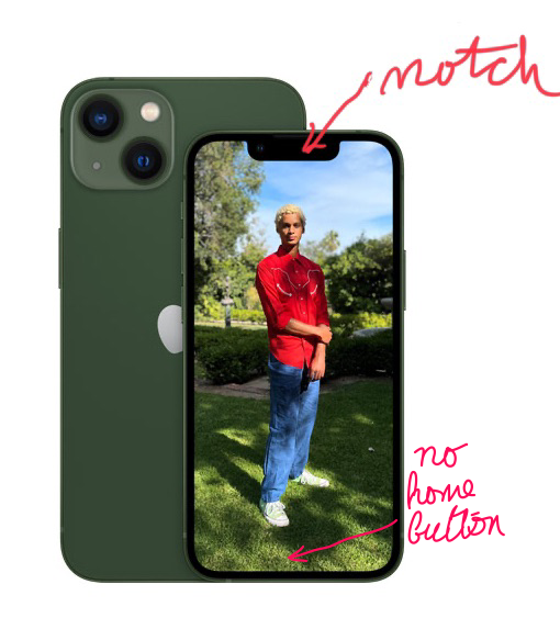
@JimRac , I suspect it has to do with iPhones which have the notch at the top and no Home button. Does your iPhone have a notch? Does it have a Home button? Because I had no problem with my iPhone 8+, no notch, had Home button. It was when I upgraded to the 12 Pro that Scrivener became unusable with an external keyboard for me.
It means I can’t hand my iPhone to Hubby because he has an iPhone SE and so has no practice with doing without the home button. And it makes UI design more complex… I have other iOS apps that use an extended keyboard row, but they’ve put extra side margins on it, I think, to avoid the landscape problems. And they don’t have “hot swappable” triple extra keyboard rows,so the portrait mode problem of switching apps rather than switching the keyboard row while using an external keyboard is not an issue.
Extra side margins in landscape mode would be easy enough to provide, (imo, but my development skills are 20 years out of date), for a “modern” iPhone screen. But I have no idea how the extra keyboard row could be switched to different icon sets in portrait mode while the external keyboard is active.
Ok, I’ve done some extra experimentation with external keyboard v. portrait mode. If I’m really, really careful I can switch icon sets on the extended keyboard row. But if I place my finger a fraction of a centimeter too low, I switch apps. If I’m a fraction of a cm too high, I’ve effectively tapped somewhere in the text. It can be done, but it’s very sensitive to vertical finger (or stylus) placement. And the corner icons are really hard to tap. (OTOH, my other iOS app that has an extended keyboard row also has corner icons that are hard to tap while an external keyboard is active. )
Hmm, we might have to do something like we did for the iPad with this last update, which fixed a problem with Apple taking over the top .5cm or so of the middle of the screen with that split view control. It was getting in the way of stat goals, scriptwriting element switching and the “reveal in binder” tap function.
But another thing we’re considering is ditching the bespoke toolbar and using what is now the OS toolkit for it. Back when Scrivener came out, you either rolled your own or didn’t have one. Not sure if that’s an iPhone thing though, or just iPad.
That other iOS app I’ve referred to has changed its extended keyboard row in recent months, and IIRC it changed on both iPad and iPhone. This might’ve had something to do with switching to the new OS toolkit. I’ve been unable to confirm this by looking at their various release notes, though.
I second this issue. iPhone 12, most recent OS, and Scrivener on landscape makes the top row of helper buttons above the key board go really crazy wide, like the center part spacing the buttons out and showing the little dots which let you know what “page” of buttons you are on is wider than needed by 20% or so.
As such, like Silverdragon posted, a good portion of the buttons are off screen. You can see them as you drag the bar over to get to the next page, they are there, just not on screen normally.
FYI I can betatest if needed, if a build needs to be tested on the actual hardware.