I am trying to find where this fine-tuned font weight option is, that one that is applied when a line in the editor is highlighted. The highlighted font weight is absolutely lovely and I would like to apply this as a global weight. I do not want to lose this, if it’s a bug. I want to be able to set this option and use it, since it makes the text so much more comfortable to read.
See video of this weight “issue”; font increases in weight as we highlight the line with:
Hi.
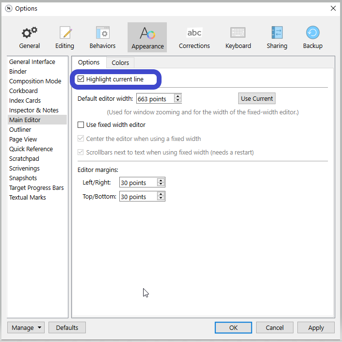
That is from the “Highlight current line” option ?
If so, I don’t think you can reproduce it, other than if a font has a semi bold font face that you happen to like.
Or perhaps if you play with Windows’ accessibility settings. Some setting for people with not so great eyesight ?
Opposite to you, I truly dislike this effect. I find it makes the text harder to read. (Perhaps because I write in french, diacritics and all.)
I am not quote sure what causes this to happen. I have not tinkered with settings, but attempted to change the theme a few times. As far as I can tell, this is default behavior. Font is: Source Sans Pro (Regular).
Perfectly understandable. I am not a fan of the effect it creates, appearing to toggle on for the highlighted/selected line. That is undesirable for me as well. I want this effect to be on at all times, for all lines. This font weight is much easier to read and cleaner.
The slight bolding of the highlighted line is unfortunately a side effect from a fix instituted at some point and not an intentional effect of the feature. How noticeable it is depends on the font, size, and probably the screen resolution. I experimented with Source Sans Pro at a 12pt font and 110% percent editor zoom and while I notice the effect, I’d say it’s more subtle than in the screenshot. However, I don’t think my font initially looks as pixelated as yours, so toward your main goal of just improving the regular font appearance, two Windows settings that might help are ClearType tuning and font smoothing.
You can bring up the former by running cttune from the Windows search. This is the one I’d try first, since you can experiment with the tuning to see what works best for your display.
Font smoothing is a setting in the Performance Options of the Control Panel; a Windows search for “performance” will probably bring it up (as “Adjust the appearance and performance of Windows” in the Control Panel). Under the Visual Effects tab, if you customise the settings, you can tick or untick “Smooth edges of screen fonts” to see if one or the other makes your text look better in Scrivener.