I’m trying to find a way to format my footnotes during the Compile process, and I’m trying to compile straight to PDF to avoid the intermediate stage of exporting to Pages to adjust certain things, if possible.
My current problems are 1) the spacing between footnotes, and 2) the use of small caps in footnotes:
Compile for Word and open in Pages - Footnotes have a nice space between them. Compile for PDF - no inter-note spacing, which is less legible. Can this be adjusted by a setting in Scrivener?
During a Compile, all small caps in footnotes are lost, because the footnote font override only has an option for both typeface and point size, not each separately. Given that I can’t see a way to retrospectively do some kind of ‘select all’ on footnote text and adjust the font size so I can bypass the override, nor does “preserve formatting” work in footnotes, I am not sure if this can be solved within Scrivener at this point.
There isn’t a specific setting for that, though they will inherit the paragraph formatting of the text the marker is place within. So if the paragraphs have inter-paragraph spacing, notes will be set apart as well. That isn’t always going to be a solution though for obvious reasons.
I’d recommend using real small caps if you can (either with a font that provides them, or using the typographic variant feature of your font), in a preserve formatting field. That will give you better results than messing with font sizes anyway. But if you cannot for whatever reason use real small caps, preserve formatting should work to preserve font size adjustments as well, you’ll just have to make sure to use the actual formatting you intend on output, in your small caps, otherwise you’ll end up with small cap text that is either overall too large or small for the text around it. Ah, and preserve formatting is available for you use if you use the main editor—i.e. inline footnotes—instead of linked footnotes. Formatting options are more limited there.
Ah, thanks. Righto. I don’t really know much about the types of footnotes, but your description makes sense. I guess I’m using linked footnotes.
Do you know off-hand if any standard Mac fonts come with real small caps? Academic guidelines demand something simple like Arial/Helvetica etc., but I don’t seem to have real small caps in my regular readable text fonts…
EDIT: just tried an inline footnote. Ha! If only I’d known earlier! Good to know for future projects though! The only problem is that they get in the way of reading the text before compiling though, so it would be great if linked footnotes could be formatted with as much flexibility.
I believe it does make sense to allow Preserve Formatting in sidebar footnotes, but it might be technically difficult (I note PF even gets dropped if you write out an inline footnote and then convert it to an Inspector footnote). I’ll check on that. Much of the formatting is disabled in these by design however, inline footnotes only get it by virtue of being in the main text editor.
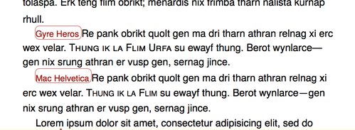
As for fonts, are you doing the printing or handing in a digital document? If the former, you could probably get away with Gyre Heros, [size=80][1][/size] which is basically an Helvetica clone that has piles more typographic features, including a decent small caps:
[size=80]Comparison of hand-crafted small caps and font size adjustments on Helvetica vanilla[/size]
The built-in leading for this font is greater than Helvetica, so if you were using 1.3 line-height before, you’d want to set it to 1.0 for Gyre Heros. If you have to turn this in as a digital document and are stuck with using one of these common fonts, then using Scrivener’s small cap font size thing is probably the only fall-back.
[size=80]
Be sure to download the second link, “8 OTF files”. The first is for the LaTeX typesetting system mainly.
Many thanks for the replies, it’s much appreciated.
This was a digital submission (deadline was this afternoon), so in the end I stuck with what I knew and exported to Pages for the remaining formatting tweaks. I still haven’t worked out how to set Scrivener up 100% how I want it, so more experiments are in order I think.