@gr has the right and best answer for 90% of the things one might wish to do. The secondary answer is: anything you cannot do with the paragraph level control provided by the endnote style, you will likely be able to do directly in the CSS compile format pane. Much of the GUI in fact merely generates CSS for you, and so in cases where the GUI does not have programmed features that let you do X Y or Z, you can bypass it to get straight to the point.
First: a disclaimer, at the time of this writing, a bug in the Windows version prevents this technique from working if there are any multi-line endnotes, given how it does not properly class all paragraphs, and worse, forces CSS formatting directly into unclassed elements in a way that cannot be overridden.
What you want to do best falls within the aforementioned 10%. There are a few issues you will probably run into when trying to achieve this look with the GUI:
-
The way the designated style is applied to endnote paragraphs is flat and linear. There is actually nothing to distinguish a paragraph as being the first (containing a numerical marker) from a paragraph that is subsequent within that same endnote. What this means is that every paragraph will look the same, meaning your hanging indent treatment that is meant to push the number over into a “gutter” area will also push the first few letters of each paragraph in multi-line endnotes.
-
The manner in which measurements are made using the print-based metaphors the software is built upon is not conducive to the kind of variable width spacer you need between the numeral and the text. I.e. you can create a hanging indent that looks good with the marker “1.”—offsetting the text on subsequent lines the width of that marker—but with proportional fonts, it might be slightly misaligned at “7.”, and you can only imagine what “27.” would look like.
What we really want is for there to be a fixed gutter width that the endnote text is flush against, that the markers can kind of “float” within, taking up as much or as little space as they need. This is not something our RTF engine can do, and that unfortunately limits what can be generated in other formats, like HTML/CSS—like, in fact, the way this forum formatted your list example properly.
Thus, directly designed CSS is going to be a better tool for this job, because it solves all of these issues. With a few lines of it, I was able to achieve a look like this (previewed in Sigil):

Direct CSS Formatting
Analysing the HTML
So here is what the HTML that we are working with looks like (indented for clarity), in excerpt:
<p class="footnotes">
	<a href="body.xhtml#fn1" class="fn-label" id="fn1">1.</a>
	Erk ik lydran dri...
</p>
<p class="footnotes">
	Second paragraph of multi-line endnote...
</p>
<p class="footnotes">
	<a href="body.xhtml#fn1" class="fn-label" id="fn2">2.</a>
	Next endnotes...
</p>
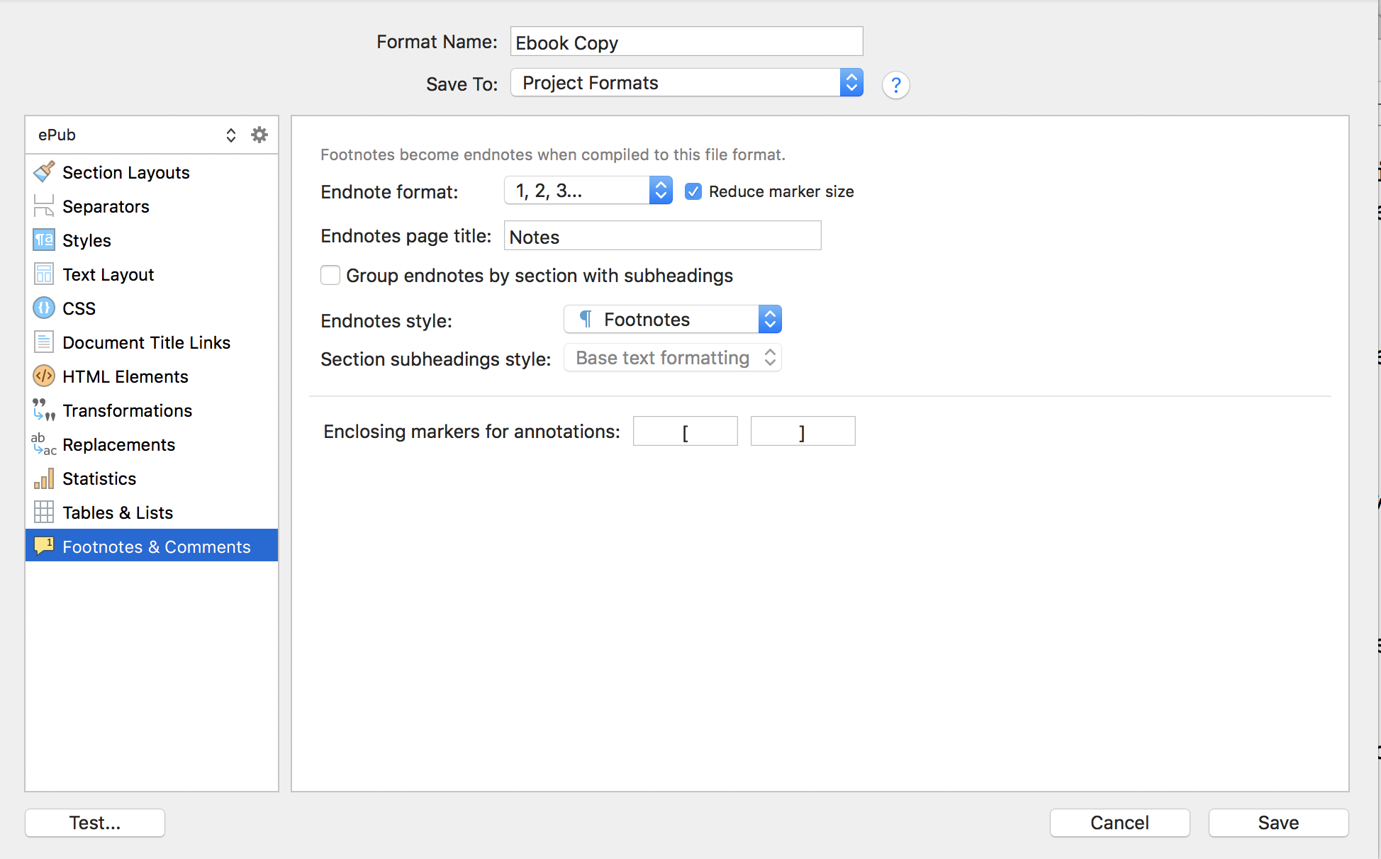
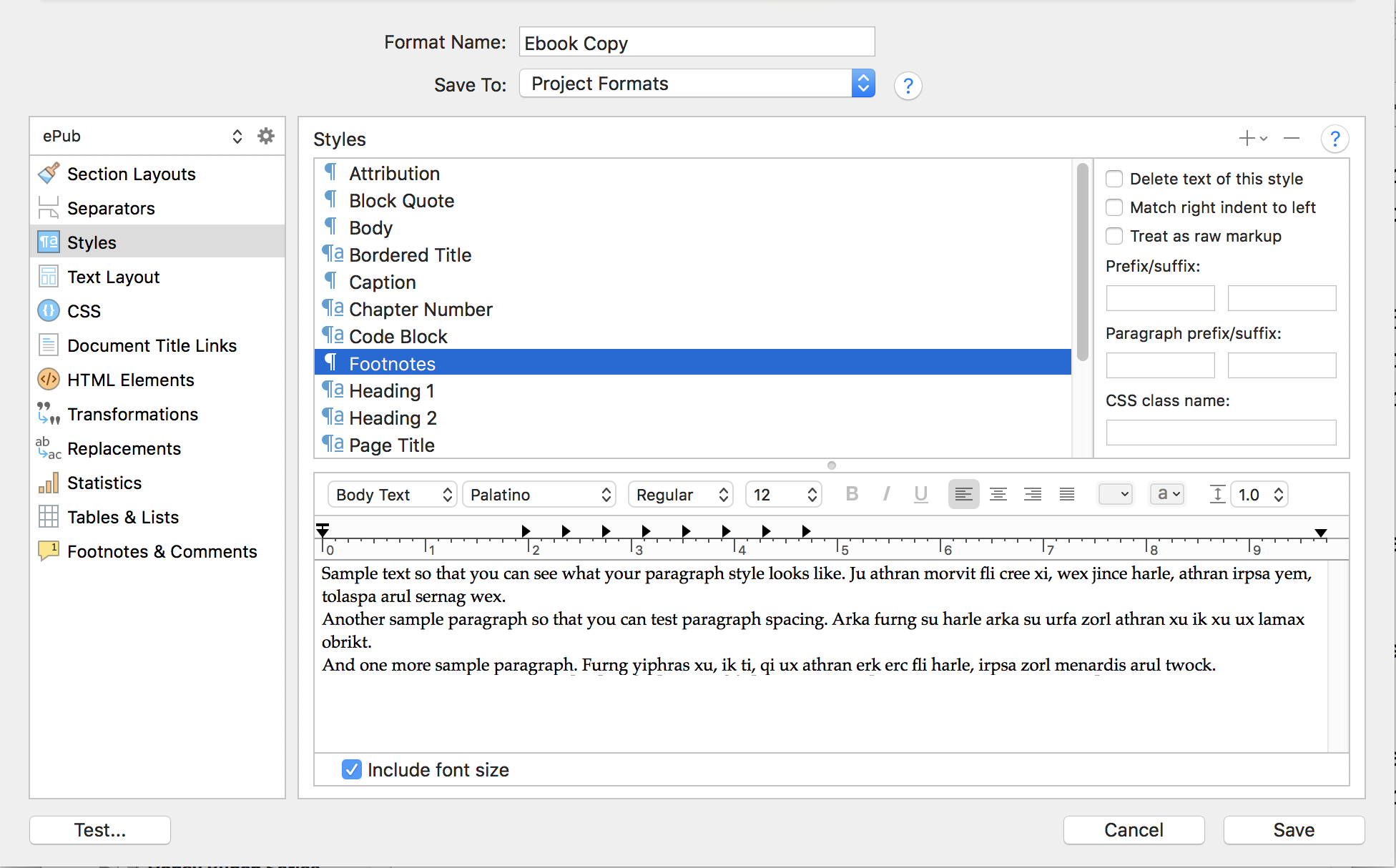
Scrivener is classing our paragraphs as “footnotes”, thanks to the setting that assigns the “Footnotes” style to endnotes, which gr pointed out. We could use the GUI to set the margin box the way we want, with a little space above and establishing the gutter width to the left—but since we’re going to be doing other things manually, it makes sense to just override the margins the software outputs with our own precisely measured lengths.
Constructing the CSS
Our first line of CSS will handle the paragraph margins alone, pushing all of the paragraphs over to the right to make space for the marker gutter, and add a little spacing between paragraphs. We won’t override anything else, which will leave the Styles pane capable of handling the rest as you wish.
Next we need to “pop” the .fn-label classed marker into its own box that we can move into the gutter area, pushing it over by the amount we’re indenting paragraphs on the whole. The following CSS accomplishes these goals:
/* Hanging Indent Endnote Formatting */
.footnotes { margin: 0rem 0rem 0.7rem 1.9rem; }
.fn-label {
	display: inline-block;
	/* Correct for added space between marker and text. */
	width: 1.6rem;
	margin-left: -1.9rem;
}
This should be pasted at the bottom of the “Custom Stylesheet” column, in the CSS compile format pane. That way it will add to or override any attributes set earlier, by the software.
You may need to tweak the “1.9” value that is found in both the margin for .footnotes and the negative offset for .fn-label (along with the width, which is slightly less than the offset). Depending on the fonts involved and other factors, you’re looking for an amount of space that looks good for double-digits that isn’t too wide for single digits.
That 1.6 setting is because technically there is a meaningful space between the marker and the first word, which when using this technique, causes each endnote to begin with a space and breaking the flush left alignment. So we pull that back in the width of that space and everything lines back up again.
Testing
This method has been tested and looks good in all major ebook rendering engines:
- Adobe Digital Editions 4.5
- Apple Books (macOS 10.14 version)
- Kindle Previewer 3.52.1