Hi,
I’m nearly sure this was discussed before between the developers and the users, but I confess to be unable to find the relevant thread.
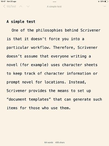
If I remember correctly, Keith didn’t want, or could, go entirely fullscreen with Scrivener for iPad. I have however to say that I, too, would really like the iPad version of Scrivener could show a cleaner UI, with UI elements made to the absolute minimum.
A compromise solution may be to move all the UI elements under a three-dot icon (…). Info, Recent, Search, Add, Share, Settings, Bookmark, are all commands that are not used while writing. They may slide to a second, semi-hidden position without compromising functionality.
When you need them, you can simply touch the ‘…’ icon, and choose one of the commands from a drop-down menu.
The name of the project, the Previous/Next icons, the name of the document could fade into a lighter shade, to be lighter than the text one is editing.
It would not be as clean as Composition mode on the desktop version, but not far, and all the elements extraneous to text would at least be partially out of the way.
Paolo
With word count shown:
With it hidden:

