I haven’t seen a cursor like this until yesterday with the Sonoma update. Again, only in Scrivener. It’s really distracting and actually makes it hard to write and edit. I’ve been on these boards for years but lost my login when I moved and could not access old email that was part of cable company. Can I be given status to post a picture of the cursor I am seeing. It’s really oversized. Not a subtle difference. It’s a log. Thanks!
1 Like
You see this in version 3.3.3?
Yes unfortunately. Running Sonoma and Scrivener 3.3.3. Have rebooted and looked at all accessibility settings.

1 Like
If you are referring to how it gets even bigger when you zoom the view in, yes, that is what happens to it. We don’t have any control over its width. You can observe the same thing happening in TextEdit.
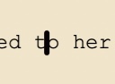
I am zoomed at 200% on large external monitor. Actual size 100% is too small to read. This is not happening in pages or Word. Here is the same text at 200% in Word. This is a usable thin cursor.

Here is the cursor in Scrivener at 100%. Still fat and in the way. Zoom is not the issue.

There are the same behaviors on laptop monitor. Zoom is not the issue. Only happening in Scrivener. And only started happening 2 days ago after Sonoma update.
Neither Pages nor Word (especially) use the Mac development toolkit everyone else uses, so we can set those aside as references. Like I say, you’d do better to look at how TextEdit handles things, though one notable difference (as above in the thread) will be cropping the cursor shorter to avoid spanning the entire height of the line.
Just for the record confirming here that my own issue with the large cursor at 200% zoom has been resolved in 3.3.3 with line spacing set to 2.0 (i.e. it is still fat, but short ![]()
Here is mine at 200% in 3.3.3 spacing set at 2.0. Is this considered resolved? Amber is correct that I do see same result in TextEdit (but not other word processors). But why? Why is Scrivener and TextEdit suddenly different with Sonoma? Apple just decided that in the new OS that the cursor should take up all the room between fonts so that it is hard to place and to read the letters themselves (look at screenshot below you literally have to assume it is an h). Makes no sense. Why that change? And why do other word processors not have this change? I am sure this is a code issue that is over my head. But thanks.

I believe I answered these questions, in relation to what has changed in this thread on a separate issue, potentially an unusual bug regarding the colour getting stuck.
I do think it is funny (in the Shakespearean sense) that Apple hasn’t “upgraded” Pages to use their new cursor yet. I hadn’t known that. You should be seeing it all over the place though. Even when logging in I see it there in the password entry field.
Hey Chris, for clarity, my issue was the lengthened insertion point which, I believed, you were exhibiting in your “avoiding” screencap above. That issue, for me, is resolved in 3.3.3.
Cheers
TextEdit is different because Apple changed the underlying toolkit.
Scrivener is different because Scrivener uses the same text kit that TextEdit does.
Pages and Word are unchanged because they both use completely different text systems. (Different from both Scrivener/TextEdit and each other.)
Why did Apple change it? You’d have to ask them.
I’ve just installed Sonoma and Scrivener 3.3.3 on my MBA.
On the insertion point, if you leave the line height at 1 (or 1.1 in my case) and set Other → Paragraph spacing - before/after to 12 pts or whatever your font size is, you get the equivalent of line height 2, but the cursor remains at the 1 height.
Just a thought.
Mark
Is this still necessary after the 3.3.3 update?
1 Like
I don’t know. I have always used 1 or 1.1 line height with spacing before or after paragraphs; I don’t think I’ve ever used 2 line height. My post was just an observation of an alternative for anyone who has a problem with the new insertion point height.
![]()
Mark
As a further observation, if you use TextEdit or any other apps based on the Apple TextKit and which haven’t had KBs input to override the norm, you could deal with the insertion point height my way.
1 Like
That’s true! I don’t see why anyone would use such a line spacing on a screen (apparently Apple didn’t test this either) – because what are you going to do with it, scribble something between the lines with a pen? – but that’s no excuse for a buggy cursor. Looking at you, Apple.
FWIW, I use double-spacing in the editor, for two reasons.
First, because that’s what I’ve always used, so tighter spacing looks cramped.
And second, because I typically print working drafts directly from the editor without bothering with the Compile command, and I need room to scribble.
This in one of those cases that never fail to amaze me. So many ways to use Scrivener to achieve the same result. E.g. I only print compiled output.
And I haven’t owned a printer for over fifteen years. Diffrn’t strokes.
I dust my printer religiously, otherwise sitting there unplugged and dejected in the corner. It gets used every once in a while, whenever my visa needs to be renewed and bureaucracy demands toner smashed into wood pulp.
1 Like
Just a data point for Scrivener: this huge insertion point is so distracting that I’ll have to stay away from Scrivener until it gets fixed one way or another. This is a bummer because I vastly prefer the app to Word. I understand this is something Apple did, not Scrivener.