I use a split editor screen: left side for the main document, right side for notes, documents, etc. The header bar for the active screen has a blue background. Try as I may, I often (always?) fail to notice this subtle indicator and I type in the wrong window. Is there a way to provide greater visual clues as to the active screen? A different background? Since both windows are actually viewing the same project perhaps this is impossible but it doesn’t hurt to ask.
Maybe in a Theme, you should be able to change to light blue color to a more striking color.
But I haven’t seen one Theme that actually was able to change the color of that bar…
[Edit:] Actually, I have. In one of my own Themes. I investigated which color in the palette or in the QSS Stylesheet that bar responds to, and it seems to be the same color the bar gets in Themes with the “Dark” Style in the XML manifest. It’s very likely that the bar color is automagically changed depending on the Text Color to make sure it stays legible. Which you don’t have control over in a Theme, other than setting the Style in the manifest to “Default” or “Dark”.
Or you change editor to vertical split and keep active window always on top
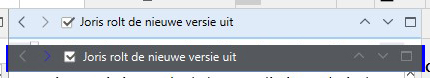
How would you do that? The active Editor is the one with the text cursor in it.
When you place it in the bottom Editor, that becomes the active Editor.
The issue with the title bar color remains the same.
I meant by convention or might be easier to open second file as QRP
While I don’t know for sure about whether the Targeted shade can be changed (and don’t forget there is also a Locked background shade) with themes, or the actual indicator for Active, which is the blue underline beneath the header, not the shade itself—you could say that to a degree the theme does have control over the contrast, since themes can control the normal background shade. I.e. everything around the stuff you can’t change.
So to back up a bit, yes, it’s a bit more complicated than you’re thinking, because this isn’t a simple “active view highlight” like in most software. It’s a four-way state indicator. The details of that are documented in the user manual PDF in §8.1.1, under subheading, The Active Editor and Targeted Editor in Split Views. The screenshot in that section needs to be updated, sorry about that, but it gets across the idea of how this works.
Here’s an example of a theme that provides a greater contrast between the normal background and the shaded one:
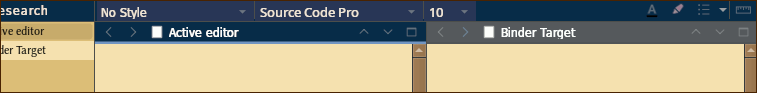
If you click to expand that, note how the active editor is the left one, with the solid blue underscore. The shaded one, on the right, indicates Navigate ▸ Binder Selection Affects ▸ Right Editor is engaged (or perhaps Other Editor, so clicks from the binder go wherever you aren’t working). If you’ve never messed with those more advanced navigation settings, you’ll only ever see the blue underline with the shaded background, and wouldn’t be blamed for thinking it’s all one thing.
Tips & notes aside: we do have a narrow bridge to walk across on this one. On the one hand, yes a strong signal is important, and honestly I think we should make ours stronger, it is very subtle compared to the Mac treatment and feels a bit “dull” (grey). But if we go too strong with it, we’ll get a lot of complaints about how the impossible to change the"garish eyesore" highlight that disrupts one’s monochromatic preferences, etc. The best solution is probably to just document or implement theme hooks, as the case may be, since honestly this is one thing we’ll never make everyone happy about.
(Witness the recent tug of war on the Mac, when Locked turned grey, and the active/target background was also changed to grey, on grey, on grey—it was impossible to know anything about the editor state since every signal was a slightly different shade of grey. So we changed it back to using colours for most of it, and instantly got a bunch of complaints about how “Grey Means Grey! I don’t want colours in my UI!”, despite it having been that way for over a decade before we briefly experimented with grey. Whew.)
1 Like
Can I change the active header bar color?
Currently it is blue.
I want to change the color into more distinct color, for example, yellow.