My current project has 343 files so far. These are roughly evenly split between the actual book and folders for various uses – bits that don’t have a spot yet, bits that I’ve separated out probably not going to be used. research files, character sketches.
I don’t work linearly.
I have to pretty much keep all folders open to find stuff. already I end up search for a word I know is only in a small number of files, find the file in the smaller list, then reveal in binder.
I need to scroll a LOT in the binder view
Is there a way I can make the MANUSCRIPT section visually different from the rest of the binder.
What could that look like:
Different sections of the binder could use different icons.
Different sections of the binder could use different background colour for the icon
Different sections of the binder could use a different base font
The first one I’m already doing. But the icons are so small.
I use Labels for something similar. See View/Use Label Colour In for their usage, which includes displaying them in the Binder.
Note that you can filter search by Label, and that searches can be saved.
(If you know regex, then you can have multiple words in Labels and filter them with non-consuming matchers. e.g. (?=.*term1)(?=.*term2) In this way you could set up Labels like, say; “manuscript protag1 location” or “research protag1”. That’s too much management for me, but it might suit your needs.)
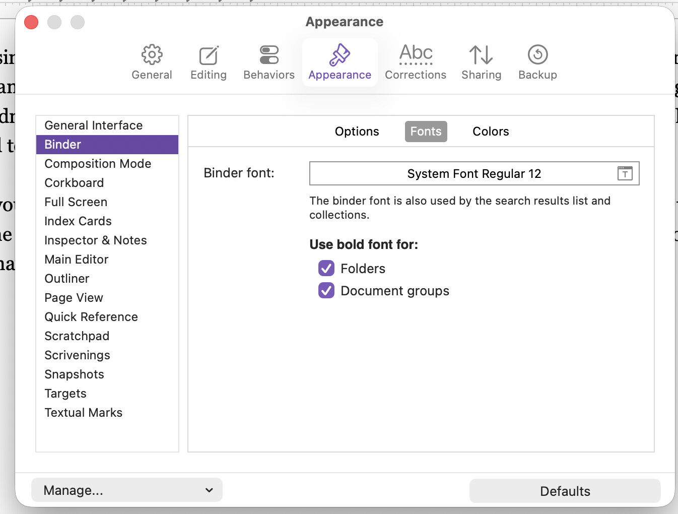
I use the option to bold binder folders and document groups. Find it at Settings → Appearance → Binder → Font. I’ve never experimented with changing the font, but you could do that here as well, though it would be a one setting rules them all sort of deal.
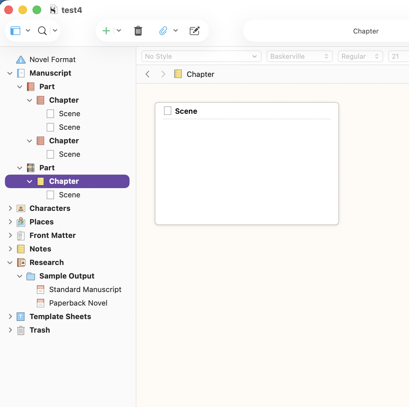
You mentioned already changing the icons, but some of the icons can have different colors that may help, especially with the above settings checked. Here is an example:
I suppose you could take it further and push all of the ‘fluff’ into the Research folder too and then click to fold it down…. That would do the most to limit the headings in the binder outside of the Manuscript top-level-folder.
A lot of the time I have one editor in the research folder, and one editor in the manuscript folder. But the number of times that I have looked for something only to find it in a collapsed folder…
I need to grovel about and see if I can drop more icons into wherever Scrivener keeps them.
You gave me one lead: I need to grovel the manual and find out about document groups.
I use bold for folders. It does help. The indents are crucial.
Another tool, that I make use of in larger projects, is to right-click on any major binder item that would serve as a keystone for visual navigation, and select “Show as Binder Separator” (around 3/4 of the way down). This will add a little accentuation to the item and make it easier to see when scrolling rapidly through a list.
But another thing I do is reserve folders only for major breaks. Folders in Scrivener are a different icon, really. They are the same things as text sections, and that is especially true if you go into the Behaviors: Folders & Files settings tab, and switch Treat all documents with subdocuments as folders on. My binder lists tend to be a sea of page icons, with the much bolder blue folder icons used at bigger breaks. And then I’ve got the divider setting for the even bigger breaks, offering a bit of a visual layering of call-outs for the eye to find.
There are other reasons I like using files to outline, almost exclusively you might say, which I go into in this post.
Really though, the biggest answers to this question probably sit outside of the binder. Scrivener has a rich toolkit for navigation and discovery, such that I very often almost completely collapse the binder (with +1k items you really have to), and make use of split views for deeper navigation, or the quick search tool to jump from one section to another directly, by name. The binder then becomes a very high level tool. The forum is filled with threads on these topics though, so it might be better to search outward from here than go over them all again (we try to tag such threads with project_navigation).
343 files is not actually a very large project, FWIW.
In my experience, Bookmarks and Search Collections are great for navigating complex projects.
I tend to use a split Editor, with one half permanently in Outline view. Among other things, that lets me look at two different parts of the Binder at once.
Seconded. Bookmarks and Search Collections are favorite ways of mine to address this. Also opening key files (that are already bookmarked) and putting into their own Quick Reference editor/window and moving to a second monitor. When I first open the Project to work, I select the key bookmarks in the Project bookmark list, hit the spacebar to open them all at once, go to Window > Merge Windows and they all combine into a tab-based single window which I move to the other monitor. Then those files are quickly available. All this takes maybe two minutes. Saved Search Collections (color coded also) help provide focused lists of key files, e.g. “References” for fairly rapid navigation as well.
Yes, the purpose of that left sidebar is to browse Project Bookmarks easily, in the main viewer. If it changed every time you clicked, to show the viewed item’s Document Bookmarks, the list would constantly change, maybe ending up empty depending on where you go.
But you can view Document Bookmarks for the viewed item, over on the right side, where it will say “Editor Only” by default.
Sorry, I’m confused. When @kewms mentioned you can show Bookmarks as a sidebar in a QR window, I went looking for it. The only way I found was the Document bookmarks on the right side where “Editor Only” was the default, hence my question about Project bookmarks. I don’t have a left sidebar in my QR window, nor see a way to turn one on.
If you go to Chapter 10 in the user manual, in its table of contents, you will find §10.3.3, Working with Bookmarks in a Quick Reference Panel. This section goes over the multiple ways of getting to that point, and how to use the feature overall.
Bookmarks are clunky. I have to access a bockmark for a folder, then access the file within, then if I want to show the following file, I have to reveal document in binder, then select the next file.
Selecting a book mark doesn’t move the binder to show that book mark.