I wanted to make the first letter of every chapter and every section bigger and capitalized.
Thanks for any guidance!
I wanted to make the first letter of every chapter and every section bigger and capitalized.
Thanks for any guidance!
Hi.
Surely you mean a Dropcap.
It can’t really be done in Scrivener per se. (I run the Windows version.)
Some formats (for e.g. epub ; you can tweak it through CSS) allow it, not sure exactly which do and which don’t, but overall that is something that is best handled post-prod, IMO. – As in, another app.
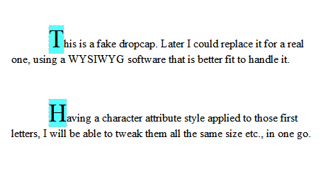
If on the other hand what you mean is not a dropcap (meaning that you want it bigger, but not dropping to the lines below, being taller on its own line, the bottom lining up with normal text on that same line),
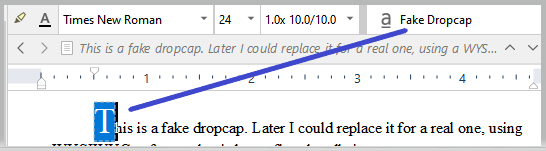
…you could achieve that using a Character Attributes Style, manually applying it to the first letter of your sections.
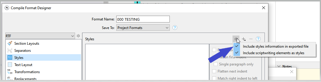
Compile + Third party app:
LibreOffice:
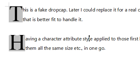
Note: It turns out that in LibreOffice it is rather the paragraph style that determines it. As opposed to the character attribute style. (For a real dropcap, I mean. Like just above – in gray.)
So, depending on the third party app you’d use (like LibreOffice, in this case) you’d want to assign a different paragraph style to the paragraphs you wish to start with a dropcap.
And likely they (whatever other apps handle it) have some way of automatically selecting which paragraphs’ first letter to apply it to. Like: after a heading, after a page break etc. (Which is 100 times better than having a paragraph style that you have to work with at compile - in Scrivener ; not to mention that you have to first manually assign it - if you can do without.)
Experiment.
Drop-capping is a styling element of the paragraph in inDesign and Word as well. If you have created a named paragraph style in your typesetting app, then create a same-named dummy style in Scrivener as Vincent-Vincent suggests. Then your tagged paragraphs will go straight into their intended style for finishing.
I do exactly that to get drop-capped paragraphs in the .docx output I send to inDesign. The paragraph style in Scriv does nothing (except tint the background so I can see it is applied). I apply the style to the first paragraph of the relevant sections. (I also use trailing small caps for part of the first line, for which I use a symbolic character style.) When the compiled output is dropped into inDesign, the special paragraphs take on the look that the same-named paragraph style defined in my inDesign template has.
-gr
P.S. It might be worth saying that, typographically speaking, drop caps are very tricky to get right. You are using text characters as an element of graphic design. But, as such, to make them really look right almost always requires review and individual tweaking at the typesetting stage. The challenges have to do with the character of the first letter (capital A’s slope away from the body text, capital W’s slope toward) and what text the drop cap runs into on the second or third line. What if the paragraph starts with a quote mark? What if the paragraph is only one line long; how will the drop cap interact with the indented next paragraph; weirdly? You can ignore all these things, of course, but it means that you might not get the polished look you are imagining and that you have seen in books. Drop caps. In for an ounce, in for a pound!