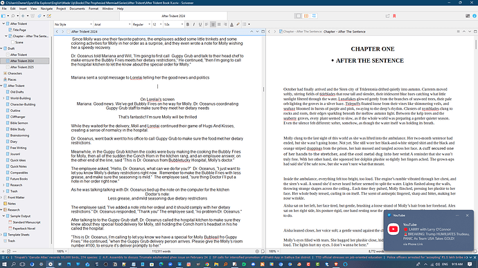
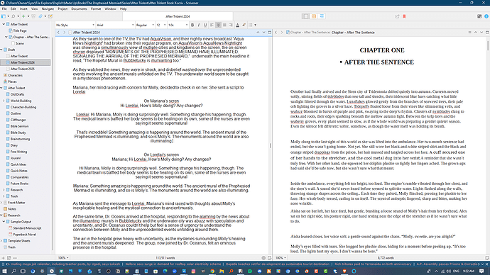
I am not sure where to post this question. I would like to know how others have formatted Tweets and Text Messages in fictional manuscripts in Scrivener.
I would assign a style so that whoever ultimately typesets the manuscript will be able to assign consistent formatting to all of them.
But Scrivener is not a WYSIWYG editor. The actual appearance is irrelevant at this stage.
I take your point. But shouldn’t you be concerned about using the appropriate style to make a good impression on agents and publishers?
“Appropriate style” in this context is whatever the publisher or agent requests in their submission guidelines. Which probably means Times Roman or Courier. If they publish your book, they will pay someone to design the text, including how to handle these elements.
And you still don’t need to worry about it until you’re ready to assemble your output document.
If the submission guidelines don’t specify something, I would say just choose a non-distracting alternative that’s distinct from ordinary dialogue.
“I don’t believe it,” she exclaimed, shoving her phone in his face. “She’s got some nerve!”
– Check out this cute dress, girlfriend! –
The text, from someone named “AnnaB,” included a photo of an ordinary-looking black cocktail dress.
Italics are often used for telepathic conversations, so that might be another alternative.
Okay, thanks. I appreciate the example. Although I’ll probably create format that includes the texters’ names so I can have back and forth text conversations.
I’ve only heard the “texts” in an audiobook, so I don’t know how the author’s publisher handled them, but you might want to check out “An Absolutely Remarkable Thing” by Hank Green. It’s a good read, but you can also see how he/his editor/the publisher’s typesetters handled various social media including video, TV interview appearances, Twitter posts, and of course, texting between friends.
It’s just one example, and it’s the end-result; I have no idea how his manuscript looked when he first presented it in his journey to publication. But I imagine that it would help to see how each exchange is tagged in contrast to standard “spoken” dialogue.
A view:
Many thanks for the CMOS tip. My copy got lost in a move or is still packed in a box. Although it’s so old it wouldn’t have covered texts or tweets!
Have you tried a screenplay or playscript dialog format? That approach is easier to deal with if your target is print media.
The CMOS approach looks like a lot of work converting every line to a graphics. I’ve seen this approach used in movies where the camera zooms in to show a text on-screen. It’s worth the trouble there.
I find this interesting because I am planning to do self-publishing. I expect to do the final edit myself.
As a reader, I detest this approach. Yes, I understand that it’s a text, you don’t need to show me pretty blue or green bubbles. Images are generally less ebook-friendly than text, which is justified only if the image actually adds something, which a green bubble doesn’t. And of course the visual effect is completely lost in audio books, or to people who use screen readers.
(On paper, you’ll also find that color printing is substantially more expensive than black and white. Again, justified only if the image actually adds something.)
Well said.
Don’t hold it against CMOS. Their Fiction+ column has some useful ideas.
I just happened to encounter some text messages in a book I was reading. This was an ebook, and it simply said:
AnnaB: Check out this cute dress, girlfriend!
That’s a really useful example. Simple to execute and define, stylewise. Do you recall if the initial lines were indented, and if so, were they indented more than normal dialogue text?
Indented the same as normal paragraphs/dialogue, IIRC.
I have created the mermaid equivalent of texts messages which i call “scripts” short for script messages. After Trident is not the only book that scripts appear in. I’m now using Scrivener to write book and want to make these “scripts” (mermaid text messages) look like real texts on a phone.
Since i’m using Scrivener, is their a way i can make a phone screen background and outline for when these “scripts” appear so they will be distinct from normal texts and the rest of the story. I want to make them look like they’d actually appear on your phone
When I was writing this with LibreOffice i was showing the same messages on both characters’ screens I know that rewriting (revising the book) i’ve checked.I’ve decided only to show texts on the receiver’s screen
For example, if it’s Lorelai’s scene, it only shows her phone screen, and we see what she sees on her phone since she is the receive of Mariana’s script and vice versa. Instead of showing both the sender’s and receiver’s screens with the same messages, which would be redundant and not necessary.
The main question I have is that i want to make these “scripts (text messages) look like real text messages on their phone screens, and distinguish them from the main texts (so the reader will now they are looking at a character’s phone screen when these “scripts” appear (just as the character themself)
Just a thought.
If you don’t use Inline Annotation for anything else, you could get the texting effect, even play around with positioning and alternative colour for various people messaging.
I freely acknowledge what it was developed for, but hey, if you don’t use it for its intended purpose, then try it for this.

