How to manage replacements for different compile formats?

With the PDF output now good enough to send out to beta-readers :heavy_check_mark:, a question about ePub for readers who want that instead of PDF (planning ahead)
Problem: I had text arranged like this, in ~columns.

But ePUB didn’t like that - there was no alignment at tab stops.

Options:

  • Use Replacements, HTML and CSS using inline-blocks to emulate tabs – alas, this won’t work because each para (row label) begins with a different word so the block width would be unique (possible in theory though with a fixed space font)
  • Use Replacements, HTML and CSS to turn groups of rows into a table; I could probably introduce the <table> tag, and then do something clever on each row to start a row <tr> </tr> and create cells <td> inside those tags
  • Other? Use a real table in the document? (A last resort - table setup is equally non trivial given its % width column control)

However, it seems replacements are global per project or compile format. I don’t want HTML in PDF.

How could I achieve the goal in such a way as to make Compile as simple as possible, requiring minimal setting changes (ideally none) for different output formats (PDF, ePUB)

Why is this a goal? The whole point of the Compile command is that it’s easy to tweak the output based on the needs of a given format.

If this is a goal, then use a table. There’s really no other way to force specific layouts in an ePub without resorting to HTML.

In most cases I would say that’s a compromised proposition, given how very different these formats are. Even if the underlying technology were not so radically different (top-left origin print-based measurements vs floating box model), just to speak purely on aesthetics, what looks good in PDF might not work well in an ebook and vice versa, and any tweaking you do is going to require more work proofing multiple copies to make sure the change doesn’t blow up everything else.

I’m talking even things like measurements between elements, like how wide your label gutter here is, which will consume most of an iPhone screen. For an ebook it might even make sense to ditch the hanging indent label and use a vertical stack approach where maybe the content is indented, but only a little. Or maybe it means ditching the fixed label column gutter and letting the label flow into the first line however wide it needs to (like how the user manual handles menu and interface label descriptions, if that isn’t clear). That’s what I’m talking about—I don’t see how design decisions for a fixed media system can always be expected to work well in a reflowable media that needs to scale from budget phones to 27" screens, and if you change your design to live with that, then you’re compromising what you wanted for print media.

There is a reason for why switching to ePub in Scrivener offers none of the print/word processing Formats, and “Ebook” isn’t an option in them. We never intended for these to be easily cross-wired, and little of what any of those stock Formats do would be applicable across the divide.

I know some do try for this One Format to Rule Them All approach, but I wouldn’t be interested in the amount of bidirectional lowest common denominator compromises I’d have to make to get it working. I feel like the result would tend to converge toward a much more bland result, than if each file type can be refined and made to look good for what that media uniquely offers. End of page footnotes in PDF, pop-up interactive in ebooks, etc.

I understand this is proofing, so some of what I’m saying is less relevant, but I mean to at least put some fundamental background to the concept of why cross-wiring isn’t easier—and why formatting decisions like the very thing you are asking about are reasons why even fairly basic output intended for a beta reader audience can still benefit from a media-specific touch.


Theory aside, I’d go with your first option. Bear in mind that table support in ebook readers very much isn’t a layout tool. Most readers will be presuming tabular data, not hanging indent formatting meant to go on for page after page. It certainly is not “best practices” at any rate.

With this setup, I would use a Format Replacement to convert the “syntax” you’ve established to spans, and the style you’re using to wrap everything neatly. So a sequence of such paragraphs using this style might come out as:

<div class="glossary">
<p class="entry"><span class="label">Authority</span> Mr Dr Strange</p>
...
</div>

(Or if you did want the dash still, that could be left in there somewhere or in a second span.)

As for presentation with CSS, you’re right you would usually want to establish a widest common margin based on the widest label, same as you did for PDF. I don’t really see the problem with that. So long as you use em units so that it can scale with the ebook font that should be pretty resilient.

Maybe I’m misunderstanding it, but I don’t see how a table would even solve this problem, fundamentally, anyway. Whatever width you set for the first column is still going to need to be based upon some maximum that everything else sits within.

Or maybe the missing ingredient is that I’m not sure what you’re trying with the CSS, but your description of using an inline-block for the span is how I’d go about it anyway. I did write up a solution a while back for cleaning up Scrivener’s stock endnote numbering. So obviously the application is completely different, but the execution is very similar: a fixed label width column alongside a flush left content column. The CSS was tested against all popular ebook reader engines.

1 Like

Thank you, as always, @AmberV for the thoughtful reply. I don’t disagree with anything you said.

I’m moderately familiar with book design, and in the beginning I considered ebooks to be design and typographical abominations – my opinion has not improved much: technology limitations and device constraints still make for a very poor reading experience from my personal POV, but I can’t completely ignore the fact that some readers might find it more accessible in an ePUB format.

Of course some changes in settings must be necessary, I just wanted to find a way to minimise them to avoid making mistakes while switching from one to another, because one always has to iterate on any change (to content, style, compile format, etc. etc. etc.).

That said, I belatedly realised that the text I wanted tabulated is in a FIXED SPACE font, so if I remove the tabs and use spaces, everything will be OK. :man_facepalming:

For the benefit of others as well as me, I do have observations from your comment; I’m just clarifying by writing it down.

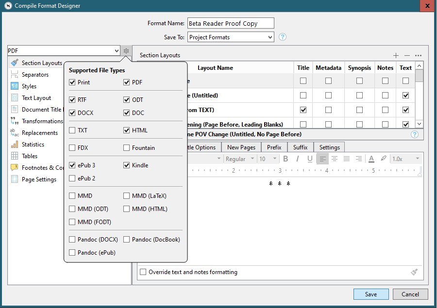
I live and learn. I see now that changing the output format in Compile Overview completely changes the list of available compile formats (hard to believe, but I hadn’t noticed before, because I was only interested in my format!), whose presence/absence for each format is determinate by the checkboxes under the cog settings too for the format. (Took me a while to work out what controlled that.)

You’ll notice I made my beta reader format support both PDF and ePub 3. I shall reconsider that and think harder about having two separate formats.

And looking now at the content of the eBook format I see everything is “as-is”, and that ePUB output adds CSS and HTML items to the left hand panel of the compile format designer, and drops Page Settings.

Looking back at the ePUB output I achieved without ePUB adaptations, I now think I did pretty well – and the tabulation issue can now be resolved (leaving only (?) the weird problem of missing text - opening word(s) on deeply indented paragraphs)

Thanks again.

1 Like

And there you have it. Almost perfect, and certainly good enough, as seen in Calibre

image

The key is custom CSS.

1st, required styles must be added to the compile styles, so they create CSS, then the default CSS has to be modified to provide margins, indents and and some font stuff.

I know the left-margin is declared twice – ignore that – here’s a sample of the CSS fot the line beginning “Basis…”

.transcript-detail { font-family: 'Courier Prime', monospace; white-space: pre-wrap; margin: 0rem 0rem 0rem 12rem; text-indent: -10.00rem; font-size: 0.83rem; text-indent: -1.5in; margin-left: 1.75in }

Note

  • the use of pre-wrap to prevent multiple spaces being collapsed
  • pushing the margin right to where the wrap should be, then
  • text-indent negative to pull the first line back

Note also that the default CSS for that style from Scrivener is:

.transcript-detail { margin: 0rem 0rem 0rem 12.00rem; text-indent: -10.00rem; font-size: 0.83rem; }

which doesn’t include the font or font family.

1 Like