Oh, we’ll get a new version of our icon made to be as awful as the rest once we’re sure they aren’t going to replace the icons with something better…
Quote KB
Oh, we’ll get a new version of our icon made to be as awful as the rest once we’re sure they aren’t going to replace the icons with something better…
And the swearing at your lineage will begin.
Um… no? ![]()
Um… OK?
Actually, you may have a point about the Reminders icon, but in look at the current icon: there’s no need for the ruled lines and, seriously, a margin line in the current icon? However I think that numerals would probably be better than coloured dots in the replacement.
How about… “Professional”? Or maybe, to quote my earlier post, “consistent” and “coherent”. ![]()
Finally, this: venturebeat.com/2013/06/14/ios-7 … e-of-less/
I was thinking, I really like that design. But then… jonyiveredesignsthings.tumblr.co … 3210815405
Looks like Jony saw your ideas and thought to incorporate aspects into the next beta of iOS 7.
PS After all this time, I still don’t know how to create attachments on this board. ![]()
LOLZ.
I seriously thought that was a parody at first!
That “Jonny Ives Redesigns…” site would be funny if it weren’t so truthful. This, in particular, is exactly what the equivalent redesign of OS X would be like:
There’s plenty to like in iOS 7, but the icons are bloody horrible and garish. Apple is just fortunate that it has an army of early adopters that will like whatever it does regardless and sing its praises; the same people who have been telling us how amazing monochrome icons in sidebars and toolbars on OS X are will be extolling the eye-burning gaudiness of iOS 7’s icons. And funnily enough, I have the same problems with the new iOS 7 icons as I do with monochrome icons: I have hell finding anything. Everything is so flat and garish that I am left reading the text beneath the icons to find out what anything is, because the icons pull my eyes in multiple directions.
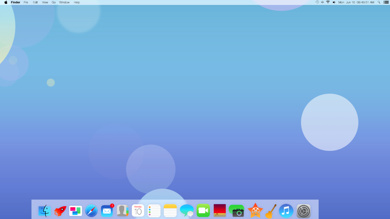
Actually, what am I complaining about? The great thing about the new icon designs is that developers no longer have to hire professional icon designers - they can now bang together icons that look as good as Apple’s in Photoshop on their lunch break! Here is the official new iOS 7 icon for Scrivener, which I spent a good ten minutes on and is every bit as beautiful as the icons for Reminders app, iTunes, Passbook etc:

It’s awesome.
Wonderful. I was tired to be considered a snob, just because I liked the care of every detail in the computer I was working on.
Paolo
I know you don’t like it KayBee, but I don’t see what’s so bad about monochrome. Talk all you like about making it hard to find the right icon, but truth be told, unless you are putting some sort of random icon moving code into the software, I rely mostly on muscle memory to pick the right button. As such, I will value using a consistent and coherent style over forced differentials.
Programs like MS Excel, which has far more buttons, icons and general clicky areas than Scrivener ever will, AND has a habit of randomly reordering those icons every time they issue a new version, still only requires a day or two to be comfortable in a relatively monochrome and consistent fashion.
Go too far in your shape and colour differentiation, and you end up with iOS7.
Still, for your benefit, here is the redesigned pigfender theme. Just for you.
[attachment=1]Untitled.jpg[/attachment]
and the original for comparison
[attachment=0]Untitled2.jpg[/attachment]


I like when it said: Do you keep a pad of paper handy at all times to jot down notes with pen and ink?
Erm… YES!
That’s great for you, not so great for those of us who rely on colour. And it doesn’t work so well when you are working with a list of items that can change, such as sidebars. I still find the sidebars of Mail and Finder hell to use, and I constantly click on “Get Mail” in Mail when I want to click on “Reply”. So–truth indeed be told–some us find colour incredibly helpful, and from the feedback I received to my “bring back colour” blog/rant, I know I’m not alone in this. ![]()
This has been "Total Finder"s saving grace; it has an option to color the sidebar icons in the Finder, in addition to adding tabs. I just hope the latest update fixed the crash bugs that were annoying me so much a while back.
Have we entered the “modern art” era of computing design, where it is now all about breaking the innovation wall—being the first to spray paint this way rather than that way, and doing that Gugenheim group proud—even if, and naturally even especially if, breaking the walls of tradition requires demonstrating that a million dollar painting could indeed be crafted by a woefully neglected toddler and a box of oil paints.
May I present for you, iOS [size=150]∞[/size]

Because who needs clunky old concepts like user interface when all we need is [size=150]Content[/size]!
I would like off the world now please. Please?
STYLE over SUBSTANCE.
Just for you…
virgingalactic.com/booking/
I’m surprised it too anyone so long to provide that Nom.
At least they’ve backed off some from their recent Skeuomorphism fetish. Maybe contacts and Calendar on Mavericks shudder … will get rid of the ridiculous mimicry of leather and torn paper.
Contacts and Calendar on Mavericks do look much better.
What goes around usually comes around.
We faced a similar cycle in TV graphics. In the latter days of cardboard, we had the most amazing examples of skeuomorphic cardboard engineering - which is why when they went wrong live on air, they really went wrong - with in-vision, graphics tumbling off the music stands on which they resided, or starring roles played by the operators’ thumbs.
Then along came electronic graphics. The technology ensured that at first everything was very simple. Drop-shadows were almost at the limit of what computers could do. Computer rendering of the day wouldn’t allow for much more. Because the ‘chrome look’ had been pretty much impossible with cardboard but was quite easy with computers, TV graphic designers went crazy with chrome, usually ‘flown into frame’ - yuk. But as computing power developed, more complex effects could be achieved - so skeuomorphism appeared. You wanted your newsreader to talk about mortgages and interest rates, you gave him an electronic house to walk around - yuk again.
Now - in theory - computing power has allowed TV graphics to ascend to that superior state where the design can precisely meet the need. In practice, mostly. You need complex - you build complex. You need simple, you build minimal… Of course, that ultimately depends on the accuracy of the brief and the skill of the designer. Today I see examples of flown-in chrome creeping back…
So it will be with computer icons, I expect.