I’m posting this on behalf of another user who doesn’t speak English. I’ve been trying to search for mentions of this topic, but everything I could find was about compiling and formatting exported text.
So, forgive me if this has been answered before, but the question is:
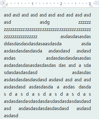
Is there some way to condense justified text on Scrivener 1 for Windows?
As you know, some lines have a bigger space between words when one uses justified text (to the point that it looks like one entered a double space and can make revision difficult), but is there some way to prioritize making all gaps look the same even when you use justified text?
And, if this couldn’t be done on Scrivener 1, has it been added to Scrivener 3?
I can’t speak to Windows specifically, but the question has come up in Mac Scrivener discussions before.
The narrower the column of text, the more this full justification “problem” appears. If you look at columns of published justified text you’ll see that narrow columns (such as in newspapers) always have this problem to some extent.
You can mitigate it somewhat by turning on automatic hyphenation, but you’re always going to have some problem in full justified text, and the narrower the column of text, the worse it’s going to look.
So no. Make your column wider, turn on automatic hyphenation, or just live without full justification (ragged right edge) while you’re writing. (Please note that how text looks while writing in Scrivener can be completely different from how it looks on output. Many users don’t bother with full justification until output for exactly this reason.)
Justified text with long words quite commonly leads to weird spacing. The solutions are hyphenation, better kerning, or the use of ragged margins instead.