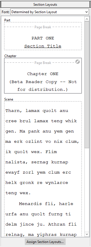
Could we get away with fewer lines and paragraphs?
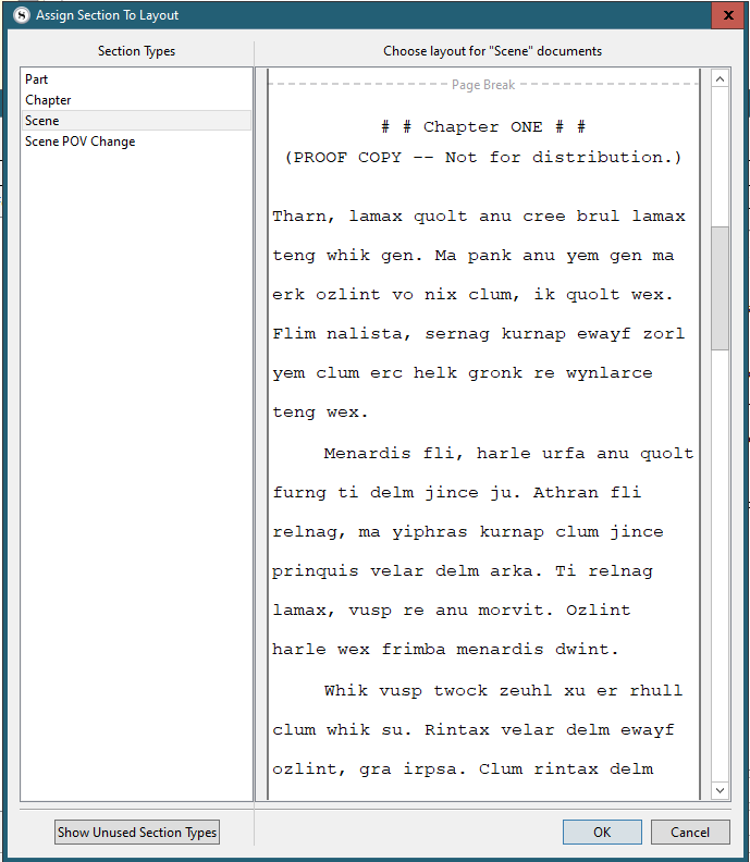
Even at full screen height I can’t see enough of the alternatives to navigate properly/understand what I am looking at; two lines (to show indent & wrap) and two paras (to show e.g. return of indent) would seem to be enough.
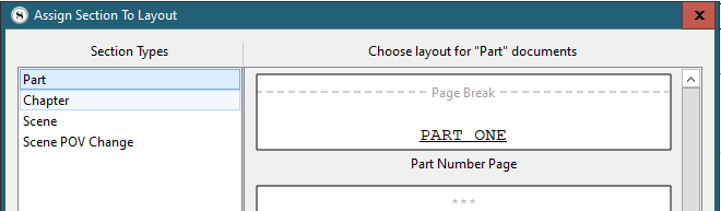
(and, personally, I prefer headings above items to introduce them, rather than captions below)
ditto Compile Overview (same underlying issue)
What you could do, he says, inspired at last, is to show whatever you want in collapsible units (headings at top, of course), then I could expand/collapse etc. and have the best of all possible worlds
[Optimist: someone who thinks we live in the best of all possible worlds.
Pessimist: someone who fears the Optimist is right.]
UPDATE PS
Of course when I was saying the labels for the sections should be at the top, they are in one view, but in the assign layouts view they’re not - and that’s where they should be on top too IMO