Light text on dark background

If working for a few hours in front of a bright screen bothers you, this information might be useful. One of the main reasons why I found Ulysses, and then Scrivener, so appealing, was their “Full Screen” mode–which meant light text on a dark or black background. A real blessing for my eyes.

Unfortunately, I’m a writer who needs to see his reference material as he writes–probably due to a very poor short memory. This is not possible in Full Screen, and there were some suggestions to either use DEVONThink or a similar tool to show research material. This of course would require a dual screen setup, and would not use the wonderful Research Folder in Scrivener.

Wock, gave me these very detailed instructions to take advantage of Layouts in Scrivener, so that I could have a setup very close to Full Screen, which at the same time would give me access to Scrivener’s Research Folder. Unfortunately, although these instructions are great, I was back to the bright screen I wanted to get away from.

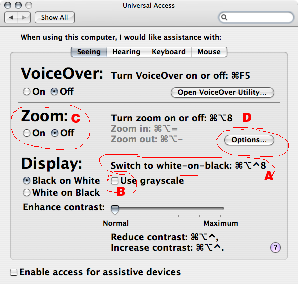
I remembered that MS Word, and Wordperfect, and other word processors allowed you to work with a blue background and light text. So, I requested Keith to create an option to change the text in the Edit Pane so the user could select a dark background, but this feature will not be implemented in Scrivener.

Fortunately, there is a solution. AmberV suggested that I take a look at Nocture, a wonderful little app that reverses the screen colors, giving instant relief to your eyes. It’s simply amazing. Then, Wock suggested another very simple solution: Control-Option-Cmd-8, which reverses the screen colors as well.

I sometimes wear sunglasses while using a computer, too. :slight_smile:

[size=80]But I am a freak.[/size]

Check out DarkAdapted. This small app was developed for astronomers, but I’ve been using it for ultimate control over screen brightness and colors. Very convenient with customizable presets and menu bar access.
versiontracker.com/dyn/moreinfo/macosx/16951

Strange thing about that: Whenever I come across a light-text-on-dark-background-screen, it brings up good memories of my early computer days - especially when the text color is bright green or amber. I wrote a lot in this look when I was younger. But I can’t work like that anymore - not really. It’s so easy to have it: Just set the full screen mode accordingly and type away. I did this several times, but I always came back to black on white after no longer than half an hour. In fact, light text on dark background stresses my eyesight in a way I can’t ignore.

the whole thing makes me wonder how man ever survived writing. I mean centuries of black on white … the horror!

Seriously, I don’t think the issue isn’t the color as much as the brightness. Too bright and you get eyestrain. The only advantage to white on black is that you can lower the brightness easily.

That and font/magnification. There is a “too small” AND a “too big”. The rule of thumb that I was taught was “take off the glasses, when you can start to read it but not perfectly put them on.” Granted I and the “wizard” in this case are highly functional without our glasses.

Anyway, I am you AE. Black on white seems to be the spot for me these days even though it is fun to play in green on black for a little bit.

I never liked green on black or orange on black. The first computer I owned was the original Atari 520 — the “Jackintosh”, which had a “whopping 512K of RAM and an external 3 1/4” floppy drive — with the 12" black on white monitor. That was utterly great.

Even better is the MBP and the MBA … the self-adjusting brightness … if you don’t want your screen too bright, just turn the lights out. The screen will dim and the keyboard will light up … brilliant.

:slight_smile:

Mark

[size=150]CONTROL+OPTION+COMMAND+8
[/size]
Like stated above
SImple, free, easily turned on or off, and totally psychedelic.
:imp: :smiling_imp: :imp: :smiling_imp: :imp: :smiling_imp: :imp: :smiling_imp: :laughing: :laughing:

Oh and for those who use SPACES. Hide the dock, make sure nothing is on your desktop and change your desktop picture to one that is solid black. Helps a little.

I suppose that’s OK if you’re into the psychedlic … I’m not I’m afraid; and if you have an MBP or an MBA, turning the lights off is more eco-friendly and reduces your electricity bill! :wink:

Mark

I tried that and only got a ding. :frowning:

Is it an intel processor thing? I’m on a powerbook.

Really!? 8) Is that the same as a, Rush? 8)

No it is something that has been in the OS since I think OS 7 or 8.

It is a function of UNIVERSAL ACCESS.

Your keyboard shutcuts may be different. You can check this by checking your settings in Universal Access.

Go to SYSTEM PREFERENCES (Lightswitch Icon for 10.4 and before, Gears Icon for 10.5 and above)
Click on UNIVERSAL ACCESS (Blue Icon with person symbol)
Click on the SEEING TAB
(See picture below for following instructions. PIcture is from 10.4.11 other versions of the OS may look slightly different)
Ok look at A this is the short cut command to switch between Black on WHite and White on Black. If it is different than what I showed you then use the commands you see listed in this window.

The radial button to the left is what you want the default to be (Black on white is Normal. White on black is inversed.)

For those that do NOT like the psychodeleic look they can checkmark USE GRAYSCALE B. At the bottom of course is the contrast settings and the keyboard shortcuts for increasing and decreasing contrast.

NOw for those that like really big letters or hate squinting look at C and D ZOOM is off by default but you can turn it on with COMMAND+OPTION+8. Then once it is on and if you have a scroll mouse you can hold down CONTROL (default. you can change this in KEYBOARD and MOUSE System Preference Settings - NOT in UNIVERSAL ACCESS settings), mouse tab, bottom of the screen) and while holding control down you can scroll up or down and it will ZOOM the screen like an iPhone or iPod touch does (this is where they got the original idea.)

In the KEYBOARD and MOUSE settings under MOUSE tab at the bottom there is a checkmark next to sentence that says
"Zoom using scroll wheel while holding (pulldown menu for your choice, contorl is default). then an OPTIONS button. the OPTIONS button gives you many options for ZOOMING.

Hope that helps?

Hm.

The key combination matches, but on my pref screen it’s in grey, not black - and all the other on/off switch combos are also grey, and also cause nothing but a ding.

I wonder if I disabled the whole system somewhere.

Those who’ve noticed that screen color combinations seem to affect their writing mood are on to something. Some just-out research in Science magazine links a red work environment to increased accuracy and a blue one to increased creativity. I suspect green would give a similar affect to blue. Dark versus light backgrounds probably have similar effects, as would a screen that is too dark or too bright.

I quote and link to the research elsewhere in Literature and Latte:

https://forum.literatureandlatte.com/t/moving-full-screen-combinations-to-the-view-menu/5248/1

A few studies that I found intersting were that color can effect mood.

Colors in the Red-Yellow range (hot colors) tend to create excitability and restlessness and hunger. So go to any fast food restaurant and few tricks they use are turning the air down a tad (a little to cold) so you tend to keep your jacket on and are a tad uncomfortable, bright fluorescent lighting (9300k) because it is cheaper but also is less “comforting”, hard plastic chairs that are comfortable for about 30 minutes before your bum hurts, and bright “hot colors” (Usually shades of Primary Hot). What this does is makes you order more food, makes it only comfortable for a short time, causes excitability and restlessness so you will leave within 30 minutes.
Now go to a nice restaurant and they keep the temperature up a tad warm which makes many take their jackets of (make themselves comfortable), dim warm lighting (5500K), very comfortable seating but not too relaxing, and earth colors (NOT BLUE) but rather browns, tans, and greens. These colors make one feel comfortable but not sad (Blue is related to sadness, “I’m feeling blue”). In other words they use a mixture of cold colors and hot colors to give you secondary cool warm colors (greens browns, tans, burgundies) because these colors create “comfort” and relaxation but still contain enough “warmth” to fend of sadness or depression. Why do they do this? Simple. To sell alcohol. In fast food you want to sell as much as you can and then have your customers rotate out within thirty minutes so you can keep the size of your dining to a small manageable size and most of your labor is preparing food, so the end product is at the counter. In nice restaurants their wait staff may rival their whole kitchen staff because their main product is not the food but drinks. The idea is to keep them at the table for about 2 hours. In 2 hours time a small group of 5 people can usually spend more on drinks than on the meal they ordered. Also the cost of labor for the large waitstaff is mainly put off onto the customer (tips) than paying a large wage per hour by the restaurant. The markup profit on the alcohol is much higher than on the food since preparation is low cost compared to preparation of the food. So they use warm temperatures so you will relax and take your jacket off, cool warm colors to make you feel comfortable yet still feel a little hunger, and more comfortable seating and ambience all to keep you in your chair for 2 hours to get you to buy as much wine, beer, and liquor as possible.

You will notice that bars are usually earth colors and the two least successful colors in a bar would be RED or BLUE. Red because it causes to much excitability and restlessness making the person not stay long enough, and BLUE which causes a more depressed sad experience and leads to a person drinking more slowly which cuts down on profits.

The two most commonly found colors in homes across homes in modern societies? (Besides white) is shades of Brown and shades of Green. (Secondary colors).

Studies also showed that little girls with Bright red or hot pink rooms tended to sleep less and show more excitability, where little boys who had deep blue (cobalt) rooms tended to act more lethargic and sad.

Also bluish white (cold white) which is found in many fluorescence (9300k) have found to make people feel “clinical” or cold and detached, where soft white or “warm” white (5500k) tended to make people feel happier and more secure or more homely.

Sunlight? (6500k) is smack dead center. It contains all the all of the spectrums and is considered the most “balanced” of any lighting and also the most balanced in how color is perceived.

Many large corporations will do very extensive color studies and lighting to achieve the most optimal results.

Hence lighting makes all the difference in the world on how we perceive colors and how we act or interact with others and locations we visit.
:slight_smile:

True, Wock. However, (and this hasn’t anything to do with your summary of the research) many of these recent studies are skating on very thin cultural ice. Much of what they report is very much bound to the culture where they did their research. Red has very different connotations and effects on the spirit in China than it does in Western countries, for example. It’s been too long since I’ve been Asia to cite things but I’m sure Xiamennese could weigh in on this. You may think that’s a nice color flower to bring to your new Thai friend but she might be perturbed by your funereal flower.

Dave

Yes cultural differences make a profound difference on color symbolism and expression. On color one thing I find humorous is the study that shows Red cars are involved in the most accidents and also the ones who get the most speeding tickets. Of course the amount of speding tickets is easily explained because the most popular color for sports cars is red. The most popular color for ties on men who are in power positions is Red (Called the power tie). Since Red is associated with power in many cultures. Also studies have shown that a woman wearing red is considered “more attractive” than wearing any other color. Red is associated with lust, power, sexual attraction, “hot”, etc. Which explains the power ties, the sports cars getting tickets and the sexy woman in red, but leaves one to ponder why red cars are involved in more accidents. One would think since they (red vehicles) are mainly sports cars and driven above the speed limits and recklessly more often then that would be the case.

Actually no. The reason why red vehicles are in more accidents than any other car is none other than they were not seen. The reason given was the person did not see the red car.

Which lies the humor. Red is the hardest color for the human eye to detect or to see and yet people would point out that Fire trucks are red, fire hydrants are red, stop signs and stop lights are red.

Well after many studies many places are repainting their fire trucks and fire hydrants to flourescent yellow. Also many have noticed that red signs and “stop lights” are ran because they were not seen or noticed, yet green signs and yellow signs are immediately noticed. At night a green light is noticed further away as with blue. Red and yellow lights are not noticed until closer up.

A turn signal gets someone’s attention more than brake lights. And in emergency vehicles white lights, yellow lights, or blue lights are easier to notice than red lights.

In my culture “black” is considered the color of death. In some cultures white is the color of death. Color theory is a very interesting subject, especially the effects colors have on people and their reactions. Or how we assign a color to a person based on sex, religion, age, culture, or status.
Pink for girls, BLue for boys, Green for greed or envy, Red for power,sex or danger, black for death, white for innocence, yellow for coward, brown for nature, orange for warning or construction, purple for religion, gold for worship.

What is most interesting is the effect light has on color and what is really interesting is how there are three major companies that have impacted the lives of people all around the world on color and how they perceive color more than anything else in modern history. The three companies that influence color and its appearance which effects everything we see in print and how we react?

Kodak, Fuji, and Agfa.

Question for you all: What colour are an aircraft’s black boxes?

It always amuses me sardonically when westerners start lecturing me about colours and their impact as shown in fengshui … because it’s not as if we don’t have our own long-held beliefs about and research into the effect of colour, most of which are essentially the same.

But yes, the Chinese do differ in the colour associations in some areas: red for good fortune, white for death … but now brides are hedging their bets … they come into the wedding ceremony wearing a white, western, meringue-style wedding dress, then when the chicken soup is served – made with chickens with a black skin 'cos it’s more healthy, they claim! – they do their first change of dress into a red qipao to go round toasting all of the guests, table by table. On the other hand, I know of women in Britain who have got married in a red wedding-dress – Oh the scarlet lady! – and a friend of mine was asked to make a black wedding dress for someone.

And if red is the colour of sin, why do cardinals wear red?

Then for the Chinese, pornography is yellow, not blue; and reputedly in the 50s, since red is the positive colour, the colour of the Chinese flag, “The East is Red”, i.e. the dawn of the new era, of “New China”, etc., Mao and co are supposed to have ordered that on traffic lights, “red” should mean go and green “stop” … the resulting chaos wasn’t allowed to last long.

:slight_smile:

Fluorescent Orange. :slight_smile:

I would ask the choir boys.

:slight_smile:

Yep on the first, and good one on the second!

:slight_smile:

The historical reason is that the Catholic Church is the heir of the Roman Empire, where purple red was the symbol of power (due to the high cost of this color).
The actual reason may be just because it is the colour of sin.

Funny: in Italy, yellow is the color of mistery stories, due to the color of the cover of the most famous series of the past (‘I Gialli Mondadori’). Mistery and erotic is a winning combination. Nice.

Best, Paolo