For increasing visibility in the binder, while you do not have direct control over the selection bar, you can achieve an indirect control, and through that find a level contrast that suits you better:
- Firstly, go into the Appearance: Binder preference pane, and set the Base selection color on background color option to true. With that set, the stock macOS blue/grey will no longer be used, and instead the bar will be tinted to match the binder background.
- Next, in the Colors tab, tweak the Binder background setting to taste. The following example is perhaps a bit more saturated and extreme than most would prefer, but demonstrates how you can boost contrast by playing with a combination of saturation and lightness. (Hint, on a Mac you can control background windows without raising them to the foreground by holding down the Command key when clicking. You can thus see what the binder will look like when active, by keeping the project window in the foreground and Command-clicking on the colour chip in the backgrounded Preferences panel. But for your purposes you might want to select based on the inactive look.)
- As a general tip, consider cycling with
⌃Tabto quickly darken the selection highlight, if need be.
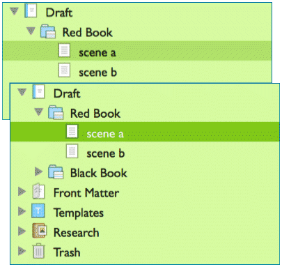
Inactive (top) and active (bottom) appearance.