Is there a minimum size for images inserted as links from files? I’m trying to resize some small images to be very small, but the controls in the Edit Image dialog don’t allow me to go under a certain size.
The only recurring behavior I’ve seen is that 72dpi and 144dpi seem to be some non-negotiable numbers (I’m on a Mac, and these are the default display image resolutions for this system).
For example, I’ve an image that is 14px x 14px, 72dpi, and I can’t make them appear smaller in the editor. Another image is 365px x 25px, 144dpi, and I can’t shrink it more.
Is there a rule? Better yet, is there a workaround to make them smaller?
(This also makes me want to reiterate my desire for image placeholder tags to be previewed in the text editor; linking an image from disk would be much more flexible, while letting one get a preview of the linked image).
Searching for “minimum image size” on the forum, I get:
@ptram : (This also makes me want to reiterate my desire for image placeholder tags to be previewed in the text editor; linking an image from disk would be much more flexible, while letting one get a preview of the linked image).
There are already two different ways of linking to images with thumbnails.
This one is specifically for when you don’t want to work with the image as a thumbnail.
So making this third way of linking to images work instead exactly like the other two ways of linking to images seems like a very strange thing to do…
Because then we’d have to make a fourth way of linking to images that works like text placeholders again!
My advice will always be to make the image the right size to begin with, though. Using a text editor to change the image size is not of acceptable quality or good practice (wildly different DPIs for the sake of visual appearance), save for scratch notes and such.
Sorry, I had missed this message. Ok, so there is a lower limit of 25pt for larger images. And smaller ones can’t be further resized, being already under that limit.
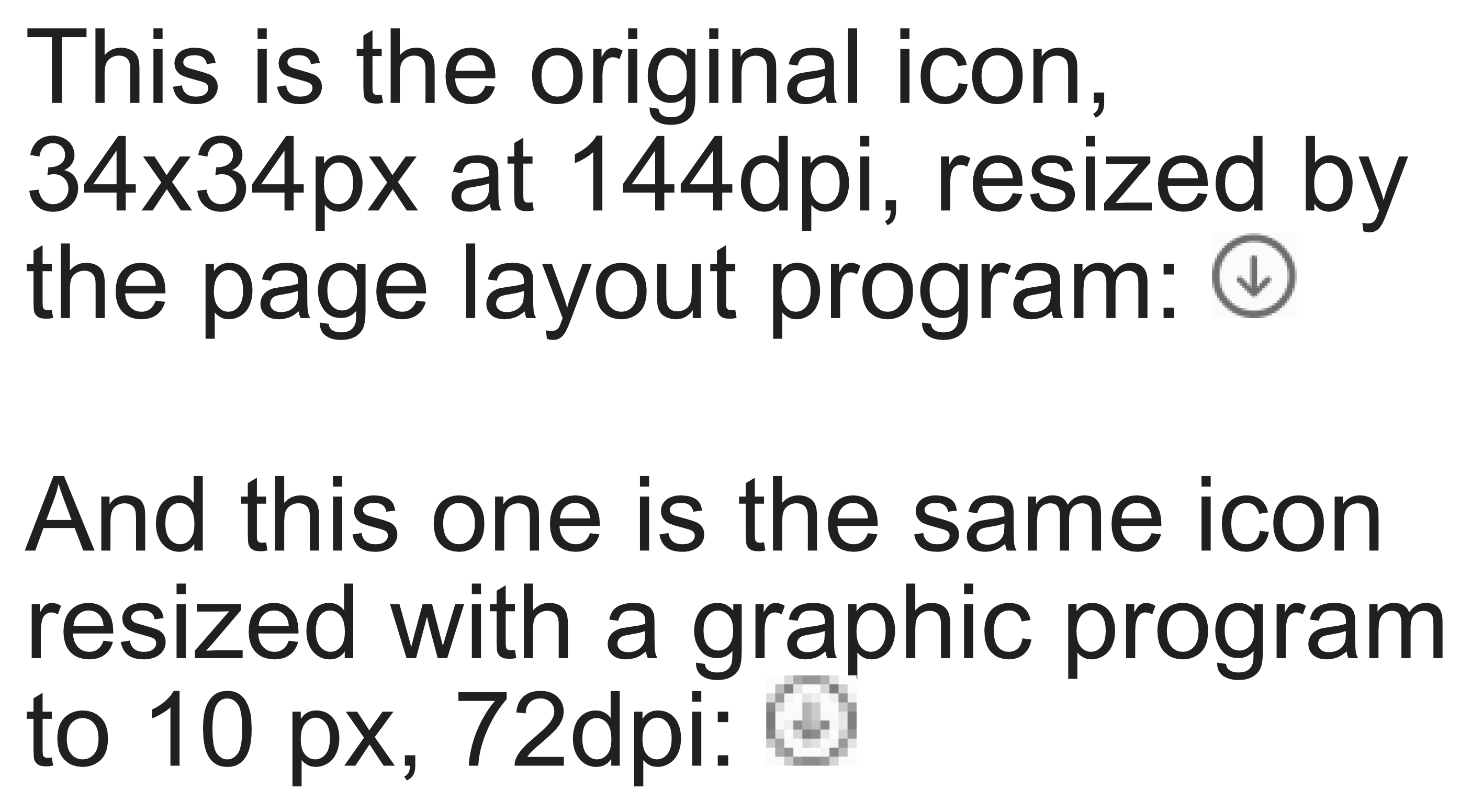
Eh, but it doesn’t always work as expected. With more pixels, there is more material for the rendering engine to work. Take this simple icon:
The second version is made to fit, but it simply doesn’t work.
Actually, I would like one or two of the current ones to be modified, or to converge, to work both as a textual link and a preview. That is, if the placeholder tag could optionally show a preview (maybe with the click of a button in the toolbar), or the images linked from file could allow editing the link as text, it would still be the existing system, but with more flexibility.
It will for sure do a better job, but if I have to create an image that will not have to be resized in the text document, I have to make it to the target resolution (either 72 or 96 dpi).
If I insert the linked image at 144dpi show above, I can’t downscale it below 25px. As a result, it will be always too big, since the size in the Scrivener document is given in pixels, and not in millimeters or the like.
I think that is because the second one is below the 25pt limit. It’s not that there is an issue with reducing how low the sliders can go, or what the text boxes allow, but that the text engine itself doesn’t display really small graphics correctly—which is what I assume you are running into here, it’s blowing it up to 25pt from 10 and making it blurry in the process.
If the same file displayed in another tool which uses a different text engine, perhaps result better (or worse, depending on that tool, of course). So it’s a tool issue, not a graphics issue?
I mean, I wouldn’t want to definitively say it is not a graphics issue; I’m looking at a screenshot of something, with a declaration of what I’m looking at beside it. I can at best speculate. But we know, from the quoted post, that the text engine doesn’t like stuff smaller than 25pts, and a 10px 72 DPI image is definitely smaller than that. So it is likely that it is a tool issue, but it could also be a graphics issue and a tool issue.
By the way, are you magnifying your text editor at all? That’ll certainly blow images up, and if they are already tiny, I doubt it will look very nice. Check against 100% and see if maybe it’s crisper.
Sorry, I’m maybe not understanding how the conversation has changed. Are we going back to the statement I made of making the image the right size instead of resizing it in Scrivener, and this is your demonstration that it’s not better? I hadn’t understood this was meant to be a rebuttal of that.
If so, I would clarify that “made to size” can mean more than just using the scale function. In my opinion, no 10px image should be made with interpolation or discarding pixels. I have never seen that work well. The only way to get something that small to look decent is by drawing it that way to begin with (and there isn’t a lot you can do with 100 pixels anyway).
25 pts is about the size of two letters in 12 pt type. At 72 DPI, 10 px is just over a tenth of an inch. These are not dimensions at which I would expect to see a huge amount of detail.
Indeed, at that resolution. But the image shown on page or display, today, is much higher. On print, it is at least 300dpi. Onscreen, it is at least 144ppi.
If the original image is 10pt high, we can have at least 20px forming the image in that height. Four pixels will make one dot. The detail will be much better. The more pixel there are in the original image, the better the rendering system will draw the small detail.
That’s the reason why I don’t like the idea of resizing the original image at exactly the size of a 72ppi display. I want an original file that is big enough to warrant enough pixels on which to work when downscaling, and not too big to cause slowdown.
But apparently I’ve not understood what the idea of resizing the original image at the target dimensions actually means.
Probably the most significant factor in the dramatic loss of clarity is that the original image is greyscale, rather than black and white. So the downscaling is attempting to preserve the tonal variation, including the drop shadow to the left of the arrow, and there just aren’t enough pixels.
I think this is an argument for creating images in the resolution that you actually want. A 300 dpi image has more than 4 times as much information as a 72 dpi image. Downsizing requires throwing away about 3/4 of the available information; upsizing requires generating that same amount by interpolation. Neither of those is an easy task for an algorithm with no built in “vision” of its own.
Ok, I tried something else: I saved the icons with a resolution of 144ppi instead of 72ppi from Affinity Photo.
As a result, the images are inserted in Scrivener at half the size. For example, if the icon is 14x14px, Scrivener halves them to 7x7. It understands it is Retina image, therefore it halves its actual size.
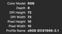
Trying to resize the images in the Edit Image dialog resets them to a minimum of 25ppi, but if you don’t touch them they stay as small as when inserted.
Still about the image size: I could see that having an image preview in the editor separated from the output very handy. The published image could be of small size, and end up being too small to see all the details while editing. At the same time, a preview that is easy to see while editing could be too big in some outputs (for example, an A5 or pocket book size).
This is the same as with text styles: Scrivener offers them as separate sets for the editor and the output. What is nice to look in a printed document may be uncomfortable while writing. With Scrivener, you can have both.
This different image size can be a problem when having a direct Scrivener to DOCX output flow. It isn’t, if passing through the Markdown conversion through Pandoc/Quarto. In this case, you can have an embedded or linked image as a large size preview, and a Markdown link as the output image, with a smaller size.
Going directly from Scrivener to Word is easier, but in the end the alternative strategy is mirroring the HTML output, that I will need, and is based on many shared elements.
Still about the image size: I could see that having an image preview in the editor separated from the output very handy.
Oh, personally I totally agree, I have no use for the concept of using the display size of an image for any kind of output result. I just want to make the image comfortable in the editor.
Fortunately with Markdown it’s not too hard to post-process those values, either deleting them entirely (which has a good result with Pandoc) or regenerating them from the original using a command-line utility.
As to whether breaking the link between editor size and output size is a good idea for everyone though—I don’t know. That sounds like it would lead to confusion, and would then at best lead to yet another checkbox in the compiler.
Take, for example, my situation. I need a different size for the same image for:
the editor, comfortable at normal working zoom
an A5H PDF, with a fixed width in cm
a Website, with a variable width in percentage
The solution I’m adopting is to add both a linked image for the editor, in a paragraph that will not compile to the PDF or Website output. The same for inline images, with character styles.
Then, I’ll have a Markdown link to the same image on disk, in a paragraph that will compile for both a PDF or Website. It will have two width values in the link: one for the PDF, another one for the Website. I’ll use character styles to make them appear or not in the output.
Yeah, I understand your situation, I’m just thinking here of the hoards of users that are used to resizing an image in Word or whatever and having it print that way. I don’t think many people would expect that resizing the image in the editor would be purely cosmetic—no matter if that is in philosophical alignment with how Scrivener treats text formatting.
Yes, character styles would work for this. Another thing I’ve done to add multiple image sets to the workflow, depending on the output intent, is to source them all into different subfolders, and then use a Format-specific Replacement to adjust the path on the fly. Folders for black & white or CMYK folder for print, high-res RGB for screen PDF, screen res for ePub/HTML, etc.