I use the Book icons and like the blue, brown, and red options, but might we have just a few more colours? Yellow, green, purple, and orange?
yours
Michael
I use the Book icons and like the blue, brown, and red options, but might we have just a few more colours? Yellow, green, purple, and orange?
yours
Michael
Hi Michael,
You could always extract the white one and colour it yourself, adding it as a custom icon. Ctrl-click on Scrivener.app in the Finder, select “Show Package Contents” and then drill down into Resources and Default Support Folder/Icons.
All the best,
Keith
Ah yes, I see. I’m mildly apprehensive about it, but can try this sometime.
By the way, I’ve just sent a tweet praising Scrivener:
twitter.com/ullyot/status/281448964849557504
yours
Michael
No need to be apprehensive - just copy out the book icons and then you can edit them in any image program to add a tint. Then you can add them to Scrivener via Documents > Change Icon > Manage Icons…
Thanks for the kind tweet!
There are a few here that you can download and add. I think I’ve made a purple one since then too, so if I find a chance later I’ll dig that one out (somewhere on another computer) and throw it up here for you.
Ah, lovely! More colours would be most welcome.
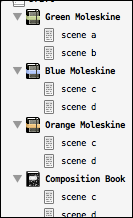
I’m using green now; I’ll attach a screenshot.
yours
Michael
Here are a few more I had. You can also take any of these and adjust the colors in a graphics program, as Keith said (and without then needing to dig into the application resources folder).
BookIcons.zip (22.8 KB)
All right, I just had to do it. Here are some more. This is a set of Moleskine style notebooks in classic orange, blue and green label, and finally the venerable composition notebook.
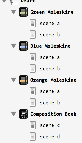
These icons are Retina/Standard compatible (both versions shown above). Just drop them into the manage icons window and the appropriate version will be used by your system, filed into the “Book” sub-menu.
12354977-Scrivener-Book_Icons.zip (17.1 KB)
Oh man, you’re upping the bar. These are swank.
These are cool. What chance of getting something similar in the Windows version 
Very nice!! Thank you both very much.
yours
Michael
Customizable icons will be coming to Windows down the road, and you’ll be able to use these then.
How do the customised icons (eg something like the moleskin ones above, or a highly coloured one like the books) look / interact with using label colours in the binder / on icons?
Silly question time… What application(s) do you clever graphics guys and guyesses use to make these cute little icons? And what basic process do you follow? I’m rubbish with pictures, but I’d love to be able to make dinky little graphics and I don’t know where to start. (I’m on a Mac.)
The labels are drawn under the icon on the Mac, so they don’t affect the icon’s colouring at all. Tinting does, giving a coloured film over the icon–depending on the label colour and the icon, it may be a little less obvious, but it fades the icon out a bit so there’s a definite coloured tint over it. I don’t tend to combine custom icons and the labels-in-icons that much. Either they’re unlabeled or I use the full binder bar but with fainter hues so it’s not overpowering. Depends on the project and how much I need to procrastinate.
For making the icons I’ve been using Pixelmator of late when working on the Mac; I used to do this stuff on Windows and I finally had to give in and get something for OS X and I picked that up cheaply, but I’ve been liking it when I get a chance to play in it. I also waste time finding just the perfect icon in the myriad websites that host icon images for this purpose. 
For me, the custom icon feature kind of supersedes the icon label tinting feature. If something has a custom icon, then that is all that needs to be said about it at that level. There are a few exceptions, the example the “To do” checkbox icon is white and black, so it tints nicely and that is something that could use labels more readily.
But at any rate, the trick with designing an icon that works well with tinting is to have a neutral area within it, that way you don’t get blending with background colours. Even though they are faded out that still happens. A Moleskine variant with a white band would probably work better for that reason, with labels.
I use Photoshop CS6, which fortunately just had a Retina update. Everything looked horrible in it before that. As for making icons, you really have to hand draw everything at this scale. You can use shape tools to make something worth tracing over, but the shape tools don’t work well at a very small scale. Thus all texturing and shading details have to be drawn by hand, usually pixel by pixel with a single pixel brush. It’s easiest to have the graphic open in two windows, one scaled up to 1600x and the other hand actual size (on Retina, when working on non-Retina graphics, I use a third window scaled to 200x which is roughly real size). But that all just takes practice, and knowing what to do on a huge grid of pixels that will look good at real size. Even the double-scale screenshot I posted below is showing more detail than you’ll really see on a Retina display. Stuff that looks awful zoomed in looks fine at 100%, and conversely sometimes the stuff that looks good at 1600% is just a muddy mess at 100%.
Best way to learn is to go into the icon folder that Keith mentioned above, drag all of those out, and load them up in something like Acorn, Pixelmator, Graphic Converter, or even Photoshop if you have it. Then scale them up to 1600% or so and see what tricks are used to make the shapes you see at 100%.
Thank you for the info, Jennifer and Ioa. I’ll try it out… If previous experiments with graphics are anything to go by, you will probably hear the grinding and gnashing of teeth all the way across the Atlantic. 
