It seems the last column of the outline is always in autofill mode for the rest of the available space (unless the whole outline pane is fixed with the “center content” option).
When Scrivener is maximized on today’s screens, it doesn’t make sense to have a word count column taking half the width of the screen, with the header far away from the value.
The first column with the synopsis could use that space, but if I enlarge it, then when the app windows is not maximized, it keeps its huge width and the other columns need horizontal scrolling to be displayed.
So maybe I’m missing something here.
What do you do with that behavior?
In the column header in Outliner mode, you can manually adjust the column width (using the double bar with an arrow each side that appears when hovering in the header area—sorry screen capture kills the feature before capturing it) for the Title and Synopsis column to take up most of the space. Otherwise, have a progress bar in the last column to take up the balance of the space.
2 Likes
Thanks for your reply. I forgot to explain I did that. Trying to manually adjust the columns. Or using a filler column like the progress bar (that I don’t use) to compensate. It works but I don’t want so many useless rectangles displayed.
In that case make your last column a static data column from a dropdown:
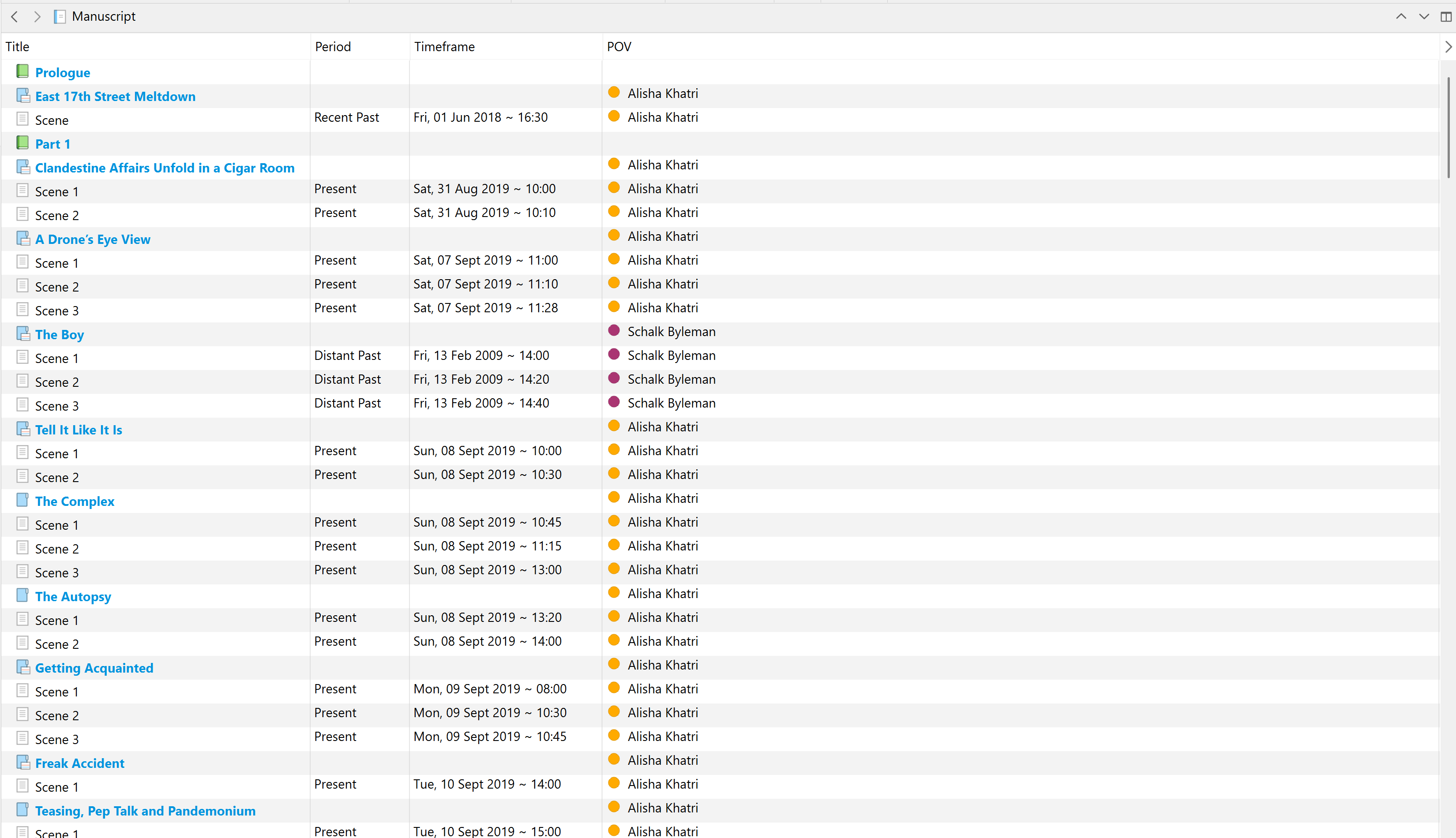
I just moved the status as the last column of the Outline (as I don’t use it for the moment).
This does the job (although I’d rather have a specific column to expand instead of the last).
Thanks again!
1 Like