Para margins and tabs different in Compiled PDF. Fix?

[Scrivener 3.1.5.1, Windows 10)

In the editor

In the PDF
image

The new lines within the para should align with the initial “I” AFAICT, but don’t.

I am not trying to “typeset” the MS, I am simply trying to avoid formatting distractions for beta-readers.

How can I fix this?

UPDATE: putting in a hard return that looks good in the editor like this doesn’t fix it.
image

Nor does trying to use a table
image

vs
image

Nor does putting a (extra) left tab at the indent marker.

PS This is the style used.
image

I don’t see mention of it, but have you verified yet what is happening in a word processor file? Trying to “debug” a PDF is pretty difficult, and mostly a matter of spamming one copy after another trying different things, since it is closer to a painting of a file than anything else.

If I had to guess though, you’ve maybe got an out-dated style transformation in your compile settings. Maybe you added it a while back, and have since revised how it looks in the editor.

Otherwise, you might try playing with the PDF related settings in the application Editing: Options tab. I’m using Default/High Res, and tab stops + indent pairing work flawlessly (and that is indeed the right approach for this look, I would say. Having to use tables or hard breaks all feel like undesirable workarounds to me).

Indeed :rofl: I was just exhausting all the possibilities, because it “feels” like a bug, notwithstanding your local experience (maybe there are other differences??)

There are no transformations. I switched to High Resolution; no change.

I think it is the tab after the em-dash before the indent – making more “space” between the tab and indent doesn’t help.

image

image

Replace the final tab with a space and we do get (fortuitious? Yes - just tested that too) alignment.

Pasted into Word and set page size and margins to match
image

PDF output is as it should be
image

@AmberV Separate post to avoid cluttering the previous.

I have used spaces around the em-dash and manually set the indent very carefully. It’s hacky, but there are only two sections where I had this problem.

Obviously, a proper solution would be preferred! (whether that’s a setting change or ‘otherwise’).

(FWIW, since I did typeset my own MS on another work, I can say that LaTeX has it’s own issues… just try getting the lines on either sides of a page in the same place! It was done, but it needed the assistance of a guru :slight_smile:)

You could maybe try centre-alignment on the tab stop that handles the positioning of the em-dash, rather than left? That should in theory handle font size / family variances a bit better—but I wouldn’t be surprised if there is no one-size-fits all solution here if there is indeed a font family or size change.

You may need to use a Styles pane transformation, in other words, if the output doesn’t match the editor precisely.

Using spaces to fudge the em-dash or indent point around seems quite fragile to me.

Thanks as always for the prompt reply. When I have an alternative I’ll take it! :smiley: The following suggests a more fundamental issue that using a centred tab stop seems unlikely to address [Update - I tried; it didn’t], because the problem case below doesn’t have manual tab stops.

I’m shan’t do any more on this as I am up to a couple of dozen test variants and the chances of making a mistake (if I haven’t already) and confusing both of us are now too high, but this looks like a minimal example of the problem using the proper “No Style” starting point. Styles were applied from their prototypes by copy and paste formatting.

Note the problem with style 3 in the PDF. One thing I notice is that Scrivener editor has implicit 0.5" tab stops if none are manually created. The PDF does not seem to have those, the 1st tab stop is at the indent, and on the next line it goes wrong.

Editor


PDF
image

Sorry, I still don’t see a difference between input an output. If the style declares a particular tab stop that matches a particular indent, that carries through to the output even if the font metrics change beneath it (within limits of course, if we used an ultra-wide font where the hanging portion of the line exceeded the indent width we’d run into problems, but that’s to be expected).

tabs_and_indents-pdf_test.zip (245.5 KB)

Give this a shot, and document what you have to do to it to make it stop working, perhaps as a second style setup in an uploaded modified copy of this project.

The following suggests a more fundamental issue that using a centred tab stop seems unlikely to address [Update - I tried; it didn’t], because the problem case below doesn’t have manual tab stops.

Wait, why would you do that though? If you need a specific hanging indent that is paired with some tab stops, why not set what they are supposed to be? Of course if you leave it up to fall-back defaults in the editor, and then compile to a format that actually defines tab stops or uses a different default, things aren’t going to line up right—but why do that?

One thing I notice is that Scrivener editor has implicit 0.5" tab stops if none are manually created.

As for that default, it’s a setting in the middle of the Tabs and Indents window. It is set per binder item.

Thank you for your patience; I can’t see that you can’t see the difference and I have tested that patience (and my own) long enough for one day.

However, I thought I’d give it one last try., and voila! REPRODUCED! (If I just open and compile, your demo is fine)

  • With Scrivener closed… open the demo .scrivx
  • Show invisibles
  • Turn on the ruler
  • Drag the indent to 1", revealing (left) tab setting
  • Remove the tab (drag it out of the ruler) - note that the tab disappears from the text! (is that expected?)
  • Place cursor in front of Urfa and backspace to leave “3 B4”
    • Type tab, insert em-dash, type tab (I have a replacement that converts “–” to em-dash)

Setup now looks like this:
image

  • Compile with Built-In Paperpack format 5.06 x7.81

Result is this:
image

Does that look right to you? (I also replaced em-dash with “a”; same result)

Same app, same format, all I did was perform the described steps. So, can I claim any result, or is there something I’m still missing?

Oh not at all! If I get impatient I just come back a day later. No big deal. :slight_smile:

Yeah, I was confused about why the format changed in the second example from the first, but now we’re on a third which seems to be a mix of the two. I’m not sure which is supposed to be the target data at this point, as that does kind of matter when it goes from two to one and back to two tabs.

That aside, looking at your checklist, I can see that you removed the formatting that made the example work, changed the data format, and then never restored or replaced ruler formatting with what would make the new data work (3 B4\t—\t vs 3 B4 tab\t). There are now two tab characters instead of one, so we would need two tab stops to make this work right—but instead of adding one and moving the previous, you deleted the only tab stop we had.

I guess I’m still not understanding why you would want to remove necessary formatting for PDF output. What is the goal here in working that way?

At any rate, the fact that PDF output uses a different default tab spacing interval is illustration enough that depending on that for actual layout isn’t a good idea. It would be like setting your coding editor to print tabs at 4 spaces wide, and mixing that with some literal spaced stuff here and there to line things up. It’ll look good in any other editor with a 4-space tab setting, but an editor using an 8-space setting will look messed up. It’s just a visual setting for more gracefully handling what is essentially an error condition: tab characters on a line with no stops.

tabs_and_indents.zip (245.8 KB)

Try it, open that, go into the Tabs and Indents window, and change the Default tab spacing setting to 0.25". The third example will break, because it was using happenstance formatting that assumes everything will display tabs 0.5" wide. So… again, why do that? :slight_smile:

You are patient and saintly. Alas, I am frustrated and not, for which, my apologies.

So, without further ado, as they say on YouTube, “Let’s dive in!” - and thank god for non-linear editing. [In the course of writing, and adding info, inspiration struck, so “watch” to the end and don’t forget to smash that Heart button :wink:]

To be honest, I’ve lost track of what I was aiming for and how the testing evolved, so let’s forget all that. (Ditto your new zip, but thank you.)

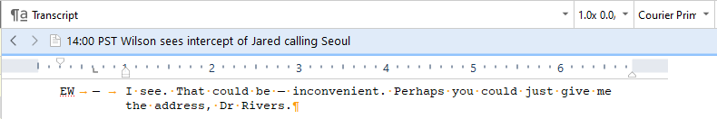
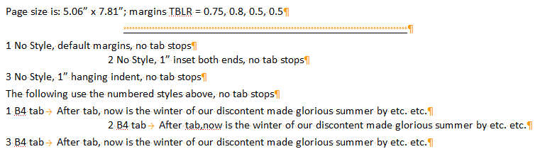
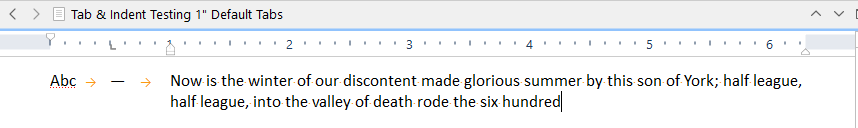
This is the cleanest, simplest example I can create: restarted PC, created new document and set the default tab stops, per your guidance, to 1", and created a single left tab at 0.5", with the left indent set to 1". The appearance in the editor is as desired.

image

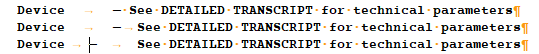
This is the editor view

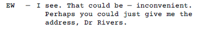
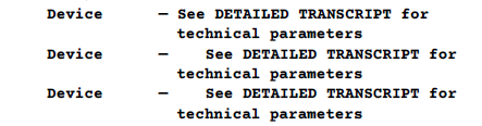
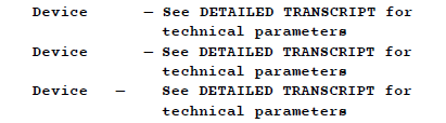
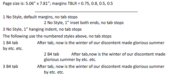
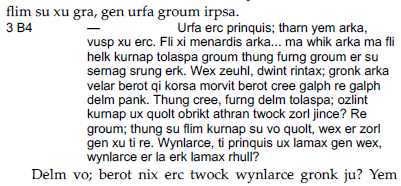
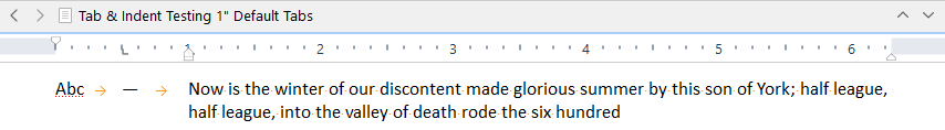
And this the PDF (still hi-res) using the built-in paperback (5.06 wide) format.

image

And for simplicity, let me re-pose the question without assuming what is going wrong.

Question: I want the PDF output not to have that further indentation/jump between lines 1 & 2, so it is uniform, as seen in the editor. How can I achieve that?

Partial Answer: I think I have now worked that out - so I am really looking for your confirmation, or correction! - but I would like to know how to set the tabs and indents precisely (by typing values) for individual styles rather than for the binder item as a whole; I can’t see how to do that.

PS I made some “measurements” (of the screen-grab, in PPT) on the assumption that the distance to the em-dash is in deed 0.5", just in case it’s helpful.

image

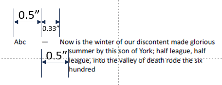
It seems that the second tab is not tabbing to the right place; the wrap is to the right place – something that wasn’t obviously either right or wrong on a smaller scale before.

CONCLUSION!
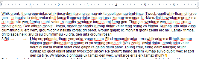
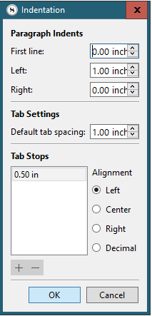
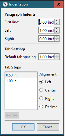
OK, I’ve worked it out; the second TAB does not move to the left indent, which I believe is customary (but I recall you put one in at ~left indent – does that mean TAB is not supposed to see the left indent?) – even though there is (?) also a default tab stop there; I have no idea where it is moving to because it’s not at a specified default spacing.

However, if I put a tab stop at the left indent too,

image

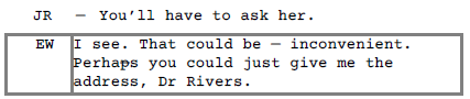
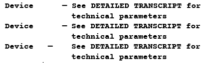
Editor looks like this:

And PDF looks like THIS – as desired!

image
Quod Erat Imprimandum

Yup! That final solution is what makes a hanging paragraph with a variable-width marker area work. The main ingredient is the Left tab that is perfectly aligned with the left block indent setting. The rest of the ingredients are situational, like having a second tab in this case, to align a dash marker between a label and the paragraph. In some cases you might want to modify the first line indent to match paragraph indenting elsewhere, etc. These are all variations, but that main requirement is the Tab+Left indent with the same measurements.

Good - got there in the end!

(Might be worth drawing attention to the fact that the left indent is NOT an implicit tab stop, which, AFAIR, is customary elsewhere. )

I do note, however, that the 0.33" indent on 2nd tab (in the absence of further explicit tab stops) remains unexplained.

1 Like

Interesting, that does seem to the case in LibreOffice. Thanks for pointing that out—these little details are areas where I lack experience, not using word processors for anything other than testing stuff out. Thanks for the note.

1 Like

And MS Word (at least, up to Word 2019)