Inspired by klcorridon’s screenshot of how he has his Scrivener project set up in this thread, I thought it would be interesting to call for screenshots of how different users set up Scrivener. klcorridon has a binder, then a vertical column of single index cards on the corkboard, and then the text, for instance:
And here’s a “minimalist” look created by AmberV:
Likewise, I have seen screenshots by AmberV in which the corkboard has a paisley background (remember you can change the corkboard background via the preferences).
So, if you have Scrivener set up in a particular way that you haven’t seen done in the regular screenshots, this is the place to post your images. And even if you have it set up in a standard configuration, still feel free to post a shot if there’s something particular you want to show off about how you use Scrivener.
If you could include one or two sentences explaining what it is about the set up, or what it is in the screenshot, that you find particularly useful, that would be great.
The idea is that this would be a great way for new users to see different ways that Scrivener can be used, of course. If there’s enough response, I may even post some of them on the main page showing how users use Scrivener. (If there is no response, I will delete this thread and pretend that no one ignored me. )
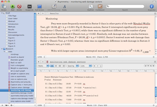
I mainly use scrivener for writing scientific papers, and here’s my set up. The most useful feature for me is the split screen view, where I can refer to the actual details of the statistics while I’m writing the paper. I import pdfs (usually) of the results of the statistical tests so it’s always available to me. Previously I’d had to spend an awful lot of time figuring out where the results where and what they were about. I color code the stats results in the research section to remind me which part of the paper they are supposed to go in. I also put all the extra stuff, such as comments of reviewers and cover letter in the same scrivener file for easy access. Thanks for this application Keith, it’s changed the way I write.
Here is a very simple tweak. When I first tried Things by Cultured Code when it was still in beta, it wasn’t what I wanted for my todo lists, but I found the background image very good. So I put it in Scrivener as corkboard background. I don’t even know if Cultured Code still uses this image, maybe it is a copyrighted image (let’s say it is a fair use) and here is the result with a short story (I don’t use synopses in short stories, but you can read it if you’re curious and you can read French!):
It’s quite simple: just use the character palette to locate a wingding or whatever, and then copy and paste it into the project’s status configuration as the sole name for it. It will come up in menus as a symbol as well.
Shouldn’t you be delegating this type of thingy to the shadowy puppet avatar? Or are you avoiding the 2.0 code base? Which means we are enabling bad KB behavior. Which means that the father in law is right and I am a bad influence.
Dang you! I was well on my way to proving him wrong!
I’ve been experimenting with using the outliner as a replacement for the binder, since on my laptop there isn’t quite enough room for binder + outline + editor + inspector.
So far, it’s working okay. I select the manuscript icon, switch to outline mode, split the window and lock the left one to the outline. I set it to open documents in the right editor, then hide the binder and/or the inspector. I have everything I need on screen, synopses included, and navigating the story line becomes pretty easy. If only the outline had the binder icons too, or the binder would just simply expand to be the outline, I think everything would be perfect for me.
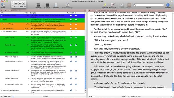
The colors indicate to me if the protagonists (blue) are the focus of the scene/chapter, or the antagonists (green), or both (orange). I guess in hind-sight, I should have use yellow & blue for each side of the conflict and green for the combined presence of antagonist and protagonists. In this screen shot, I had just finished a scene, and am using the Edit Scrivenings feature to be able to view the just-finished scene right above the one I’m writing.
Also, I customized the toolbar so that the mini iTunes window can sit up there without obstructing any of the controls.
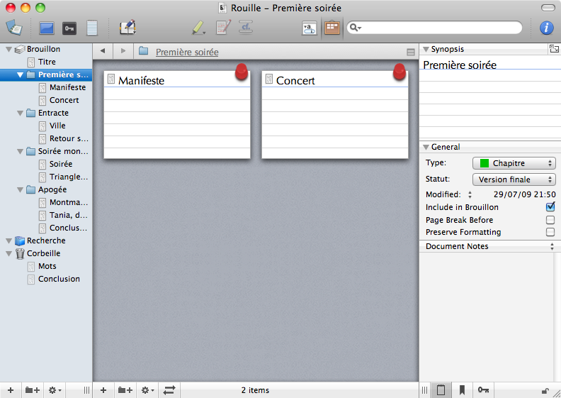
I spent 5 months meticulously researching and outlining my script in Scrivener before I began writing it in Final Draft.
I started over fresh in Final Draft hardly referring to my Scrivener outline. My characters began speaking and acting for themselves. Almost every scene in my Scrivener outline found its way into the script although totally jumbled by the character’s actions.
On page 63 of the script I realized my setup was complete and it was time to cut to the chase. For the first time since I began the script I reverted back to Scrivener to work out the Obligatory Scenes in the script’s ending.
The white cards are the characters and the blue cards are the obligatory scenes. I can now go back to Final Draft knowing exactly what’s going to happen in the last 40 pages and how the story will end.
All in a day’s work thanks to Scrivener - 2 corkboard views and uses - outlining and brainstorming.
A while ago, as part of a larger writing project, I was trying to put a BBC BASIC program together. So I used full screen, white on black, and Verdana, a similar font to the old BBC Micro’s mode 7. The sections in Times New Roman are the actual text; me thinking through the program.
This is a really nice idea. I’m going to have to try some of these layouts - I never thought of changing things that far.
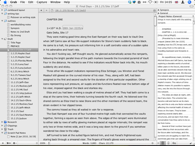
The way I have things set up, I can check the basic synopsis on the right, and jump between chapters on the left, with a good amount of space given over to the text. The colours are nice and neutral, although often, to save wear and tear on my eyes, I’ll hit ctrl-alt-apple-8 to reverse the screen (I’d include an example, but if you just did the same yourselves you’d see how the screenshot here would look like that anyway).
I don’t know how original this is with what I’ve seen thus far, but I use all the stamps and colors I can on the cork board and put that vertically on the right with a background image that reflects the story I’ve got going at the time.
This pretty much does away with the need to have the inspector on screen. On the binder, I’ve flipped research and story outline, so that my research items are at the top. It just feels more natural.
When just writing I use the retro set up for Full Screen as Keith describes in his tutorial video on Full Screen.
Thanks for all the great ideas. This just proves what an incredible program we use.
Cheers,
SLC
I usually have both panes open, writing in the lower, organising in the upper. In this case the story in the novel consists of three days. Every day is a subfolder in the binder. And there are two main story lines - they are marked in yellow and orange, and the outliner view is tinted with them.
And I ALWAYS have the Scratch Pad on my secondary monitor open. I don’t use “Project Notes” at all, because I tend to forget it’s a secondary function of the notes. The Scratch Pad can’t be overlooked.
My workflow tends to get a bit awkward when I want to reference stuff I’ve written in the Notes section of another document. First I have to browse to that file in the upper pane, then have to click back and forth between the reference file and the work file. (Copying the contents is not really an option, because I need these notes in the other file.)
Is there a critic out there who has to write a torrent of 300-word reviews of CDs and concerts and who would share a screenshot of their pure efficient flow ?
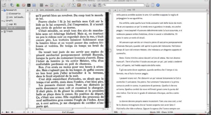
these days I’m working on a translation (French to Italian) and I’m trying using Scrivener instead of MS Word (usual tool for this job).
So I set a tre panes-view:
a narrow binder (list of source and chapters - not yet complete in this view)
left editor - Source text, pdf (scanned from paper)
right editor - translated text (Binder affects the right editor, so I can switch from chapters to notes in the binder without losing focus on the source PDF
Nothing revolutionary, not exactly a CAT tool, but for now it seems better than having 2 windows of differents programs (wp & pdf reader) and keeping up switching from one to another.
Scrivener, the writing tool with a thousand faces!


 )
)