![]() I liked the old one better. I’m currently on version 3.5.0 and the icon is purple.
I liked the old one better. I’m currently on version 3.5.0 and the icon is purple.
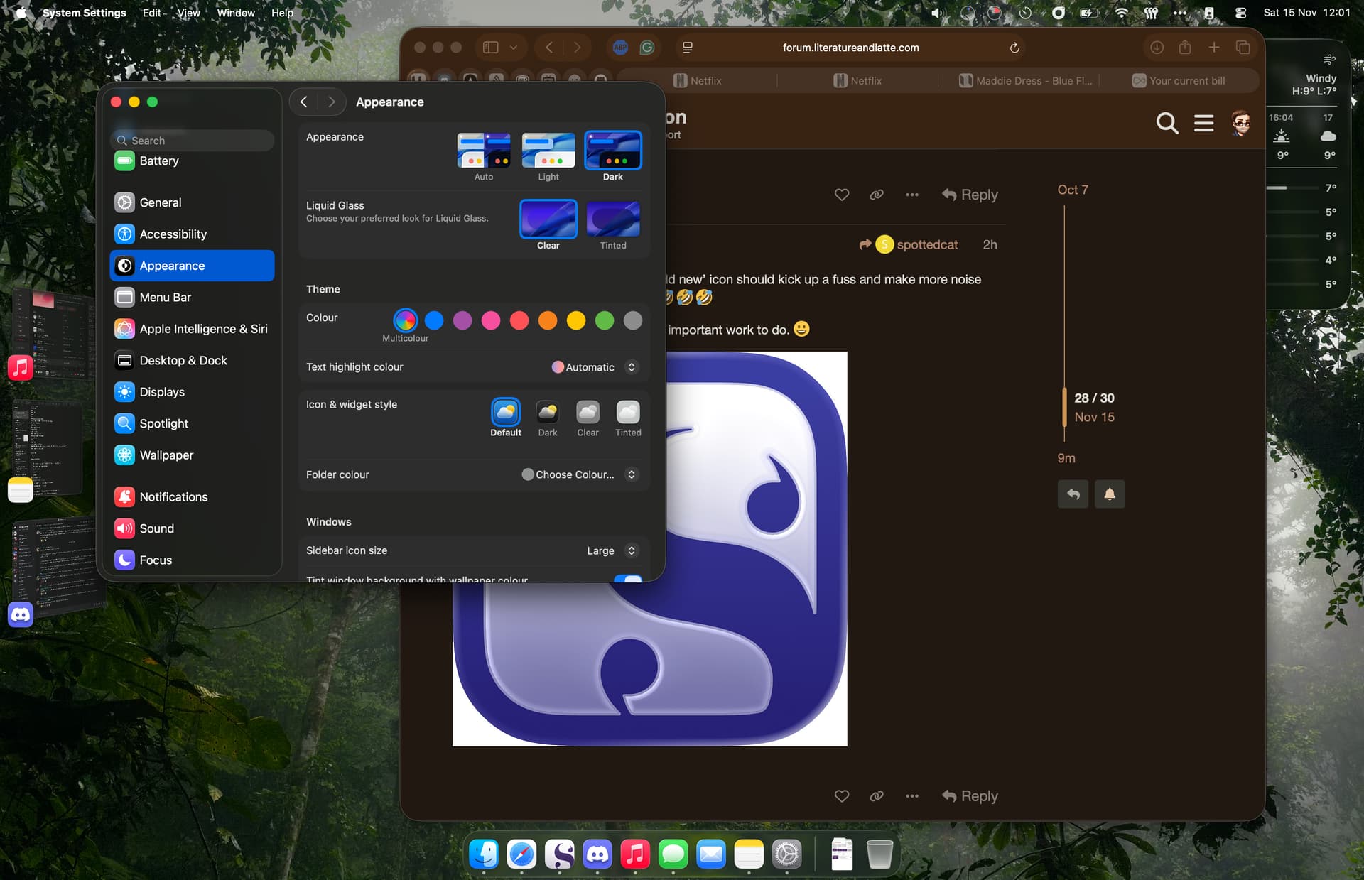
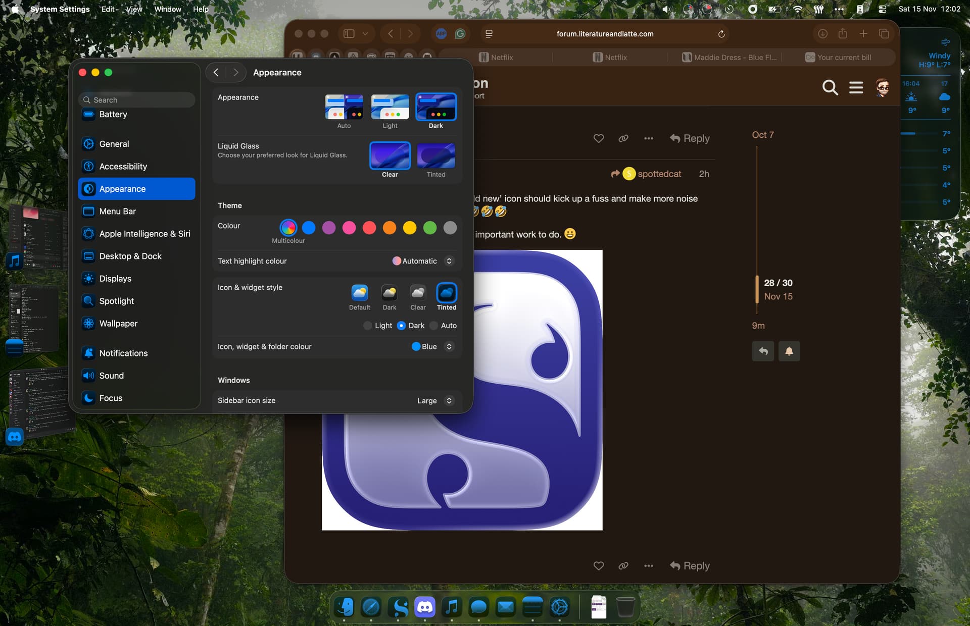
System Settings—> Appearance—>Icon & Widget Style—>then select Dark, Tinted or Clear.
You can also read the similar threads about this elsewhere in the forums.
3 Likes
Search is your friend. There are a couple of threads if you do a search that explain the icon, all the hysteria over it, and what Keith has in mind.
BTW, the old icon is PURPLE, not black. It just looks black.
3 Likes
Thank you! Hopefully it could be changed, but the system color is a bit too much lol. I saw in another thread that they’ll revise it in the next version, so I’m going to wait for that.
1 Like
The icon for Scrivener 3.4 was nicer than the ‘liquid glass’ one used by the Mac OS. It was like embossed ink on parchment paper… I don’t even know what liquid glass is.
1 Like
Just following up that I appreciate the developer considering the feedback and going back to what I think is a far more elegant (nearly) black & white app icon.
Mine changed from the boring black and white one to a lovely shiny bluey colored one. Now it’s gone back to the original amber I don’t know why.
How can I get it back?
Perhaps those of us who prefer the ‘old new’ icon should kick up a fuss and make more noise than the luddites and get it back ![]()
![]()
![]()
![]()
Sorry Keith, I know you have far more important work to do. ![]()

1 Like
Just wanted to say thanks for bringing back the old style icon, it feels much more at home.