My application icon suddenly changed from the straightforward, beautiful black and white icon I had grown attached to into a shiny blue icon that has nothing to do with what I like about the app. Does anyone know a way to revert this?
It’s an icon compatible with the Apple design requirements for Tahoe compatibility. I like it, though from discussion on another thread, I believe there might be a slight revision in the next update, not that it would concern me either way.
I buy and use an app for its performance, not the look of its icon.
Reverting to the older 3.4 version is the only way I know of, but that includes reverting to the list bug.
2 Likes
If you’re on Sequoia, then you can retrieve the old icon from a previous version of Scrivener, and then update the installed version’s icon in the usual way. i.e. by going to Scrivener’s Get Info window and dragging the old icon onto the icon shown top-left (of the Get Info window).
I’ve no idea whether this works on Tahoe.
1 Like
Thanks for the information, I just changed the icon manually. And RuffPub: I guess I see it as the cover of a notebook, which I also prefer to be basic black so it’s en empty container for whatever I’m writing. Always liked that this functional approach to the application is reflected entirely in Scrivener’s appearance.
1 Like
Yes, we’re almost certainly going to tone the new icon back in the 3.5.1 update. We’ve been updating the icon for Liquid Glass and Apple’s new standard for the way icons are put together, but feedback so far is that the new icon is a bit too bright and users aren’t a fan of the border. It’s a tough balancing act because Apple’s macOS 26 icons are all so bright, and it’s also a matter of working out the best way of using the layering of Liquid Glass icons for the Scrivener “S”.
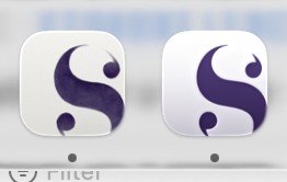
(By the way, the “S” of the old icon is in fact indigo blue-purple, not black, but it’s so dark that it almost looks black in the Dock.)
Here’s the latest revision - old icon on the left, new Liquid Glass icon on the right:
18 Likes
I need another ten versions, but I will only tell you the ones I don’t like ranked by mood and wind direction.
![]()
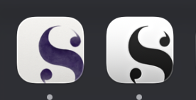
(I like this one!)
6 Likes
Although I’m happy to go with whatever you finally decide, I have to say I have definitely come round to preferring it without the border and I too like this version.
![]()
Mark
4 Likes
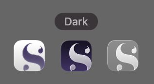
Looks glassy classy. Are you ready to share a Dark Mode preview?
2 Likes
Dark mode is just the same but the “S” is the standard dark mode icon black:
(I’m actually a bit confused by macOS 26’s settings for dark mode. I’d expect icons to switch to dark appearance when the system switches to dark appearance, but it seems to be an entirely separate switch, with no way of getting them to switch together automatically. Unless my system is just playing up.)
2 Likes
I can live with that (but was expecting a dark background with a light “S” for some reason).
ADDED LATER: Kind of like that →
“Default” is supposed to do that. If it doesn’t, that’s wrong IMHO.
And for some weird reason there’s no (permanently) “Light” toggle, that’s confusing for sure.
@KB I guess this was wrong (I’m still on macOS 15). The way it actually is supposed to work: Pick the “Dark” Icon & widget style, then directly below set it to “Auto”. Then it should automatically follow the system theme (“light” / default icons for light theme, dark icons for dark theme, and whatever is appropriate for auto theme). In theory.
1 Like
![]() Thank goodness! I don’t pop on here often, but as soon as I saw the (on my machine) PURPLE icon, I was shook! So glad to know something more restrained is coming back.
Thank goodness! I don’t pop on here often, but as soon as I saw the (on my machine) PURPLE icon, I was shook! So glad to know something more restrained is coming back. ![]()
2 Likes
I read some posts and found that before, you thought it was impossible to extend the image to the border, so you used a rounded rectangle with “S” cut out and a purple background. Then later, you discovered that the image can indeed be extended to the border.
Since the image can now be extended to the border, perhaps we could now use a background that follows the system mode and an “S” element that extends to the border on top, which might solve this problem.
I remain stunned that so many take so much out of their writing day to go on in depth about an icon. ![]()
![]()
![]()
![]()
![]()
3 Likes
Wait til you hear about graphic designers!
I like the border around the new (current) icon, but the color makes me think of Testflight/beta apps. Not a big deal, though. Bring back 1.x.
The new icon is growing on me. I still think it’s funny that this “Liquid Glass” thing is touted as new. Does anyone remember Aero?
15 year user here. Just going to add that I just got the new purple app icon and immediately started googling. Personally, I would prefer pretty much going back to the old icon. The new icon is a really poor reflection of the wonderful app Scrivener is.
In what way?
Have you read KB’s posts on his intended changes?
Even if he chose not to change it ‘poor reflection?’
2 Likes
Yes, I read KB’s post, just adding my voice that I REALLY don’t like the new icon, to emphasize that it’s not just a little tweaking and not to have second thoughts whether to tone it waaaaay down. If KB sticks to the “latest revision” above, I probably wouldn’t be writing about it.
It’s a poor reflection because it’s an ugly garish gradient purple icon that does not reflect the beauty and elegance of the app itself.
In the end, the developer can do whatever they want… it’s their app.
‘Eye of the beholder’ I guess.
While I felt the original a little bright, I have Scrivener to write (and make money ![]() ), not kick on about the colour of the icon.
), not kick on about the colour of the icon.
3 Likes