One doesn’t wish to be accused of off-topickingaaarrrgghhh!!! … nor does one want to be accused of being serious for a moment, eitherouch!ouch!ouch! … but, I can’t see anything wrong with the new icons that could earn them the description of eye-blinding. They may not be aesthetically pleasing to all, but they certainly don’t warrant a pair of these Just sayin’!
as was beaten to death in the official thread, it is an OS level color/contrast/brightness shift. L&L is right with the times and the position is understandable. But I do find that the old orbs don’t like the way apple UI is trending.
Assuming you are running on a Yosemite based Mac, just the level of “sensitivity” that piggy and I seems to share.
The original intent of “eye-blinding” was a tongue-in-cheek reference to the previous thread where the unthinkable happened… i agreed with Mr Piggy. I’ve upgraded and find the new OSX standard scriv look and feel to match all the other apps. That is to say that I find it flat and “bright” which leads to a bit of eye stress after about an hour. Same result in all but the “old style” stuff.
So … no issue other than me being old. And not liking it. And Apple rubbing salt in that particular wound.
I’m running Mountain Lion on 21in iMac. Just updated to Scriv 2.7
Are you referring to the whole Scriv layout on screen being too bright? If so, I’d just alter the brightness using my keyboard’s F14 & F15 keys. As an aesthete, I find the icons are more than acceptable for what they are designed to do.
I won’t upgrade OSX till El Capitan has been about for a bit.
Wot I do find hard to come to terms with, is the concept of you and piggy as ‘sensitive’ folk. Gonna take some getting used to.
I prefer to think of it as a sensibility than a sensitivity.
Some context… I have my monitor on full brightness. I do that, because turning down the brightness on a monitor is not the same as reducing the exposure on a photograph. It’s not neutral-density. It is closer to adding a transparent grey film over the screen. It reduces the brightness AND adds grey to the colours, distorting them.
When you do that, highly saturated colours (like those now adopted as standard in Apple systems) are bright enough to be distracting. This effect is further exaggerated when you put thess icons on a button that is not only white, but pretty much mostly white with a small icon in the middle of it.
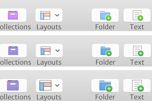
Illustrated below are three versions of the Scrivener icons. The first are the icons unaltered. The second is a very small adjustment to the colours in the icons to make them less garish. The third is a very crude enlargement of the (colour adjusted) icons within the buttons. Some might say that they really don’t see what the fuss is about, and I get that (I really couldn’t care less, for example, whether a font is Arial or Helvetica), but for me, the second row is a lot easier to look at than the first, and the third is miles better.
But that’s just my personal opinion. The first set of icons is far more in keeping with the current Apple standards, and that is the policy of LitNLat… Which is a perfectly valid policy.
THIS ISN’T A PROBLEM FOR L&L. THIS IS A DESIGN ISSUE WITH THE CURRENT SLEW OF COMMERCIAL UI GUIDELINES
It isn’t a “brightness” issue in the terms of the monitor backlight. That’s a completely different problem. And unlike piggy, while I despise the new Leap Frog look and feel of OSX, I’m used to being abused by my software vendors. What I do know is that the new L&F in OSX seems to have resulted in less tolerance of long sessions at my keyboard.
The same is true of the new Microsoft suite. Can’t stand to use if for more than about an hour before the headache sets in. Makes for long long days. At least with those tools I can lose most of the UI (ribbon) and make is just about the hideousness of their dumb a$$ software.
to reiterate, not something L&L decided to do randomly. Just a factor of marketing to the largest audience. (by apple and KB is doing the right thing by adhering to the ui guidelines)
I do disagree that pro-targeted software should follow the ‘appeal to the largest audience’ approach to any of it’s features. Pro-focused software tends to deviate from the OS defaults simply because instead of just using the software, Pros LIVE in it (I’ll call 'em defaults rather than standards because Apple itself uses a different approach for it’s – increasingly rare – pro-targeted applications).
Little differences, such as darker interfaces (or highly customisable ones) with clear easy-on-the-eye icons make a difference over time. I’m thinking Logic Pro, Final Cut Pro and the customisable console / muted icons from Xcode.
There is no “wrong” in this answer. And that’s the problem. KB needs to do what is right for L&L and that may mean, much to my consternation, that my concerns and complaints are lowered in priority or ignored altogether. The reality is that L&L is still one teacher-turned-programmer who is doing an amazing job at this. The level of programming required to make the UI work the way piggy and jaysen want while still keeping it UI standard for folks NOT piggy and jaysen is likely not in KB’s radar for “spend inordinate amounts of time on this” change requests.
Long way of saying “we lose” but for a good reason.
I disagree that there’s no wrong (images of genitalia as replacement icons would be wrong), but agree that it’s a subjective preference, and note that many / most / almost all seem to fall into the spectrum of “don’t mind” through to “love them”. So I agree that LitNLat aren’t wrong here. This is feedback, not criticism.
I do disagree that it’s a disproportionate effort to recode (but would take a couple of hours for the designer to tweak the icons). I’d also be interested to understand if people would really consider the quickly mocked up icons above to be outside what they’d consider to be in line with the UI standard.
Bear in mind that those icons have to look at home on Windows machines as well.
Piggy, I get what you are saying. I don’t disagree. But I also know what goes into this type of change. it isn’t trivial. I also understand the marketing that Apple has done. I also suspect that there are fewer “pro” caliber users than you and I would like to believe. Pure speculation on my part, but I know my daughter is using scriv for school papers and thought the new icons were the bomb (I know she’s an adult… I know it…). I just don’t think that the 3 folks that have suggested “this isn’t ideal” are even close to providing sufficient justification for KB to even post on it again.
But he is dad. His house. His rules. Options are to grumble under my breath but still eat my peas or I can move out. I can learn to live with peas.
Lot’s of people (including his trainer, Mickey) told Rocky to stay down when Creed knocked him to the mat in the 14th round. That’s not how Rocky or I like to live.
What I really need is to go find the Icon designer’s forum and go heckle there!
errr … scyooos me sir(s),
if I upgrade to Yosemite from Mountain Lion, will the appearance of my Sciv layout be different? Is it because I’m using ML instead of Yos, that I’m not seeing what you are? I’m on Scriv 2.7
Ta muchly
Be patient, Mr P and Mr J. Design fashion if nothing else is cyclical, what goes around comes around and all this will pass - who knows, in a couple of years we may even learn to love skeuomorphism again. Well, perhaps. (And be thankful, or at least Mr B can be thankful, that Scrivener is not a TV programme or a movie. For which style-critics may potentially be numbered in millions, and for which music, in the shape of titles, credits and background, can enter the equation as a topic of controversy and criticism. Because music in TV programmes and movies, let me assure you, for spattering the dark stuff all around is absolutely unrivalled… I write as someone heavily so bespattered…)

 Just sayin’!