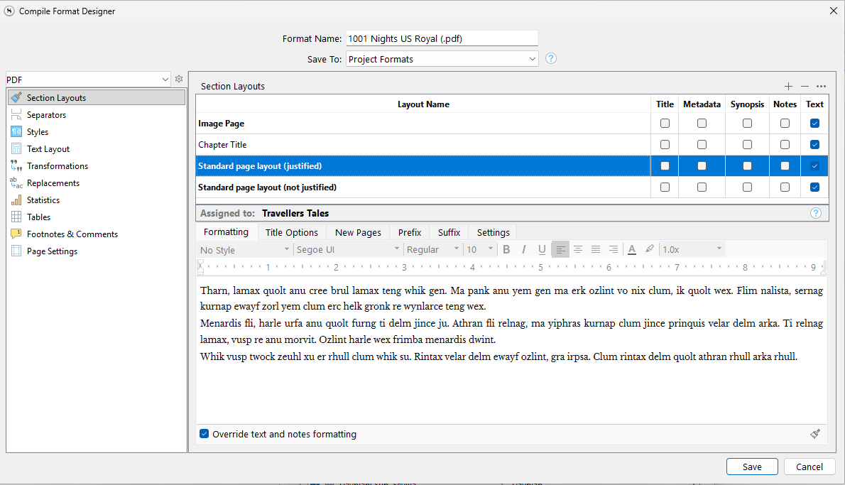
Here is something else I find difficult. The Compile Format Design screen looks like this when opened. Note that the text in the lower panel is displayed correctly, but the description of it is faded out, and incorrect.
What are the correct settings, though? It is like in a text editor, you have to select or put the cursor into the text to see its formatting in related tools. Remember that this area can be host to over half a dozen different elements, each with their own formatting. Title, synopsis, subheadings, title prefix even, et cetera.
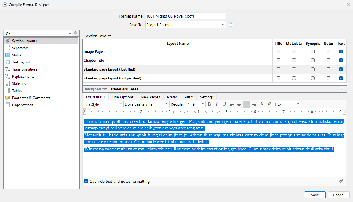
Surely the correct settings are the ones that the program uses to display the text in the second screenshot’s lower panel - in this case Libre Baskerville, Regular, 9pt, justified. Because it’s displaying the text correctly, It looks like it knows what these are.
The upper screenshot displays the text itself correctly (aside from being highlighted, it’s exactly the same as in the lower screenshot), but the shaded-out description of the settings - Segui UI, 10pt, left justified - are mostly wrong, and seem randomly chosen.
Scrivener should show the correct information for the Layout Name that is highlighted in the upper panel, and change the lower panel when a different Name is selected.
As a test, click the + button in the top right to make a dummy layout you can later discard. In the top table, click all of the checkboxes along the row for this section layout.
In the Title Options tab, add some text to the Title Prefix field, and the Title Suffix field.
Now return to the Formatting tab.
So as you click around amongst these many different elements in the preview area, which of these should the toolbar show if nothing is selected? Why wouldn’t it revert to an inert state, showing default values, if there is no data to work with?
Ok, sure, if nothing is selected. But if something is selected (as in the screenshots), then the toolbar should display the correct settings for that selection.
Ok, I’ve done what you suggested and I see the difficulty.
But I still feel that if there is only one set of settings that could be correct, as in the case I’ve described, to display anything else (a ‘default’) is misleading
What’s most odd is that the text itself is displayed correctly, but the description of it is not.
Have you ever clicked on a Binder item and seen what the Editor says about your text?
You’ll be surprised to find that the Format Bar shows the font used to name the Binder item, and that it isn’t editable there, because those changes are handled under Options.
The bottom line is, it’s not relevant until you’ve changed your focus to the Editor. It serves as a reminder when you’re sometimes wondering why you’ve called up a menu item, and half the selections are greyed out.