I’m doing a second edition of a book which - helpfully - still remembers all my compilation settings. Except when compiling, the separators are not correctly shown when using quarter moons (specifically, “Last Quarter Moon”).
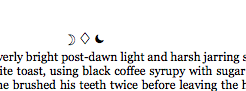
This used to work. The characters are correctly displayed on the Mac in e.g. Word, OneNote, TextEdit, that is, any application that is not Scrivener. In Scriv, it’s very unhelpfully a) a different character that is b) black. Ref:
(This is a werewolf book hence the disco use of moons).
When compiled, it carries this incorrect moon through to the compiled product.
You can see that the character viewer knows what this is, but Scriv refuses to work right. It used to work, and works right for “First Quarter Moon.” Any thoughts on how to get this working as intended?
Things I’ve tried include pasting the text into another tool (e.g. Word, OneNote) and then copying back into Scrivener. Looks great in Word, looks br0k3N in Scrivener.
The compiled version is … wrong. Doesn’t seem to matter if I change the font.
E-readers generally have very limited font selections, so if the problem only appears in epub formats the most likely cause is that particular glyph simply isn’t available.
Bear in mind as mentioned this previously worked with the same glyphs in the same formats. I think the most likely cause is that something’s changed in Scrivener (last time I compiled this document was in 2013, which implies a Scriv update or two) that prevents this from working
There’ve also been quite a few OS X updates since 2013, and I would be more inclined to attribute the issue to those than to Scrivener. Scrivener is built on the OS X text system, and uses system tools almost exclusively for this kind of thing.
Now we’re getting somewhere. So TextEdit is the only app I can find that has similar behaviour to Scrivener (indeed, even Terminal works as expected). So there’s something similar to the way TE and Scrivener work that displays not quite right. I’ve confirmed this across two machines (MBP Retina and Mac mini) which tends to indicate it’s not system specific / random corruption but also lends strength to your theory of OS X being shonky.
Apps that “work” - OneNote, Word, Affinity Photo, Terminal, Pages
Apps that “fail” - TextEdit, Mail, Scrivener, Chrome
I guess the question would be whether this is “fixable” (…for some values of fix, perhaps workaround / hammer) or whether we’re stuck with this discrepancy between what Apple show in Character Viewer vs. what the OS X text system displays.
OneNote, Word, and Pages all use their own text systems. TextEdit, Mail, and Scrivener all use the OS X system. (I don’t know one way or the other about the others.) So that’s almost certainly the source of the problem.
Unfortunately, that means it isn’t fixable by us. The only workaround I can offer would be to use a different glyph.
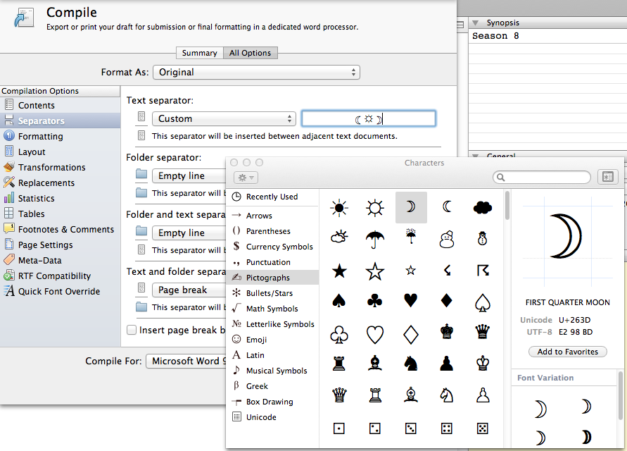
I think I’m getting to the bottom of this - it’s non-obvious what’s happening in the Scrivener “separators” dialogue above as there’s no font options, but the OS X text system (?) appears to be substituting fonts for some glyphs. So in our example above, it’s actually using the font “.SF Compact Display” for the rightmost glyph, Arial Unicode MS for the middle, and correctly honouring the request for Georgia for the left.
In TextEdit you can force a font, correcting the behaviour - so if you select “Menlo” it will update to using the correct glyphs. Scrivener does not honour font requests in the separators field, which is … unhelpful. So you get whatever substitute fonts are slotted in there (in this case, Georgia, .SF Compact Display, and Arial Unicode MS). You can see how Scrivener doesn’t really like the option of fonts here by putting any text you like in, and asking it to change it:
(Hint: “I’m a font” is not displayed in Zapfino I’m not actually sure what font that is, but it’s not Georgia, the font I’ve requested for this project).
Word and friends do not appear to do this - they report a correct usage of the font requested for all glyphs (and probably invoke sorcery at the back end to make it look right, possibly similar to what Word does for e.g. italics if your font set doesn’t include italics). The really screwy thing is that it looks fine (so the substitutions must be on point).
Where this is breaking down for Scrivener is that it’s choosing an arbitrary font for the Separators section (it looks a little Helvetica-ish?). I think this is the source of the madness, because it’s very difficult to know what will work in that field if it doesn’t honour fonts correctly (and does not show the font being used).
So I guess now we know what’s going on, it would be down to a workaround. There appear to be three possible workarounds:
Use a different glyph, or
Convince Scrivener to honour font requests in that field, or
Convince Scrivener to show us what font it’s using (which is related to #1, above).
It’s Helvetica. I don’t know where it’s getting this from, but I would say the behaviour isn’t correct if it’s not using the compile font and you can’t set the font.
I’ll use something generic for now - bullets, whatever - and file a feature request in the appropriate forum. I think the ability to edit the font in the Separators field would be one way of solving the problem but I’ve no clue how complex that kind of change would be
If you compose the glyphs in Scrivener’s main editor, which does allow control over fonts, and copy and paste from there into the separators pane, what do you get?
I use Georgia too, so I just experimented with your settings. I opened Compile and set Level 2+ to Georgia, then went to Page Separators (which doesn’t seem to offer a font option?) and opened Edit/Special Characters and used your ‘first and last quarter moons’ glyphs. No problem getting them to display.
However, I had a look in “Quick Font Override” (the last compile section) and saw that it was unchecked. If I had checked it, the default font used would have been Helvetica, and this is the only reference to Helvetica I can find. Have you got “Quick Font Override” checked by any chance?
The custom separator field is a text field. It is not possible to set fonts in them - this is a general limitation in macOS. They always use Helvetica. Setting a separate font for separators would therefore never be possible this way and would require a separate option. However, even that wouldn’t solve your problem. Even if I add the ability to set the font of separators, that would only resolve your issue when exporting to PDF and rich text formats. It would have very little effect when exporting to .epub, because no fonts are included in the .epub file - the font used depends on the e-book reader. And the font used by iBooks has the same effect for the moon as the editor in Scrivener. (The only caveat here is that if you use a monospace font in Scrivener, a monospace font will be used in the e-reader, but it will the monospace font of the e-reader’s choice - and having tested this, the moon still looks off even with a monospace font.)
So the problem here is simply that most fonts display the moon in an odd way. If you’re seeing it displayed the same way on the Kindle, too, then it means that even Amazon’s text system displays it that way using their own fonts. In fact, I think the bug here is in how Apple is displaying the last quarter moon in the special characters/emoji and symbols palette. If you look up “Unicode 263E” in Google, you will see that its standard appearance is how it looks in Scrivener.
It is a most excellent font Mostly I do this as I think it represents what I see vs. the randomness of choice for readers with their own specific fonts quite well. As an aside, I also like the new Kindle Bookerly font, but let’s keep that a dirty secret between us.
…
Ok. So some questions…
Are you on OS X or Windows? Under Windows Scrivener this works for me as well, but OS X is broken.
If OS X, which version? This used to work for me but on a much earlier version of OS X. My hypothesis is that some of the font substitution in the latest Sierra versions is causing all kinds of angst. It’d be nice to know if this is wishful thinking or accurate.
Without wanting to suck out too much of your time, would it be possible to get a screenshot of the Separators field working for you? I’d like to do a visual compare to see whether there’s some sort of specific quarter moon that works.
No - Quick Font Override is only available for rich text formats, and doesn’t appear for e.g. EPUB or Kindle. I’m trying to compile this for digital storefronts.
It makes me wonder if previous OS X versions were … not compliant? And that recent editions have updated the behaviour to be more compliant (which now looks bad).
I have reverted to plain ol’ bullets for now, but I’m tempted by use of hexagrams - but only after my new stock of booze arrives, because this is hard to do sober.
Your screenshot looks like what mine used to. I think this may indicate that Sierra (or El Capitan?) changed the way this behaviour worked, breaking something that used to look right.
I don’t think there’s any putting toothpaste back in the tube from a user perspective on this one
Thanks for snapping the screenshot, it’s helpful to try and find out where the differences are that lead to good/not good outcomes