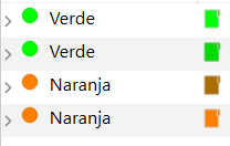
I have noticed that in the binder some icons appear darker than others. Attached image:
These are exactly the same icons and with two color labels, green and orange. The thing is that they are the same (I have checked), both the label and the icon, but some appear darker than others. Any idea why this could be happening?
Oh, by the way, it is not due to the order. In this case I have put them together so that they can be seen side by side, but wherever I put them in the binder, they appear with the same color as the image.
I have that option enabled, yes, but they are the same labels:
and they still look different
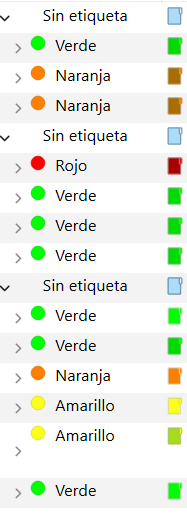
All four of this documents are set to the default icon, so I don’t understand why they look different.
Also, may I add, this happens throughout the binder and with all the labels, not just these (these are just an example). Even if I change the color, the same thing still happens, some appear darker than others. For example:
I mean, I don’t color all of my folders, but when I do this happens…
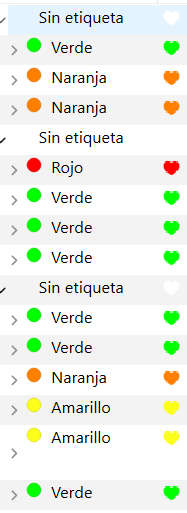
Running some tests, I’ve noticed that if I change it to hearts (for example), they appear all brighter, but if I change it back to the default icon, it appears the same as before (some darker, some brighter):
They are the same icons, yes. All of them are the default folders. I have clicked the option to set the default icon on each of them individually, just to test it, and it has changed nothing.
I’m not sure what this means. Can I do something about it?
I suggest turning off everything that might impact the appearance of the binder, to see if you can make this go away. So –
Disable all the settings under View > Use Label Color.
Under File > Options > Appearance > Binder, disable
Options > Show current document indicator
Fonts > Use Bold font for Folders/Document Groups
Turn them all off at the same time. If that makes a difference in what you’re seeing, then turn them back on one at a time to determine who’s the culprit.
Also, have a read in the user manual, section 7.1 Binder Icons, which describes how the default icons work. See if anything in there gives you a clue what might be causing this.
As for why the heart icon is working better, it is probably white when you turn label tinting in icons off? This will make it blend better than it does with the blue folder icons. The way this is supposed to work is that when you have that option turned on, all the folders turn white so that they blend better, but that was never fixed.
I’m not sure why you are getting such a different result though, are some of these folder icons custom (with a white folder) and others not?
Nope, they are all the same custom folders, that’s why I don’t understand why some of them look different.
I could send a zip file of my .scriv document containing only these folders for you to see, if necessary.
Yes, that could be helpful. You can send a sample to one of these addresses. Just paste the forum thread URL in there as well, and someone will connect me to it and I’ll have a look.