Let’s say there’s a “verse” style (paragraph + character) and one word of it is in “emphasis” style (character). What’s the best or recommended way to let the character style in this example “survive” the compilation process. I ended up with:
Maybe not the best example, but the emphasis style could also be “red color” or anything. I tried adding styles in the Compiler like “Verse + Emphasis” (the way the style dropdown above the editor displays it), but to no avail. Any ideas?
I’m a bit confused here. But firstly, what are you compiling to… ePub, HTML, RTF, DOCX?
The character assignment in your “verse” stye seems to be italic, which is fine in itself, but essentially—as I understand it—italic in HTML, and therefore ePub, is marked by <em>…<\em>, i.e. “emphasis”. If I’m right, you’re trying to apply “emphasis” to text already marked that way.
By way of experiment, try setting up a character style “Strong”—normally bold, but you could just make it red—and using that on the words/phrases in question. Does that work.
All of that said, quite some years ago, I did find there was a problem with using a character style—in my case raised or superscript—within paragraphs which already had font etc. defined—Chinese, as it happens—where the superscripting spread right across the whole of the following sentence. It’s some time ago, I found my own way round that problem, but I think KB dealt with it in a later update. I haven’t tried since, so can’t be sure.
What is supposed to be special about the single word assigned a character attribute style?
To me, it looks just like the rest of the paragraph, but marked with a box. (Those boxes don’t compile, by the way – just saying, in case that was actually the attempt.)
Here’s a small Scriv project that seems to do just what you want. It compiles perfectly well using the ePub format, which I’ve modified to have an italicised “Verse” paragraph style, together with a “Red” and a “Strong” character style. Note that both the character styles also have italic assigned.
PS You need to assign the Verse style first, then apply the character styles. If you do the character styles first and then Verse, it will override he character styles.
Thanks @xiamenese (but the order of applying the styles seems to make no difference in this case, as far as can I tell; tried both).
The PDF was not a good example to begin with, so I thought I’d give the “MultiMarkdown → Web page (.html)” route a try. And added bold to the mix. That’s what happens with a (no style) body paragraph:
Lorem ipsum dolor sit amet,<br />
consectetur <strong><em>adipiscing</em></strong> elit,<br />
sed do eiusmod tempor incididunt<br />
ut labore et dolore magna aliqua.</p>
Looks good. And that’s the compiled output of a “verse” paragraph:
<em>Lorem ipsum dolor sit amet,</em><br />
_consectetur <strong>adipiscing</strong> elit, _
<em>sed do eiusmod tempor incididunt</em><br />
<em>ut labore et dolore magna aliqua.</em>
It’s almost as if the italics of the “verse” parapraph somehow cause the Compiler to throw away the italics of the emphasis inside of it. Maybe it thinks I’ve got enough of it already. Also weird that all of a sudden the line of trouble is surrounded by underscores.
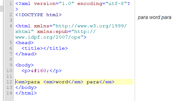
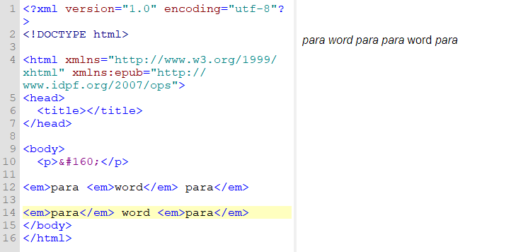
Because it’s none of it’s business? It’s an emphasized word inside an emphasized paragraph. Like: <em>para <em>word</em> para</em>. Which would be displayed / printed as: para word para.
Unless there is something I have no knowledge of that should happen, when a word is emphasized inside an emphasized paragraph, it just gets no italics and that’s all. It doesn’t get it twice, and that so would revert it.
You might have to create yourself a character attribute style named : “double emphasis” or “suremphasis”, with actually no attributes, and handle its integration to the text yourself.
But, again, yes, it’d be nice of Scrivener to handle it at compile.
Thanks @xiamenese@Vincent_Vincent. In case you’re wondering why one would attempt such crazy things: Convenience and reducing error sources. Because if the verse ends up in another type of context, the “double-emphasized” style becomes wrong and needs manual intervention. (And that’s where the weird boxes around it come in handy.)
I may be missing something, but I have my verse set up as a paragraphStyleonly. I can then apply whatever characterStyle I want to the verseparagraph, and the combination works out beautifully. No lost formatting.
For me, it all depends on how I’ve set up the character and paragraphStyles. Sometimes, it took a bit of iteration to get the best configuration.